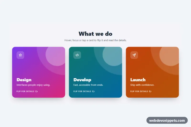
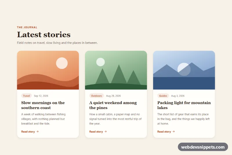
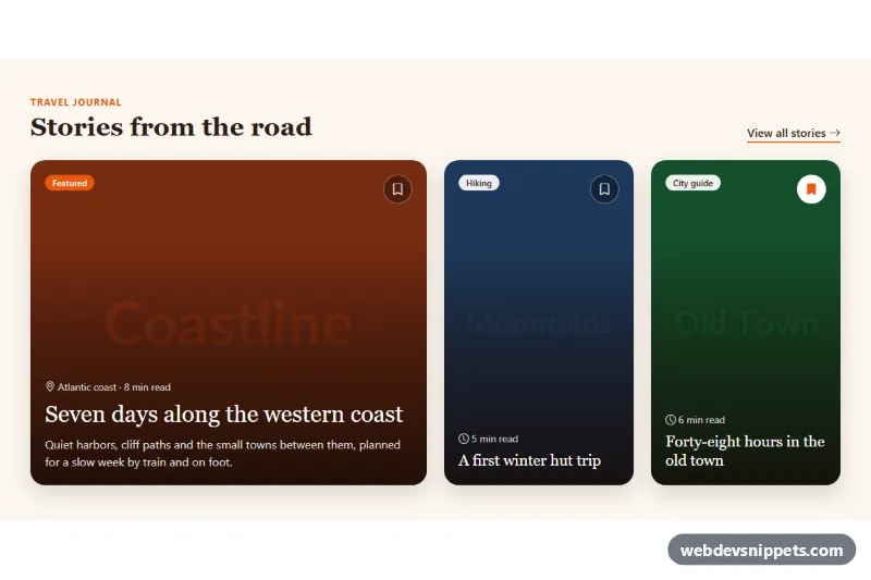
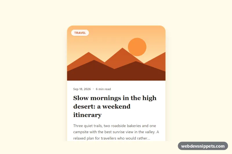
A set of three 3D flip cards built with pure CSS and a few lines of vanilla JavaScript. Each card shows a bold gradient front with an icon and title, then turns over to reveal details and a call-to-action link. Use it for service overviews, feature highlights, team bios or pricing teasers.
How it works
The root section.fc-deck holds a heading, a short intro and the .fc-grid of article.fc-card elements. Every card wraps an .fc-inner element with two faces: .fc-front (icon, .fc-title, .fc-tagline and a .fc-hint) and .fc-back (text, an .fc-list and an .fc-link). The faces sit in the same grid cell, so the card grows to fit the taller face instead of relying on a fixed height. .fc-card sets perspective, .fc-inner uses transform-style: preserve-3d, and both faces use backface-visibility: hidden, with the back face pre-rotated by 180 degrees.
The flip is driven by one custom property. .fc-inner rotates by calc(var(--fc-flip) * 180deg), and --fc-flip switches from 0 to 1 on mouse hover (only on devices that support hover), on :focus-visible of the card, when the link on the back has keyboard focus (via :has()), and when the card has the .is-flipped class. The script listens for click on each card and toggles .is-flipped only on touch screens ((hover: none)), closing any other open card. Taps on the link are left alone so it navigates normally. Without JavaScript, hover and keyboard focus still work.
Customization
.fc-card--violet,.fc-card--tealand.fc-card--amber: each sets--fc-accentand--fc-accent-2, the two gradient stops of the front face and the color of the list bullets. Add your own modifier for a new color.--fc-heighton.fc-deck: the minimum card height; raise it for taller cards with more content.--fc-speed: duration of the flip, e.g.0.4sfor a snappier turn.--fc-perspective: lower values such as600pxgive a more dramatic 3D effect.--fc-back-bgand--fc-back-text: background and text color of the back face, for example a light back with dark text.--fc-radius: the corner radius of the cards and their focus ring.grid-template-columnsin the.fc-gridmedia queries: the grid shows one column on phones, two from 640px and three from 960px.
Accessibility
Each card has tabindex="0" and aria-labelledby pointing to its title, so keyboard users can Tab to it and see the back. A visible ring is drawn around a focused card with --fc-focus, and the link has its own outline. Both faces stay in the DOM, so screen readers read the full content in order. Decorative icons and the hint text are aria-hidden. With prefers-reduced-motion: reduce the rotation is replaced by a short cross-fade between the faces.
Usage notes
Several decks can share a page; the script scopes each one to its own .fc-deck. The :has() rule needs a current browser; in older ones the card still flips when the card itself is focused.