Skip to content

Card with Image Overlay Text

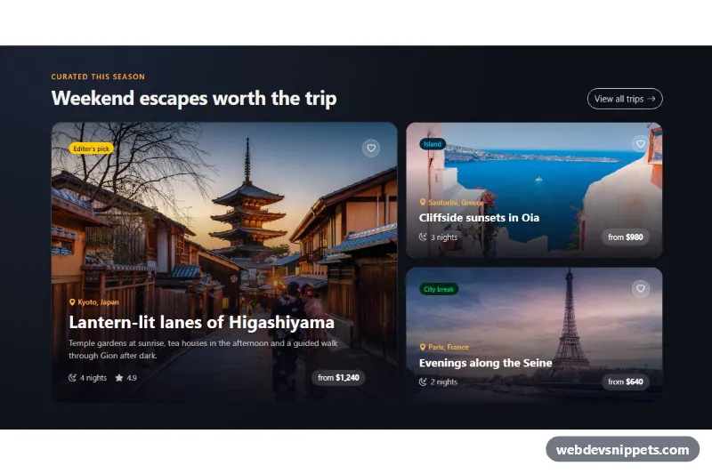
Dark Bootstrap 6 travel cards with headline, place and price set over full-bleed photos, a gradient scrim for readability, save buttons and a Toast.

Also known as: image overlay card, text over image card, travel destination card, card with gradient overlay

Bootstrap 6 Cards Responsive Dark #card #gradient #image #overlay #responsive #travel

Card with Image Overlay Text live demo

Open in new tab

Bootstrap 6 code (HTML, CSS, JS)

A dark Bootstrap 6 card layout that puts the headline, location, trip length and price directly on top of full-bleed photos. A layered gradient scrim keeps the white text readable on bright and busy images. It suits travel sites, magazine teasers and event listings.

How it works

The section .cio-root is pinned to data-bs-theme="dark". Inside, .cio-grid is a CSS grid: a single column on phones, and from 768px a wide feature card (.cio-card--feature) that spans two rows next to two smaller cards.

Each card is a Bootstrap .card with an img.card-img and a .card-img-overlay. The image (.cio-img) is absolutely positioned with object-fit: cover, so any photo ratio fills the card. The overlay (.cio-overlay) is a flex column. Badges and the save button sit at the top, and the text block .cio-body sits at the bottom. A linear-gradient on the overlay darkens the lower part strongly and the top edge slightly.

The title link uses stretched-link, so the whole card is clickable while the markup stays one link per card. The heart button .cio-save gets z-index: 2 to stay clickable above that stretched link. On hover or keyboard focus the photo zooms in slightly.

script.js imports Toast from the Bootstrap 6 bundle. Clicking a .cio-save button flips aria-pressed, swaps bi-heart for bi-heart-fill, updates the button label and shows .cio-toast with the trip name from data-cio-name.

Customization

  • --cio-accent on .cio-root: changes the eyebrow, place labels and focus outline color.
  • --cio-shade on .cio-root: the RGB triplet of the gradient scrim; use a warm brown or deep blue to tint the overlay.
  • --cio-radius on .cio-root: rounds the cards and the stretched-link focus ring.
  • grid-template-columns in .cio-grid (768px media query): change 1.35fr 1fr to 1fr 1fr for equal columns.
  • Remove .cio-card--feature from the first card to get three equal cards in a row-based layout.
  • data-cio-name on each .cio-save: sets the name used in the button label and the toast message.
  • Swap theme-warning, theme-info and theme-success on the badges for other Bootstrap 6 color roles.

The photos come from Unsplash. Replace them with your own images and update the alt text.

Use cases

  • Travel sites: headline, location, trip length and price sit directly on full-bleed photos
  • Magazine teasers: a gradient scrim keeps white text readable on bright or busy images
  • Event listings: save buttons on each card show a toast confirmation
  • Tour pages: a dark grid adapts from one column on phones to several on larger screens

Accessibility

Each card is an <article> with an <h3> link, so screen reader users can browse by heading. The save buttons are real toggle buttons with aria-pressed and a label that names the trip. The toast is a polite role="status" region. Links and buttons show a visible amber focus outline. For the stretched link, the outline is drawn around the whole card. The image zoom and arrow nudge are turned off under prefers-reduced-motion.

Bootstrap 6 notes

Bootstrap 5 users will know card-img-overlay and stretched-link; both still work in Bootstrap 6. Badge colors now use badge theme-warning and badge badge-subtle theme-info instead of text-bg-*. The outline button is btn-outline theme-inverse, and the toast is shown with Toast.getOrCreateInstance() imported from the ES module bundle, since there is no window.bootstrap. Built on Bootstrap 6.0.0-alpha.1, so APIs may still change.
Card with Image Overlay Text at a glance

Framework
Bootstrap 6
Code
HTML, CSS, JavaScript
JavaScript
Vanilla JavaScript, no jQuery
Dependencies
Bootstrap 6, Bootstrap Icons
Layout
Responsive, works on mobile, dark design
Category
Cards
License
Free for personal and commercial use

Questions about this template

Can I use the Card with Image Overlay Text code for free?

Yes. You can copy or download the code and use it in personal and commercial projects, including client work. No sign-up is needed. Reselling it as part of a component library or template collection is not allowed; see the license.

How do I add it to my website?

Load Bootstrap 6 and Bootstrap Icons from a CDN (the links are under Requirements). Paste the HTML where the component should appear, add the CSS to your stylesheet and load the JavaScript before the closing </body> tag. Download HTML gives you a complete page with everything already linked.

Does it need jQuery or a JavaScript framework?

No. The script is plain vanilla JavaScript, so it works without jQuery, React or Vue. You can still use the markup inside those frameworks.

Does it work on mobile?

Yes. The layout adapts to small screens. Use the Mobile and Tablet buttons above the live demo to check it at phone and tablet width.

Requirements

Add these to your page (already included in the download):

  • <link rel="stylesheet" href="https://cdn.jsdelivr.net/npm/bootstrap@6.0.0-alpha.1/dist/css/bootstrap.min.css">
  • <script type="module" src="https://cdn.jsdelivr.net/npm/bootstrap@6.0.0-alpha.1/dist/js/bootstrap.bundle.min.js"></script>
  • <link rel="stylesheet" href="https://cdn.jsdelivr.net/npm/bootstrap-icons@1.11.3/font/bootstrap-icons.min.css">

Built for Bootstrap 6.0.0-alpha.1. Bootstrap 6 ships as an ES module, so its script and this component's JavaScript load with type="module". Alpha releases can still change before the stable version.

Card with Image Overlay Text – Bootstrap 6 cards component screenshot
Card with Image Overlay Text · Bootstrap 6 Cards

More Cards

3D Flip Card – Pure CSS cards preview

3D Flip Card

Three pure CSS 3D flip cards that turn on hover, keyboard focus or tap to reveal details and a link on the back.

Cards with Hover Lift – Pure CSS cards preview

Cards with Hover Lift

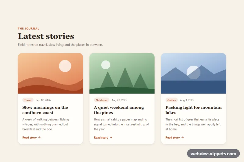
Pure CSS blog card grid where each card lifts with a deeper shadow and zooms its image on hover or keyboard focus.

Blog Post Card – Tailwind CSS cards preview

Blog Post Card

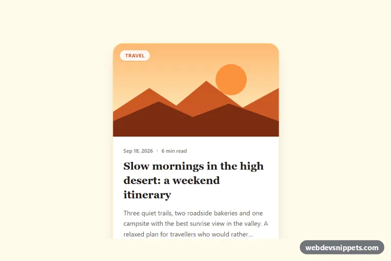
Tailwind CSS blog post card with cover illustration, category badge, date, reading time, clamped excerpt, author row and a fully clickable area.

Event Card with Photo and Date Badge – Pure CSS cards preview

Event Card with Photo and Date Badge

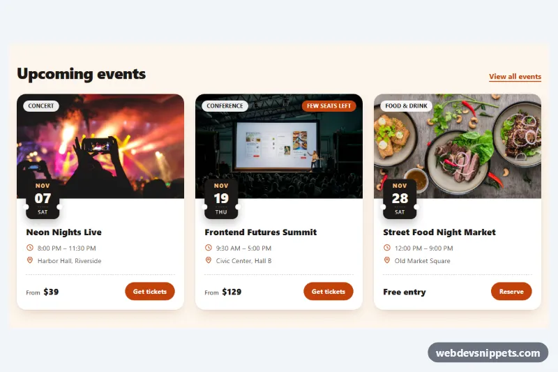
Pure CSS event cards with a cover photo, ticket-stub date badge, category chip, time and venue details, price and a ticket button.

Glassmorphism Card – Tailwind CSS cards preview

Glassmorphism Card

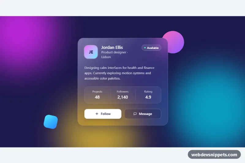
Frosted glass profile card in Tailwind CSS with backdrop blur, a light reflection and a follow button over colorful animated gradient blobs.

Interactive Card with Hover Lift – Bootstrap 6 cards preview

Interactive Card with Hover Lift

Bootstrap 6 clickable learning path cards that lift with a soft shadow on hover and keyboard focus, using hover-lift, stretched links and a level filter.