Skip to content

Card with Header Tabs

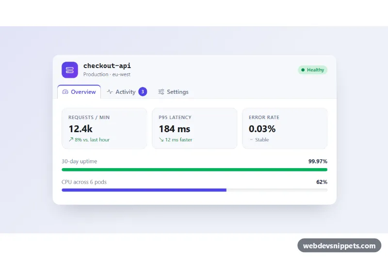
Bootstrap 6 card whose header holds nav tabs that switch the card body between an overview with stats, an activity feed and a settings form.

Also known as: card with tabs, tabbed card, card header navigation tabs, dashboard status card

Card with Header Tabs live demo

Open in new tab

Bootstrap 6 code (HTML, CSS, JS)

A Bootstrap 6 card with navigation tabs built into its header. The tabs switch the card body between three panels without leaving the page. The demo is a service status card for a dashboard: an overview with key metrics and progress bars, an activity feed, and a small settings form. The same structure works for product details, account pages or any widget that needs several views in one box.

How it works

The .card-header holds a title bar (.cht-titlebar) and a ul.nav.nav-tabs.card-header-tabs with role="tablist". .card-header-tabs is the Bootstrap 6 class that pulls the tabs down onto the header border, so the active tab merges with the card body. Each tab is a button.nav-link with data-bs-toggle="tab" and a data-bs-target that points to a .tab-pane inside .card-body.tab-content. Bootstrap 6's Tab plugin handles everything through the data API: clicks, aria-selected, the roving tabindex and arrow-key movement between tabs. Panes fade on their own, so no .fade class is needed.

The overview pane uses .progress bars with progress-bar theme-success. Their widths come from .cht-bar and .cht-bar--cpu in style.css, not inline styles. The activity pane is a list-group list-group-flush. The settings pane uses Bootstrap 6 form markup: .form-field wrappers, .switch toggles and a <select class="form-control">.

script.js does two small jobs. It gives each <time class="cht-time"> a datetime computed from its data-cht-ago minutes, so the feed never shows stale dates. It also simulates saving the settings form: preventDefault(), a short "Saving…" state, then a status message.

Customization

  • --cht-accent on .cht-root: recolors the active tab, logo, count badge, switches, CPU bar and Save button.
  • --cht-header-bg, --cht-line and --cht-bg on .cht-root: change the header strip, borders and page background.
  • width in .cht-bar and .cht-bar--cpu: set the progress values (also update aria-valuenow).
  • data-cht-ago on each .cht-time: minutes since the event; the script turns it into a datetime attribute.
  • Replace nav-tabs card-header-tabs with nav-pills on .cht-tabs for pill-shaped tabs inside the header.
  • Replace the setTimeout in the form submit handler with a fetch() call to save real settings.
  • min-height on .cht-body: keeps the card from jumping when panes have different heights.

Use cases

  • Dashboards: a service status card switches between overview metrics, activity feed and settings
  • Account pages: several views fit in one box without leaving the page
  • Product details: tabs in the card header separate information into small panels
  • Admin widgets: progress bars in the overview panel show key metrics at a glance

Accessibility

The tabs follow the ARIA tabs pattern: role="tablist", role="tab" with aria-controls and aria-selected, and role="tabpanel" panes with aria-labelledby. Arrow keys move between tabs. Progress bars have role="progressbar", labels and values. The save message is a role="status" live region. On very narrow screens the tab icons are hidden, so the labels fit.

Bootstrap 6 notes

Tabs work as in Bootstrap 5, but the Tab plugin is loaded as an ES module and needs a .nav or role="tablist" ancestor. Switches are <div class="switch"><input role="switch" switch></div> instead of .form-switch, form-select is now form-control on <select>, and btn-primary is btn-solid theme-primary. Tab and pane IDs must be unique, so change them if you use several cards on one page. Built on Bootstrap 6.0.0-alpha.1.
Card with Header Tabs at a glance

Framework
Bootstrap 6
Code
HTML, CSS, JavaScript
JavaScript
Vanilla JavaScript, no jQuery
Dependencies
Bootstrap 6, Bootstrap Icons
Layout
Responsive, works on mobile
Category
Cards
License
Free for personal and commercial use

Questions about this template

Can I use the Card with Header Tabs code for free?

Yes. You can copy or download the code and use it in personal and commercial projects, including client work. No sign-up is needed. Reselling it as part of a component library or template collection is not allowed; see the license.

How do I add it to my website?

Load Bootstrap 6 and Bootstrap Icons from a CDN (the links are under Requirements). Paste the HTML where the component should appear, add the CSS to your stylesheet and load the JavaScript before the closing </body> tag. Download HTML gives you a complete page with everything already linked.

Does it need jQuery or a JavaScript framework?

No. The script is plain vanilla JavaScript, so it works without jQuery, React or Vue. You can still use the markup inside those frameworks.

Does it work on mobile?

Yes. The layout adapts to small screens. Use the Mobile and Tablet buttons above the live demo to check it at phone and tablet width.

Requirements

Add these to your page (already included in the download):

  • <link rel="stylesheet" href="https://cdn.jsdelivr.net/npm/bootstrap@6.0.0-alpha.1/dist/css/bootstrap.min.css">
  • <script type="module" src="https://cdn.jsdelivr.net/npm/bootstrap@6.0.0-alpha.1/dist/js/bootstrap.bundle.min.js"></script>
  • <link rel="stylesheet" href="https://cdn.jsdelivr.net/npm/bootstrap-icons@1.11.3/font/bootstrap-icons.min.css">

Built for Bootstrap 6.0.0-alpha.1. Bootstrap 6 ships as an ES module, so its script and this component's JavaScript load with type="module". Alpha releases can still change before the stable version.

Card with Header Tabs – Bootstrap 6 cards component screenshot
Card with Header Tabs · Bootstrap 6 Cards

More Cards

3D Flip Card – Pure CSS cards preview

3D Flip Card

Three pure CSS 3D flip cards that turn on hover, keyboard focus or tap to reveal details and a link on the back.

Cards with Hover Lift – Pure CSS cards preview

Cards with Hover Lift

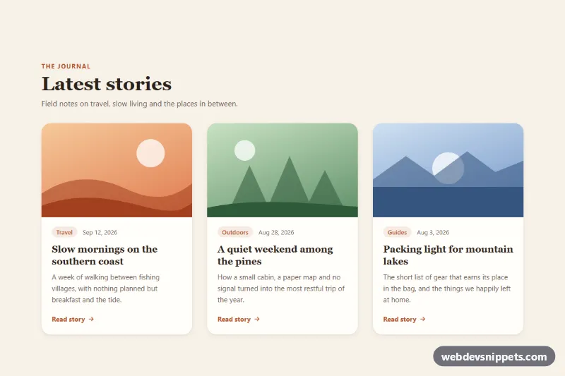
Pure CSS blog card grid where each card lifts with a deeper shadow and zooms its image on hover or keyboard focus.

Blog Post Card – Tailwind CSS cards preview

Blog Post Card

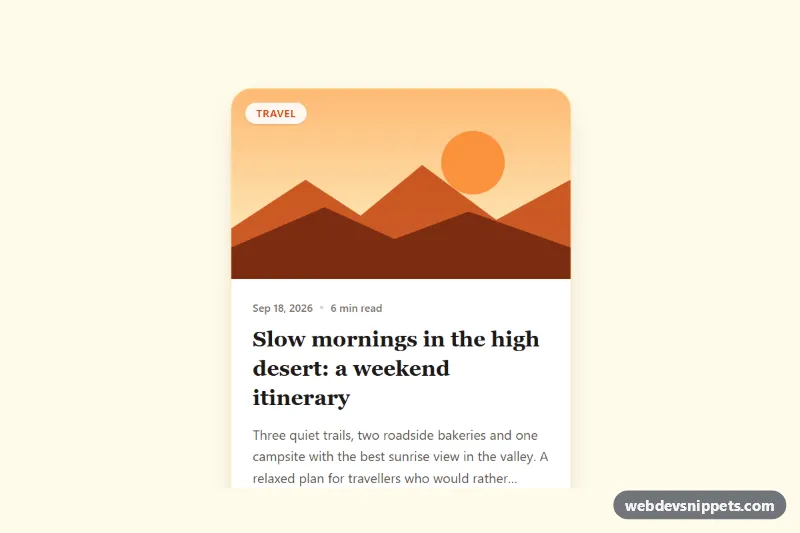
Tailwind CSS blog post card with cover illustration, category badge, date, reading time, clamped excerpt, author row and a fully clickable area.

Event Card with Photo and Date Badge – Pure CSS cards preview

Event Card with Photo and Date Badge

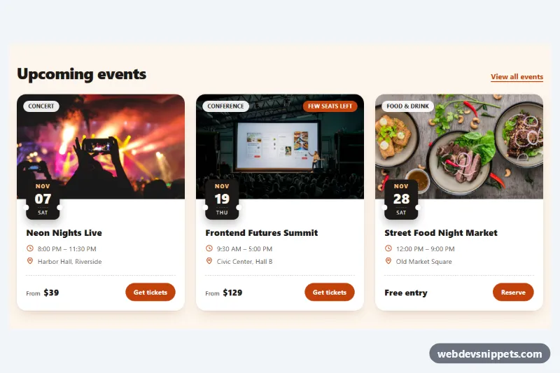
Pure CSS event cards with a cover photo, ticket-stub date badge, category chip, time and venue details, price and a ticket button.

Glassmorphism Card – Tailwind CSS cards preview

Glassmorphism Card

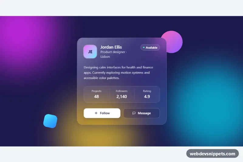
Frosted glass profile card in Tailwind CSS with backdrop blur, a light reflection and a follow button over colorful animated gradient blobs.

Pricing Card with Feature List – Bootstrap 6 cards preview

Pricing Card with Feature List

Bootstrap 6 single pricing card with a monthly/yearly toggle, large price, feature checklist with excluded items and a subscribe button with loading state.