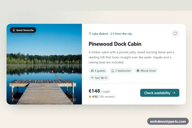
A Bootstrap 6 horizontal card that puts a photo on the left and the details on the right, then stacks the photo on top on small screens. The demo is a holiday-rental listing with a "Guest favourite" badge, amenity chips, a star rating, a nightly price and a wishlist button, but the same layout works for products, courses, articles or team members.
How it works
The card is a <article class="card card-row hci-card">. .card-row is the Bootstrap 6 class for horizontal cards, and the photo carries .card-img-start. Bootstrap's .card-row is always horizontal, so style.css sets flex-direction: column on .hci-card by default and switches back to row in an @container (min-width: 640px) rule. The root .hci-root is the query container (container-type: inline-size). The card responds to the space it actually gets, so it also stacks inside a narrow sidebar on a desktop page.
The image sits in .hci-media, which keeps a 16:10 ratio when stacked and fills the full card height when horizontal (object-fit: cover). The .badge.theme-inverse flag is positioned over the photo. The .card-body holds the location line, the title, a short text, a list of .chip elements and a footer (.hci-foot) pushed to the bottom with margin-top: auto.
The heart button uses the Bootstrap 6 button data API: data-bs-toggle="button" flips aria-pressed and the .active class with no custom JavaScript. CSS swaps the outline heart for a filled red one when aria-pressed="true". There is no script.js.
Customization
--hci-media-widthon.hci-root: sets how much of the card width the photo takes in the horizontal layout (42% by default).--hci-accenton.hci-root: changes the location line, the focus outlines and the "Check availability" button color.--hci-bg,--hci-inkand--hci-mutedon.hci-root: adjust the page background, heading color and secondary text.- The
640pxvalue in the@containerrule: raise it to keep the card stacked longer, lower it to go horizontal sooner. - Replace
.card-img-startwith.card-img-endand move.hci-mediaafter.card-bodyto put the photo on the right. - Remove
.hci-flagif you do not need a badge on the photo, or changetheme-inversetotheme-accentfor a colored label.
The photo comes from Unsplash; replace it with your own image and update the alt text.
Use cases
- Holiday rentals: photo on the left with a Guest favourite badge, amenity chips, rating and nightly price
- Product lists: the same layout presents products or courses in a compact row
- Article and team pages: image beside text works for articles or team members
- Mobile pages: the photo moves to the top of the card on small screens
Accessibility
The card is an <article> labelled by its heading. The amenity chips are a real list with an aria-label, and every icon is aria-hidden. The wishlist button has an aria-label and exposes its state through aria-pressed. The button and the call to action have a visible focus outline, and the arrow nudge on hover is disabled under prefers-reduced-motion.
Bootstrap 6 notes
Bootstrap 5 horizontal cards needed .row.g-0 with .col-md-4 columns inside the card. Bootstrap 6 replaces that with .card-row plus .card-img-start or .card-img-end. btn-primary becomes btn-solid theme-primary, the colored badge is badge theme-inverse, and the amenity pills use the new .chip component. Built on Bootstrap 6.0.0-alpha.1, so class names may still change. Icons come from Bootstrap Icons.