Skip to content

Interactive Card with Hover Lift

Bootstrap 6 clickable learning path cards that lift with a soft shadow on hover and keyboard focus, using hover-lift, stretched links and a level filter.

Also known as: card hover effect, clickable card lift, hover lift cards, interactive card grid

Bootstrap 6 Cards Responsive #animation #card #hover #responsive #shadow

Interactive Card with Hover Lift live demo

Open in new tab

Bootstrap 6 code (HTML, CSS, JS)

A set of clickable Bootstrap 6 cards that rise and gain a soft violet shadow when you hover them or reach them with the keyboard. Here they present learning paths on a course site, but the same pattern fits feature tiles, pricing options, blog teasers or dashboard shortcuts.

How it works

The section .hlc-root is pinned to data-bs-theme="light". The cards sit in a Bootstrap grid: row g-7 with col-12 md:col-6 lg:col-3, so they show one per row on phones, two from 768px and four from 1024px.

Each card is article.card.hover-lift.hlc-card. hover-lift is a new Bootstrap 6 utility that moves an element up and swaps its shadow on :hover and :focus-visible. Its look comes from custom properties, and .hlc-card overrides them: --bs-hover-lift-transform reads --hlc-lift, --bs-hover-lift-box-shadow sets a tinted shadow and --bs-hover-lift-transition-duration sets the speed.

The title link is a stretched-link, so the whole card is one click target and one link for screen readers. Keyboard focus lands on that inner link, not on the card, so .hlc-card:focus-within repeats the lift. The link's ::after area draws the focus outline around the full card. The arrow in .hlc-cta slides right at the same time.

.hlc-card--featured keeps the lifted state all the time and adds the "Most popular" ribbon, so one card stands out before anyone hovers.

script.js handles the filter. The radio buttons in .hlc-filter compare their value with each column's data-hlc-level, set hidden on columns that do not match, and write the result count into the .hlc-status live region.

Customization

  • --hlc-lift on .hlc-root: how far cards rise, for example -4px for a subtle effect.
  • --hlc-ring on .hlc-root: the featured border, ribbon, focus outline and call-to-action color.
  • --bs-hover-lift-box-shadow in .hlc-card: replace it with var(--bs-box-shadow-lg) for Bootstrap's neutral shadow.
  • Move hlc-card--featured to another card, or remove it, to change which card stays lifted.
  • .hlc-icon--violet, --coral, --teal and --gold: icon tile colors; add more modifiers for extra cards.
  • data-hlc-level on each .hlc-col: the level used by the filter; add a radio with a matching value for new levels.
  • Change lg:col-3 to lg:col-4 for three cards per row.

Use cases

  • Course sites: learning path cards rise with a soft shadow on hover and keyboard focus
  • Feature sections: the whole card is clickable through a stretched link
  • Pricing options: the lift effect signals which tile is about to be chosen
  • Dashboards: shortcut tiles work the same way, and a level filter narrows the list

Accessibility

Each card holds one real link inside an <h3>, so the card reads as a short heading plus text instead of one long link. The focus outline wraps the whole card. The decorative arrow and icon tiles are aria-hidden. The filter is a labelled role="group" of native radio inputs, and the visually hidden .hlc-status announces how many paths are shown. Under prefers-reduced-motion the lift distance is set to none and the arrow does not animate. The shadow and border change still mark the active card.

Bootstrap 6 notes

Bootstrap 5 needed custom CSS for this effect. Bootstrap 6 ships hover-lift as a utility. Grid breakpoints use colon prefixes (md:col-6 instead of col-md-6). Toggle buttons put the input inside label.btn-check.btn-outline.theme-accent, and badges use badge badge-subtle theme-success. Built on Bootstrap 6.0.0-alpha.1, so APIs may still change.

Interactive Card with Hover Lift at a glance

Framework
Bootstrap 6
Code
HTML, CSS, JavaScript
JavaScript
Vanilla JavaScript, no jQuery
Dependencies
Bootstrap 6, Bootstrap Icons
Layout
Responsive, works on mobile
Category
Cards
License
Free for personal and commercial use

Questions about this template

Can I use the Interactive Card with Hover Lift code for free?

Yes. You can copy or download the code and use it in personal and commercial projects, including client work. No sign-up is needed. Reselling it as part of a component library or template collection is not allowed; see the license.

How do I add it to my website?

Load Bootstrap 6 and Bootstrap Icons from a CDN (the links are under Requirements). Paste the HTML where the component should appear, add the CSS to your stylesheet and load the JavaScript before the closing </body> tag. Download HTML gives you a complete page with everything already linked.

Does it need jQuery or a JavaScript framework?

No. The script is plain vanilla JavaScript, so it works without jQuery, React or Vue. You can still use the markup inside those frameworks.

Does it work on mobile?

Yes. The layout adapts to small screens. Use the Mobile and Tablet buttons above the live demo to check it at phone and tablet width.

Requirements

Add these to your page (already included in the download):

  • <link rel="stylesheet" href="https://cdn.jsdelivr.net/npm/bootstrap@6.0.0-alpha.1/dist/css/bootstrap.min.css">
  • <script type="module" src="https://cdn.jsdelivr.net/npm/bootstrap@6.0.0-alpha.1/dist/js/bootstrap.bundle.min.js"></script>
  • <link rel="stylesheet" href="https://cdn.jsdelivr.net/npm/bootstrap-icons@1.11.3/font/bootstrap-icons.min.css">

Built for Bootstrap 6.0.0-alpha.1. Bootstrap 6 ships as an ES module, so its script and this component's JavaScript load with type="module". Alpha releases can still change before the stable version.

Interactive Card with Hover Lift – Bootstrap 6 cards component screenshot
Interactive Card with Hover Lift · Bootstrap 6 Cards

More Cards

3D Flip Card – Pure CSS cards preview

3D Flip Card

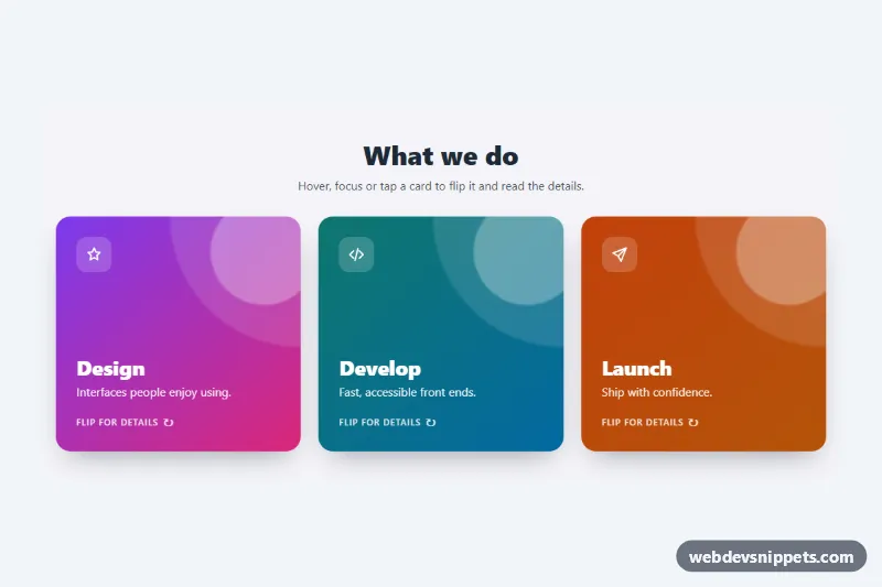
Three pure CSS 3D flip cards that turn on hover, keyboard focus or tap to reveal details and a link on the back.

Cards with Hover Lift – Pure CSS cards preview

Cards with Hover Lift

Pure CSS blog card grid where each card lifts with a deeper shadow and zooms its image on hover or keyboard focus.

Blog Post Card – Tailwind CSS cards preview

Blog Post Card

Tailwind CSS blog post card with cover illustration, category badge, date, reading time, clamped excerpt, author row and a fully clickable area.

Event Card with Photo and Date Badge – Pure CSS cards preview

Event Card with Photo and Date Badge

Pure CSS event cards with a cover photo, ticket-stub date badge, category chip, time and venue details, price and a ticket button.

Glassmorphism Card – Tailwind CSS cards preview

Glassmorphism Card

Frosted glass profile card in Tailwind CSS with backdrop blur, a light reflection and a follow button over colorful animated gradient blobs.

Card with Image Overlay Text – Bootstrap 6 cards preview

Card with Image Overlay Text

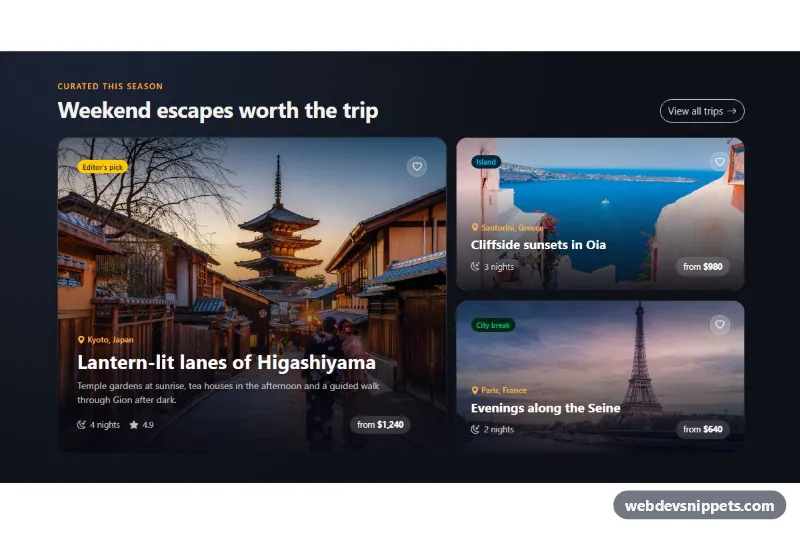
Dark Bootstrap 6 travel cards with headline, place and price set over full-bleed photos, a gradient scrim for readability, save buttons and a Toast.