Skip to content

Bottom Drawer Action Sheet

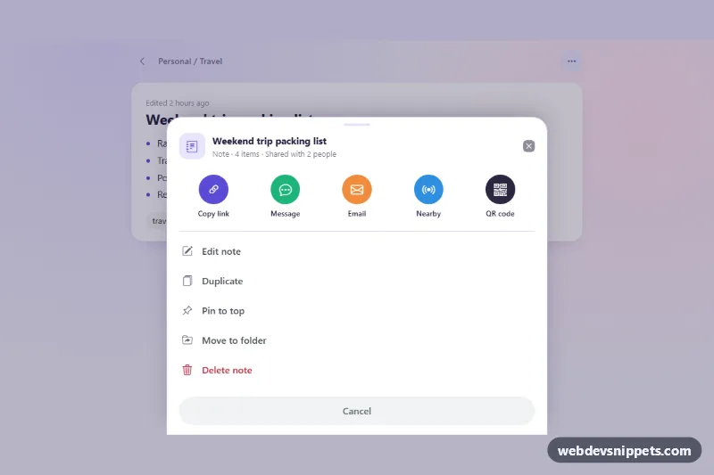
Bootstrap 6 bottom Drawer styled as a mobile action sheet with a share row, edit actions in a list group, pin toggle, delete action and confirmation toasts.

Also known as: bottom sheet, mobile action sheet, bottom drawer menu, share sheet popup

Bottom Drawer Action Sheet live demo

Open in new tab

Bootstrap 6 code (HTML, CSS, JS)

A mobile-style action sheet built on the Bootstrap 6 Drawer, opening from the bottom of the screen. It has a drag handle, a header that names the item, a row of round share targets, a list of edit actions with a pin toggle and a red delete option, and a full-width Cancel button. Use it for "more" menus in notes, file or task apps.

How it works

The "⋯" button (.bas-more) opens <dialog class="drawer drawer-bottom drawer-sheet bas-sheet"> through the data API (data-bs-toggle="drawer"). drawer-bottom docks the panel to the bottom edge. drawer-sheet makes it flush with the screen edges, and on wide screens it is centered and limited by --bs-drawer-sheet-width. --bs-drawer-height: auto lets the sheet grow to fit its content, up to 88dvh.

The share targets are buttons inside ul.bas-share, which scrolls sideways on narrow phones. The edit actions use a Bootstrap list-group list-group-flush of list-group-item-action buttons. The delete row adds theme-danger. Every action carries data-bas-action. One delegated click listener in script.js runs the action, closes the sheet with Drawer.getOrCreateInstance(sheet).hide() and then shows a Bootstrap 6 Toast with the message from the MESSAGES map. "Copy link" tries navigator.clipboard.writeText() inside try/catch, because sandboxed previews block the clipboard. "Pin" toggles aria-pressed, swaps its label and shows a pin mark on the note.

In the demo the dialog has the open attribute, so the sheet is visible on load. A :has() rule dims the page behind it until the sheet is opened as a real modal with its own backdrop.

Customization

  • --bas-accent on .bas-root: the indigo accent for the copy-link circle, focus rings, the pin state and toast icons.
  • .bas-i1 to .bas-i5: the background colors of the five share circles.
  • --bs-drawer-sheet-width on .bas-sheet: the maximum width of the sheet on large screens (640px here).
  • --bs-drawer-border-radius on .bas-sheet: how round the top corners are.
  • MESSAGES in script.js: the toast text for each data-bas-action. Replace these with calls to your own share and edit functions.
  • data-bs-delay on .bas-toast: how long the confirmation toast stays visible.
  • Remove open from the <dialog> to start with the sheet closed.

Use cases

  • Notes apps: a more button opens a bottom sheet with edit actions for the selected note
  • File and task apps: a row of round share targets sits above the list of actions
  • Mobile web apps: a drag handle, pin toggle and red delete option feel like a native sheet
  • Item menus: a full-width Cancel button closes the sheet, and toasts confirm each action

Accessibility

The sheet is a native <dialog> labelled by its title. After the first open it is modal, with a focus trap, Escape to close and a backdrop click to dismiss. On mobile it also closes with a downward swipe. Share and edit groups have visually hidden headings, and every icon is aria-hidden next to a visible text label. The pin action exposes its state with aria-pressed. The toast uses role="status". Focus goes back to the "⋯" button when the sheet closes, and the script keeps that button's aria-expanded in sync.

Bootstrap 6 notes

  • The Bootstrap 5 offcanvas-bottom becomes <dialog class="drawer drawer-bottom">, and the new drawer-sheet modifier gives the native bottom-sheet look.
  • Buttons use btn-subtle theme-*.
  • List items take theme-danger instead of list-group-item-danger.
  • The toast is shown with the Toast export from the ES module bundle.
  • This snippet is built on 6.0.0-alpha.1.
Bottom Drawer Action Sheet at a glance

Framework
Bootstrap 6
Code
HTML, CSS, JavaScript
JavaScript
Vanilla JavaScript, no jQuery
Dependencies
Bootstrap 6, Bootstrap Icons
Layout
Responsive, works on mobile
Category
Drawers
License
Free for personal and commercial use

Questions about this template

Can I use the Bottom Drawer Action Sheet code for free?

Yes. You can copy or download the code and use it in personal and commercial projects, including client work. No sign-up is needed. Reselling it as part of a component library or template collection is not allowed; see the license.

How do I add it to my website?

Load Bootstrap 6 and Bootstrap Icons from a CDN (the links are under Requirements). Paste the HTML where the component should appear, add the CSS to your stylesheet and load the JavaScript before the closing </body> tag. Download HTML gives you a complete page with everything already linked.

Does it need jQuery or a JavaScript framework?

No. The script is plain vanilla JavaScript, so it works without jQuery, React or Vue. You can still use the markup inside those frameworks.

Does it work on mobile?

Yes. The layout adapts to small screens. Use the Mobile and Tablet buttons above the live demo to check it at phone and tablet width.

Requirements

Add these to your page (already included in the download):

  • <link rel="stylesheet" href="https://cdn.jsdelivr.net/npm/bootstrap@6.0.0-alpha.1/dist/css/bootstrap.min.css">
  • <script type="module" src="https://cdn.jsdelivr.net/npm/bootstrap@6.0.0-alpha.1/dist/js/bootstrap.bundle.min.js"></script>
  • <link rel="stylesheet" href="https://cdn.jsdelivr.net/npm/bootstrap-icons@1.11.3/font/bootstrap-icons.min.css">

Built for Bootstrap 6.0.0-alpha.1. Bootstrap 6 ships as an ES module, so its script and this component's JavaScript load with type="module". Alpha releases can still change before the stable version.

Bottom Drawer Action Sheet – Bootstrap 6 drawers component screenshot
Bottom Drawer Action Sheet · Bootstrap 6 Drawers

More Drawers

Settings Drawer with Tabs – Bootstrap 6 drawers preview

Settings Drawer with Tabs

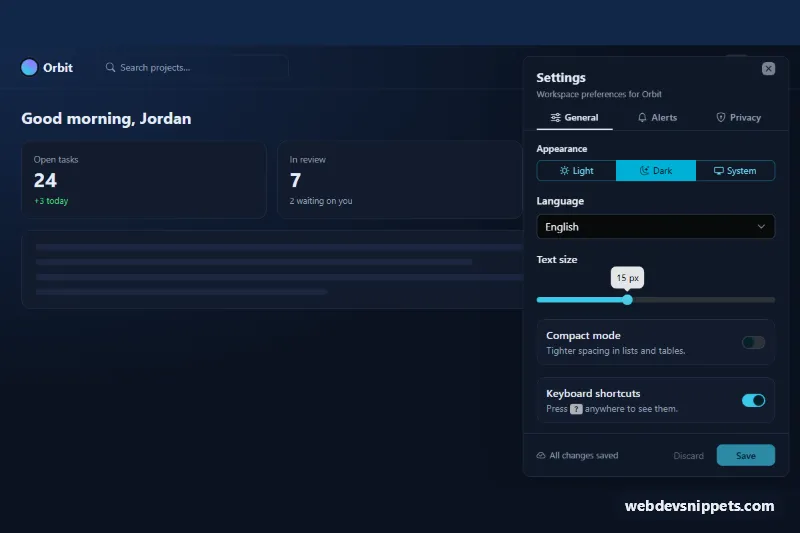
Dark Bootstrap 6 Drawer with tabbed settings panels (General, Alerts, Privacy), switches, a Range slider, select menus and a save bar that tracks unsaved changes.

Filter Drawer for Product Lists – Bootstrap 6 drawers preview

Filter Drawer for Product Lists

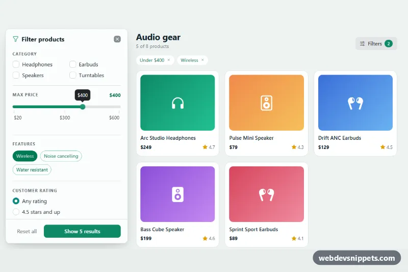
Bootstrap 6 Drawer from the left with category checks, a Range price slider, feature toggles, rating, in-stock switch, live result count and apply/reset buttons.

Drawer Shopping Cart – Bootstrap 6 drawers preview

Drawer Shopping Cart

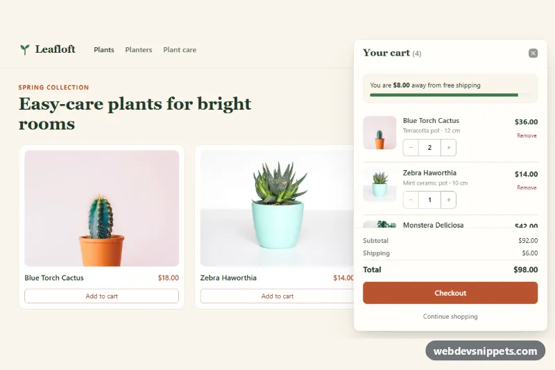
Bootstrap 6 Drawer shopping cart that slides in from the right with product rows, quantity steppers, a free-shipping progress bar, subtotal and checkout.

Notification Drawer Panel – Bootstrap 5 drawers preview

Notification Drawer Panel

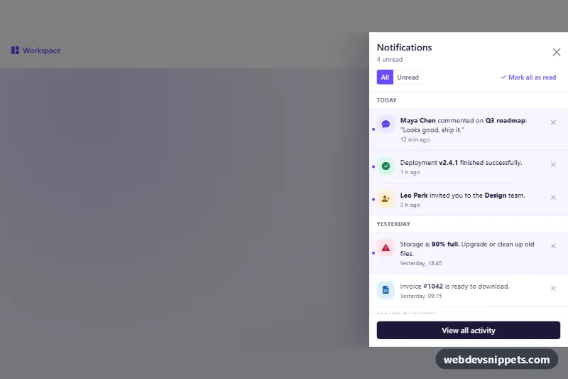
Bootstrap 5 offcanvas notification drawer with notifications grouped by day, unread filter, mark all as read and dismiss buttons.

Offcanvas Shopping Cart – Bootstrap 5 drawers preview

Offcanvas Shopping Cart

Bootstrap 5 offcanvas cart drawer with quantity steppers, remove buttons, free-shipping progress, live totals and an empty state.

Slide-Over Panel – Tailwind CSS drawers preview

Slide-Over Panel

Tailwind CSS slide-over drawer from the right with header, scrollable form content, sticky footer actions, focus trap and Escape to close.