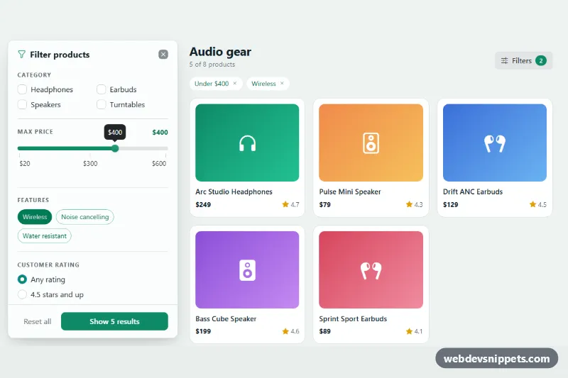
A product-list filter panel built on the Bootstrap 6 Drawer. It slides in from the left with category checkboxes, a Bootstrap 6 Range price slider, feature toggle buttons, a rating choice and an in-stock switch. "Show N results" updates live as you change filters, and "Reset all" clears them. Use it on shop category pages, catalogs and search results.
How it works
.fdp-root contains a toolbar, a row of active-filter chips (.fdp-active), the product grid .fdp-grid and a <dialog class="drawer drawer-start fdp-drawer">. Each li.fdp-product describes itself with data attributes: data-fdp-category, data-fdp-price, data-fdp-rating, data-fdp-stock and data-fdp-features, a space-separated list such as wireless anc.
The filters live in a form.fdp-form that wraps the drawer-body and drawer-footer. script.js reads the form with FormData. On every input or change it counts the matching products and writes the number into the submit button (.fdp-preview). Submitting applies the filters: matching products stay visible, the rest get hidden, and the result count, the toolbar badge and the chips are rebuilt. The drawer then closes with Drawer.getOrCreateInstance(drawer).hide(). Each chip has a chip-dismiss button that removes only that filter. The form's reset event is intercepted, so "Reset all" clears every filter instead of restoring the demo defaults.
The price slider is a .form-range wrapper with data-bs-bubble, plus tick labels from a <datalist>. The script creates the Range instance with a formatter, so the bubble shows $400 and not 400. In the demo the dialog has the open attribute, so it is visible on load. On screens 1024px and wider the list moves aside while the drawer is open.
Customization
--fdp-accenton.fdp-root: the emerald accent. It feeds--bs-primary-bgand--bs-control-checked-bg, so buttons, chips, checks, the switch and the slider all change together.min,maxandstepon.fdp-price-input: the price range. The "Under $X" chip appears only belowmax.LABELSinscript.js: the display names used in the chips. Add an entry when you add a category or feature.--bs-drawer-widthon.fdp-drawer: the panel width. Also update thecalc(360px + 2.5rem)push rule..fdp-art--ato.fdp-art--h: the gradient tiles. Replace them with product images.- Remove
openfrom the<dialog>to start with the filters closed.
Use cases
- Shop category pages: filters slide in from the left with category checks and a price slider
- Product catalogs: feature toggles, rating choice and an in-stock switch narrow the list
- Search results: the Show N results button updates live as filters change
- Mobile shopping: active filter chips above the grid show what is applied, and Reset all clears them
Accessibility
Each filter group is a fieldset with a legend. Checks, radios and the switch use real <label for> pairs. The switch has role="switch". The result count is an aria-live region, chip buttons are labelled "Remove filter: …", and focus moves to the next chip after one is removed. After the first open the drawer is a modal <dialog>, with a focus trap and Escape to close. The script also syncs aria-expanded on the Filters button.
Bootstrap 6 notes
<dialog class="drawer drawer-start">replacesoffcanvas-start..check,.radioand.switchreplaceform-check.- Feature toggles use the new
label.btn-checkpattern. - The slider uses the Range component (
.form-range+.form-range-input). - Filter tags use
.chip. - This is Bootstrap 6.0.0-alpha.1, so APIs may still change.