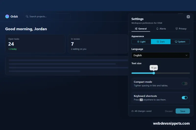
A dark settings panel built on the Bootstrap 6 Drawer. It slides in from the right, and tabs split the preferences into General, Alerts and Privacy. Each tab uses Bootstrap 6 form controls: a segmented appearance picker, select menus, a Range slider with a value bubble, and switches with descriptions. A save bar at the bottom shows whether there are unsaved changes. Use it in dashboards, SaaS apps and admin tools.
How it works
The gear button in the app bar opens <dialog class="drawer drawer-end sdt-drawer"> through data-bs-toggle="drawer". In the demo the dialog has the open attribute, so it is visible on first load. Inside, a nav nav-underline nav-fill tab list switches the .tab-pane panels with data-bs-toggle="tab", with no extra JavaScript. The panes and the footer sit in one form.sdt-form, so a single form holds every setting.
Each switch row is a form-field.sdt-row with a form-field-content block (label plus form-text) and a .switch wrapper. The appearance picker is a btn-group of label.btn-check radios. The language and digest menus are <select class="form-control">.
script.js takes a snapshot of every named field on load. On each input or change it compares the current values with that snapshot. If they differ, the root gets .sdt-dirty, the status reads "Unsaved changes", and Discard and Save become active. Save shows a spinner and simulates a request. Then commitDefaults() copies the current values into defaultChecked, defaultSelected and defaultValue. Because of that, the reset-type Discard button always returns to the last saved state, not to the original markup. The Range instance is created with a formatter, so the bubble reads "15 px".
Customization
--sdt-accenton.sdt-root: the cyan accent. It drives--bs-primary-bgand--bs-control-checked-bg, so it changes the tabs underline, switches, slider and Save button.--sdt-page,--sdt-surfaceand--sdt-line: the navy background, card surfaces and border color.--bs-drawer-widthon.sdt-drawer: the width of the panel (400px).- Add a tab by adding a
nav-itembutton and a matching.tab-panewith the sameidindata-bs-target. formatterinscript.js: change the unit shown in the slider bubble.theme-successon the two-factor.switch: anytheme-*class colors that switch differently.- Remove
openfrom the<dialog>to start closed.
Use cases
- SaaS dashboards: General, Alerts and Privacy tabs split preferences inside a right-side panel
- Admin tools: switches, select menus and a range slider cover common settings
- Web apps: a save bar at the bottom shows whether there are unsaved changes
- User preferences: a segmented appearance picker lets people choose how the app looks
Accessibility
The tabs follow the ARIA tabs pattern: role="tablist", role="tab" with aria-selected and aria-controls, and role="tabpanel" with aria-labelledby. Every control has a visible label, and switches carry role="switch". The save status is a role="status" live region. After the first open the drawer is a modal <dialog>, with a focus trap and Escape to close. The script keeps aria-expanded on the gear button in sync. The root is pinned to data-bs-theme="dark", so it always renders dark.
Bootstrap 6 notes
<dialog class="drawer">replacesoffcanvas..switchreplacesform-switch.form-controlon<select>replacesform-select.form-fieldreplacesmb-3wrappers.- The slider is the new Range component.
- Tabs still use
data-bs-toggle="tab", and the panes fade without.fade. - This is Bootstrap 6.0.0-alpha.1, so details may change.