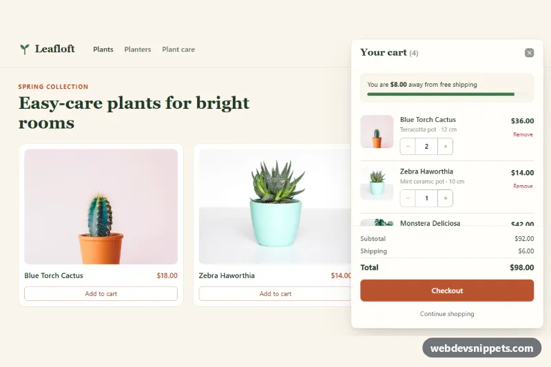
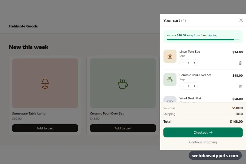
A slide-in shopping cart built on the Bootstrap 6 Drawer component. It opens from the right edge with product rows, quantity steppers, a free-shipping progress bar, a running subtotal and a Checkout button, which makes it a good fit for small online shops and product landing pages.
How it works
The root .dsc-root holds a demo shop page (header with a cart button, three products) and a <dialog class="drawer drawer-end dsc-drawer">. The cart button opens it through the Bootstrap 6 data API (data-bs-toggle="drawer"), and the close button uses data-bs-dismiss="drawer". In the demo the dialog carries the open attribute, so the cart is visible on first load. Remove that attribute and the cart starts closed.
Each cart row is an li.dsc-item with data-dsc-id and data-dsc-price. The quantity stepper is an input-group input-group-sm with .dsc-minus, a number input .dsc-qty-input and .dsc-plus. script.js handles clicks on the list and recalculates everything in render(): line totals, the item count in the header badge, subtotal, shipping, total, the .progress bar and its aria-valuenow. Quantities are clamped between 1 and 99. "Remove" fades the row out and moves focus to the next row. When the last row goes, the .dsc-empty message replaces the footer.
The "Add to cart" buttons (.dsc-add) read product data from the <template class="dsc-catalog">. They add a row or raise its quantity, then open the drawer with Drawer.getOrCreateInstance(drawer).show().
Customization
--dsc-accenton.dsc-root: changes the terracotta color. It also re-colors the Bootstrap 6 primary role (--bs-primary-bgand related tokens), so the badge and Checkout button follow.data-dsc-free-shippingon.dsc-root: sets the free-shipping threshold (default100).data-dsc-currencyon.dsc-root: sets the currency code used byIntl.NumberFormat.SHIPPING_FEEandMAX_QTYat the top ofscript.js: set the flat shipping fee and the largest allowed quantity.--bs-drawer-widthon.dsc-drawer: makes the cart panel wider or narrower (420px by default).- Swap
drawer-endfordrawer-startto open the cart from the left.
The product photos come from Unsplash. Replace them with your own images.
Use cases
- Small online shops: the cart slides in from the right with product rows and a running subtotal
- Product landing pages: quantity steppers let shoppers change amounts without leaving the page
- Stores with free shipping: a progress bar shows how far the order is from the threshold
- Checkout flows: a clear Checkout button sits at the bottom of the panel
Accessibility
The drawer is a native <dialog> labelled by its title. After the first open it runs as a modal, with a focus trap and Escape to close. Every stepper button and quantity field has an aria-label that names the product. A visually hidden aria-live region (.dsc-status) announces quantity changes and removals. The script keeps aria-expanded on the cart button in sync, because the Bootstrap 6 alpha does not do this itself. The cart count has a visually hidden "items" suffix, and fade effects are turned off under prefers-reduced-motion.
Bootstrap 6 notes
<dialog class="drawer drawer-end">replaces the Bootstrap 5offcanvas offcanvas-end.- Buttons use
btn-solid theme-primary,btn-outline theme-secondaryandbtn-text theme-dangerinstead ofbtn btn-primary. - Steppers use
input-group-btn. - The spinner uses
spinner-sm. - Built on 6.0.0-alpha.1, so alpha APIs can still change.
Usage notes
Checkout is simulated with a timeout. Replace it with a fetch() to your checkout endpoint.