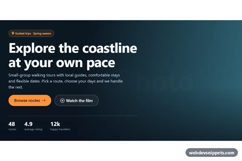
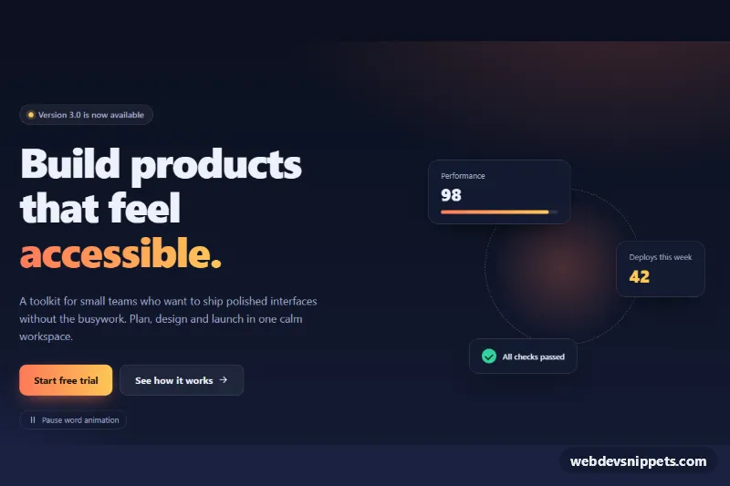
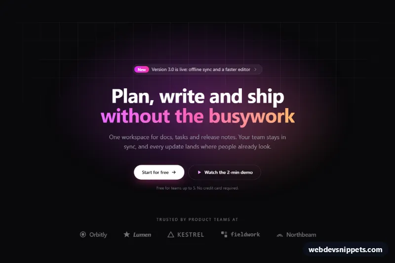
A full-width Bootstrap 5 hero section with a background image, a dark gradient overlay, a pill eyebrow, a large headline, two call-to-action buttons and a row of stats. It suits travel sites, agencies, event pages and any landing page that opens with a strong photo.
How it works
The root section.ho-hero is a flex container with align-items-center and a min-height taken from --ho-min-height, so the content is vertically centered. The background is a real img.ho-hero__bg (a placehold.co placeholder) stretched with position: absolute, inset: 0 and object-fit: cover. Using an image element instead of a CSS background-image lets the browser load it early (fetchpriority="high") and lets you use srcset for responsive images.
On top sits .ho-hero__overlay, an absolutely positioned layer with two stacked gradients: one darkens the bottom edge, the other runs from almost opaque on the left (--ho-overlay-from) to lighter on the right (--ho-overlay-to). The text sits on the darkest part, so contrast stays high even with a bright photo. isolation: isolate on the root keeps the negative z-index of the image and overlay inside the section.
The content uses a Bootstrap container and a col-lg-8 col-xl-7 column. The headline .ho-hero__title scales fluidly with clamp(), and text-wrap: balance evens out its lines. The buttons stack on phones (flex-column) and sit side by side from the sm breakpoint. The .ho-hero__stats list wraps onto several lines on narrow screens. No JavaScript is required.
Customization
srcof.ho-hero__bg: replace the placeholder with your own photo; adjustobject-positionin.ho-hero__bgto keep the subject visible on phones.--ho-overlay-fromand--ho-overlay-toin.ho-hero: make the overlay darker, lighter or tinted (for example a navy or brand color).--ho-accentand--ho-accent-textin.ho-hero: change the color of the primary button.--ho-min-heightin.ho-hero: use100vhfor a full-screen hero or60vhfor a shorter banner.col-lg-8 col-xl-7on the content column: widen it, or addmx-auto text-centerfor a centered layout.- Remove
.ho-hero__statsif you only need a headline and buttons. font-size: clamp(2.25rem, 6vw, 4.25rem)in.ho-hero__title: change the minimum and maximum headline size.
Accessibility
The background image has an empty alt because it is decorative, and the overlay has aria-hidden="true". The section is labelled by its h1 through aria-labelledby. All icons are hidden from screen readers. Text is light on a gradient that stays near 90% black behind the copy, giving strong contrast. Buttons have a clear :focus-visible outline in white, and the hover lift and transitions are disabled with prefers-reduced-motion: reduce.
Usage notes
Requires Bootstrap 5 (added automatically) and Bootstrap Icons. If the hero is not the first heading on your page, change the h1 to an h2. Replace the href="#" values with your own links.