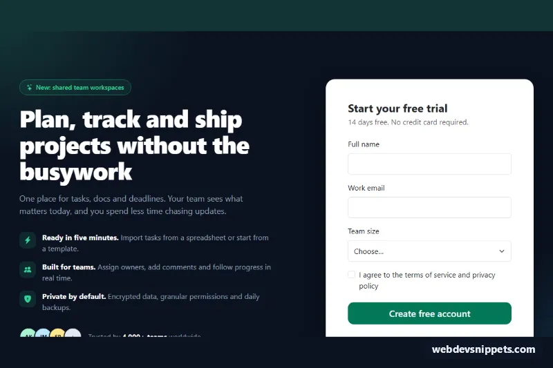
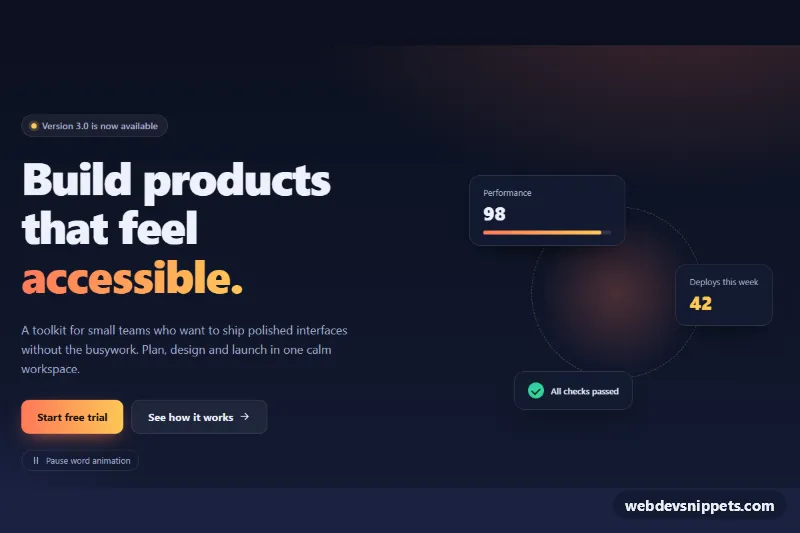
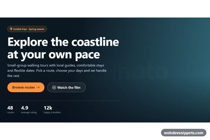
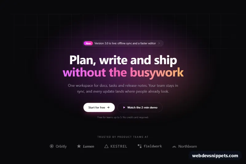
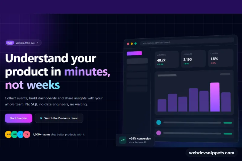
A Bootstrap 5 two-column hero section with a headline, three value points, social proof and an inline signup card with client-side validation and a success state. Use it at the top of SaaS landing pages, trial offers and waitlist pages.
How it works
The root is section.hs-hero, a dark section with two soft radial glows. A Bootstrap row splits it into a text column (col-lg-6) and a form column (col-lg-6 col-xl-5 offset-xl-1); on phones the columns stack and the form follows the copy. The text column holds the .hs-eyebrow pill, the .hs-title heading, the .hs-lead paragraph, the .hs-points list (each .hs-point has an icon in .hs-point__icon) and the .hs-proof row with CSS initials avatars.
The .hs-card contains .hs-form-panel with a novalidate form (name, work email, team size select and a terms checkbox) and a hidden .hs-success panel. The script listens for submit on .hs-form. If checkValidity() fails, it adds was-validated so Bootstrap shows the invalid-feedback messages, sets aria-invalid on every field, links each error text through aria-describedby and focuses the first invalid field. While the form stays in that state, input and change events update the ARIA state live. A valid form shows a spinner in .hs-submit, then hides the form, writes the email into .hs-success__email and reveals the success panel. The .hs-reset button restores the empty form.
Customization
--hs-accentand--hs-accent-hoverin.hs-hero: change the button, checkbox and focus ring color, e.g.#1d4ed8for blue.--hs-highlightin.hs-hero: recolor the eyebrow text and the value point icons on the dark background.--hs-bgin.hs-hero: set another background color; the avatar borders follow it automatically.patternon#hs-email: tighten or relax the email rule, e.g. allow only your company domain.minlength="2"on#hs-name: change the minimum name length; update the matchinginvalid-feedbacktext.- The
window.setTimeoutcall inscript.js: replace it with afetch()to your signup endpoint and show.hs-successwhen it resolves. col-xl-5 offset-xl-1on the form column: usecol-lg-6only for a wider card on large screens.
Accessibility
The section is labelled by #hs-title through aria-labelledby. Every field has a visible label, and error messages are announced through aria-describedby only while the field is invalid. During loading the button uses aria-disabled instead of disabled, so keyboard focus is not lost. After success, focus moves to the success heading (tabindex="-1"), so screen readers announce the result. Decorative icons and avatars are aria-hidden. The pop-in animation of the success icon is disabled with prefers-reduced-motion: reduce.
Usage notes
Requires Bootstrap 5 and Bootstrap Icons. The heading is an h1; change it to h2 if the page already has a main heading.