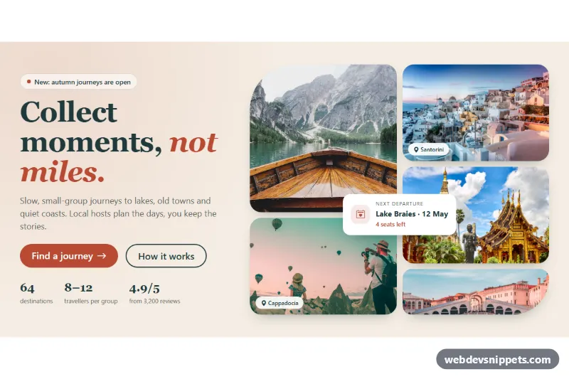
Hero with Photo Collage Grid
Bootstrap 5 hero section with a serif headline, call-to-action buttons and stats on the left and a five-photo collage grid with a floating card on the right.
Eye-catching top sections with headline and call to action.
7 component(s)
Bootstrap 5 hero section with a serif headline, call-to-action buttons and stats on the left and a five-photo collage grid with a floating card on the right.
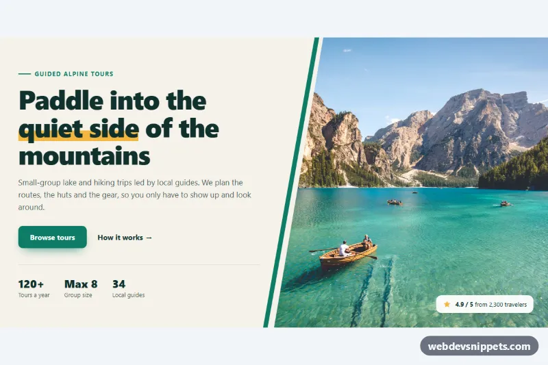
Pure CSS split hero with headline, buttons and stats beside a full-height photo cut on a diagonal with clip-path, plus an accent stripe and rating badge.
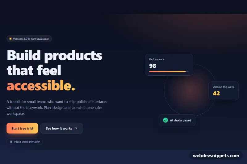
Dark hero section whose headline cycles through words with a slide-and-fade animation, a pause button and decorative stat cards.
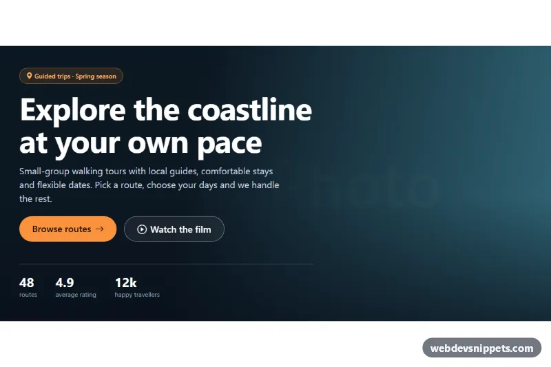
Full-width Bootstrap 5 hero section with a cover background image, dark gradient overlay, fluid headline, two call-to-action buttons and a stats row.
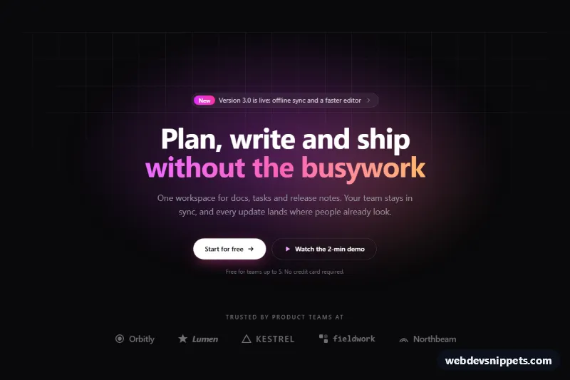
Dark Tailwind CSS hero section with an announcement pill, gradient headline, two CTA buttons, glowing grid background and a row of trust logos.
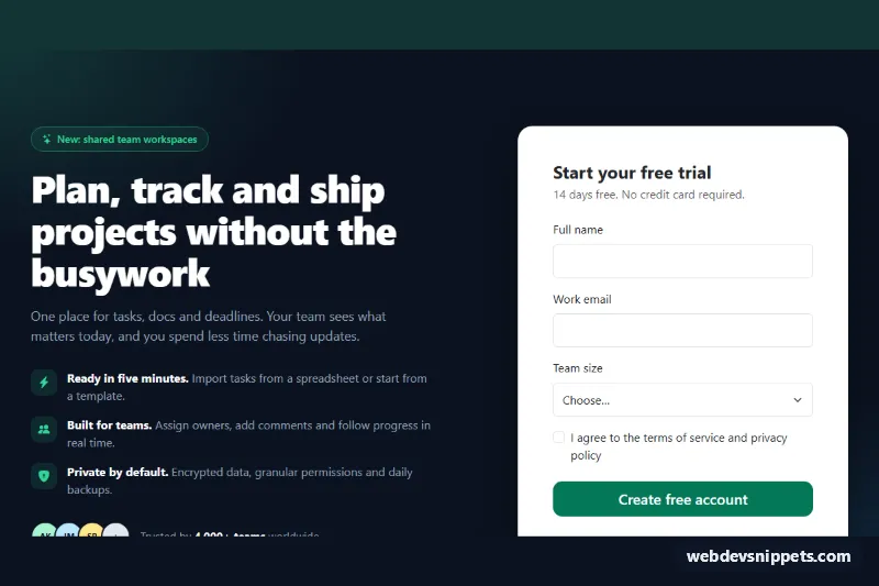
Bootstrap 5 two-column hero with value points, social proof and a validated signup card that shows a loading state and a success message.
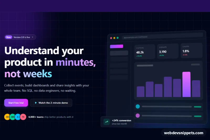
Dark Tailwind CSS split hero with gradient headline, two CTA buttons and an animated mock app dashboard built entirely from divs.
A hero section is the large block at the top of a page, directly below or behind the navbar. It usually contains the main headline, a short supporting sentence, one or two call-to-action buttons and a visual such as a product screenshot, illustration, photo, video or gradient background. It is the first thing visitors see, so it has to explain what the page is about within a few seconds.
Almost every landing page, homepage, product page and campaign page benefits from a hero. Simpler inner pages may only need a compact page header. Choose the layout by content: a centred hero for a single strong message, a split hero with text and image side by side for products, and a full-width background image or video hero for brand and event pages.
<h1> in the hero and keep the headline short and specific.width and height to avoid layout shift and serve modern formats.prefers-reduced-motion.alt text and decorative ones an empty alt.Hero snippets come in Bootstrap 6, Bootstrap 5, Tailwind CSS and pure CSS versions. Bootstrap 5 heroes use the grid and display heading classes, while the Bootstrap 6 alpha versions use theme-* colour roles so backgrounds and buttons follow your theme. Tailwind and pure CSS heroes cover split, centred, gradient and image-background layouts. Filter by framework, resize the live preview, then copy the code or download the snippet and replace the headline, image and buttons with your own.