A dark hero section in pure CSS and a little vanilla JavaScript, where the last word of the headline cycles through several options with a slide-and-fade animation. It fits SaaS landing pages, product launches and portfolio intros that want one headline to carry several value propositions.
How it works
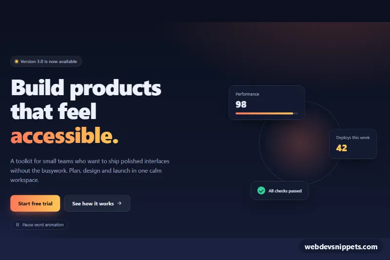
The root section.rw-hero contains .rw-inner, a grid with the text column .rw-copy and the decorative .rw-visual cards. The headline h1.rw-title has a fixed part in .rw-static and a .rw-rotator that holds one .rw-word per option. The rotator is a CSS grid and every word sits in the same cell (grid-area: 1 / 1), so the line always has the height of a single word and the layout never jumps.
Only the word with .is-active is visible. Hidden words wait below the line (translateY(0.7em), opacity: 0) and the word with .is-leaving slides out above it. On DOMContentLoaded the script initializes every .rw-hero, then a setInterval timer moves .is-active to the next word and marks the previous one as .is-leaving; CSS transitions do the animation. The timer stops on visibilitychange when the tab is hidden. Without JavaScript the first word simply stays visible.
The .rw-toggle button is hidden in the markup and revealed by the script. It pauses and resumes the rotation and adds .is-paused to the root. Below 900px the text and the cards stack; from 900px they sit side by side.
Customization
- Edit, add or remove
.rw-wordelements inside.rw-rotatorto change the rotating words, and update the matching text in.rw-sr. data-interval="2600"on.rw-hero: time in milliseconds each word stays on screen.--rw-speedinstyle.css: duration of the slide and fade, e.g.0.3sfor a snappier swap.--rw-accentand--rw-accent-2: the gradient of the rotating word, the primary button and the progress bar.--rw-bgand--rw-bg-2: the two stops of the dark background gradient.- Remove
.rw-visualand setgrid-template-columns: 1fron.rw-innerin the 900px media query to get a single-column text hero. - Change
translateY(0.7em)on.rw-wordto a larger value for a longer vertical travel.
Accessibility
The visual rotator is aria-hidden="true", and the visually hidden .rw-sr span gives screen readers one stable sentence: "Build products that feel fast, friendly, accessible and effortless." The heading is never re-announced while words change. The pause button uses aria-pressed with a fixed label, so its state is announced, and it meets the requirement that auto-updating content can be stopped. When prefers-reduced-motion: reduce is set, rotation starts paused and transitions and transforms are removed. Buttons and links show a clear amber :focus-visible outline, and the decorative cards are hidden from assistive technology.
Usage notes
Several heroes can share a page; each has its own timer and toggle. Keep the rotating words at the end of the headline so different word lengths do not shift the text around them.