Skip to content

Centered Hero with Email Signup

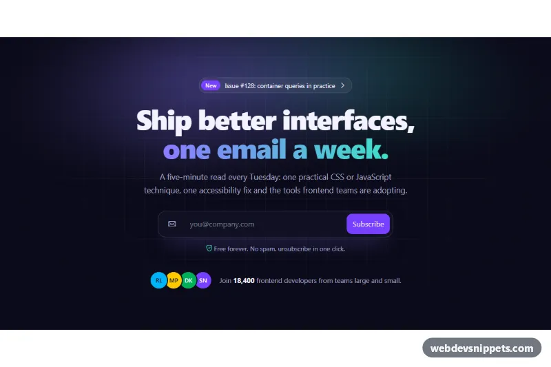
Dark centered Bootstrap 6 newsletter hero with a gradient headline, inline email input group, validation, simulated submit with spinner and social proof avatars.

Also known as: newsletter hero section, waitlist landing hero, hero with email form, dark centered hero

Centered Hero with Email Signup live demo

Open in new tab

Bootstrap 6 code (HTML, CSS, JS)

A dark, centered Bootstrap 6 hero for a newsletter or product waitlist. It has an announcement pill, a headline with a violet-to-teal gradient, a short pitch, an inline email form and a row of subscriber avatars. The form validates the address, shows a spinner during a simulated request and then swaps itself for a confirmation message.

How it works

The section .ces-root is pinned to data-bs-theme="dark". Its background is a faint CSS grid made from two linear-gradient layers. A blurred .ces-glow element adds two colored light spots, and a radial ::after vignette fades the edges into the page color. Everything is centered inside .ces-inner, which is capped by --ces-max.

The .ces-pill link combines a badge theme-accent rounded-pill with the latest issue title. The .ces-grad span in the <h1> uses background-clip: text for the gradient words.

The form is a Bootstrap 6 input-group input-group-lg with an icon addon, the email field and a btn-solid theme-accent input-group-btn submit button. .ces-group restyles the group as one rounded glass bar, so the input and button look like a single control.

script.js listens to the form's submit event and calls preventDefault(). It checks the address with a simple pattern. In alpha.1, Bootstrap 6 does not show feedback for fields inside an .input-group. So the script toggles is-invalid on the group and the input itself, and a sibling rule reveals .ces-error. On a valid address it disables the button, shows .spinner-border.spinner-sm and changes the label to "Subscribing". After 1.2 seconds it hides the form and writes the confirmation into the .ces-done live region.

Customization

  • --ces-from and --ces-to on .ces-root: the headline gradient, glow and focus colors.
  • --ces-bg on .ces-root: the page color used by the vignette and the avatar borders.
  • --ces-max on .ces-root: the width of the centered content column.
  • background-size: 44px 44px in .ces-root: the grid cell size; remove both linear-gradient layers for a plain background.
  • Replace the setTimeout in the submit handler with a fetch() POST to your newsletter provider (the comment marks the spot).
  • pattern in script.js: the email check; adjust it or rely on server validation.
  • Change theme-accent on the submit button and pill badge to another Bootstrap 6 color role, such as theme-success.

Use cases

  • Newsletter sites: a gradient headline and inline email field invite readers to subscribe
  • Product waitlists: the form validates the address and shows a spinner while submitting
  • Launch pages: an announcement pill sits above the headline
  • Community sites: a row of subscriber avatars adds social proof

Accessibility

The input has a visually hidden <label> and is described by the privacy hint and the error text. Invalid submissions set aria-invalid="true", show the message in red text and move focus back to the field. The error clears as soon as the address becomes valid. The confirmation is a polite role="status" region that receives focus, so screen reader and keyboard users land on the result. The pill, input and button all show visible focus styles. The pill hover transition is off under prefers-reduced-motion.

Bootstrap 6 notes

Bootstrap 5's btn btn-primary becomes btn-solid theme-accent, buttons inside input groups get input-group-btn, and spinner-border-sm is now spinner-sm. Initials avatars use the new avatar theme-* and avatar-stack components. Built on Bootstrap 6.0.0-alpha.1, so APIs may still change.
Centered Hero with Email Signup at a glance

Framework
Bootstrap 6
Code
HTML, CSS, JavaScript
JavaScript
Vanilla JavaScript, no jQuery
Dependencies
Bootstrap 6, Bootstrap Icons
Layout
Responsive, works on mobile, dark design
Category
Hero Sections
License
Free for personal and commercial use

Questions about this template

Can I use the Centered Hero with Email Signup code for free?

Yes. You can copy or download the code and use it in personal and commercial projects, including client work. No sign-up is needed. Reselling it as part of a component library or template collection is not allowed; see the license.

How do I add it to my website?

Load Bootstrap 6 and Bootstrap Icons from a CDN (the links are under Requirements). Paste the HTML where the component should appear, add the CSS to your stylesheet and load the JavaScript before the closing </body> tag. Download HTML gives you a complete page with everything already linked.

Does it need jQuery or a JavaScript framework?

No. The script is plain vanilla JavaScript, so it works without jQuery, React or Vue. You can still use the markup inside those frameworks.

Does it work on mobile?

Yes. The layout adapts to small screens. Use the Mobile and Tablet buttons above the live demo to check it at phone and tablet width.

Requirements

Add these to your page (already included in the download):

  • <link rel="stylesheet" href="https://cdn.jsdelivr.net/npm/bootstrap@6.0.0-alpha.1/dist/css/bootstrap.min.css">
  • <script type="module" src="https://cdn.jsdelivr.net/npm/bootstrap@6.0.0-alpha.1/dist/js/bootstrap.bundle.min.js"></script>
  • <link rel="stylesheet" href="https://cdn.jsdelivr.net/npm/bootstrap-icons@1.11.3/font/bootstrap-icons.min.css">

Built for Bootstrap 6.0.0-alpha.1. Bootstrap 6 ships as an ES module, so its script and this component's JavaScript load with type="module". Alpha releases can still change before the stable version.

Centered Hero with Email Signup – Bootstrap 6 hero sections component screenshot
Centered Hero with Email Signup · Bootstrap 6 Hero Sections

More Hero Sections

Split Hero with Diagonal Photo Clip – Pure CSS hero sections preview

Split Hero with Diagonal Photo Clip

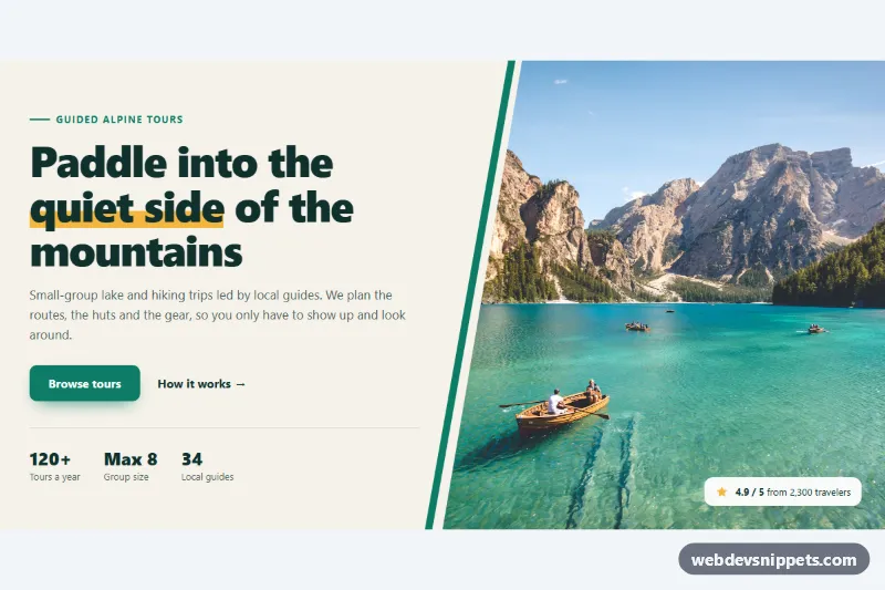
Pure CSS split hero with headline, buttons and stats beside a full-height photo cut on a diagonal with clip-path, plus an accent stripe and rating badge.

Hero with Rotating Words – Pure CSS hero sections preview

Hero with Rotating Words

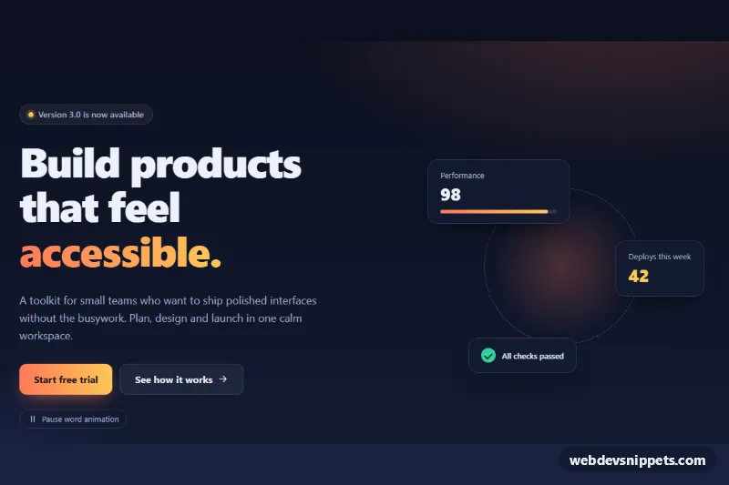
Dark hero section whose headline cycles through words with a slide-and-fade animation, a pause button and decorative stat cards.

Split Hero with App Screenshot – Tailwind CSS hero sections preview

Split Hero with App Screenshot

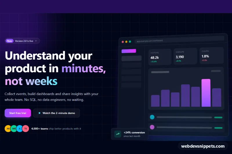
Dark Tailwind CSS split hero with gradient headline, two CTA buttons and an animated mock app dashboard built entirely from divs.

Hero with Background Video Overlay – Bootstrap 6 hero sections preview

Hero with Background Video Overlay

Full-width Bootstrap 6 hero with a muted background video or slow-zoom poster photo, dark gradient overlay, headline, two buttons, stats and a pause control.

Hero Section with Image and CTA – Bootstrap 6 hero sections preview

Hero Section with Image and CTA

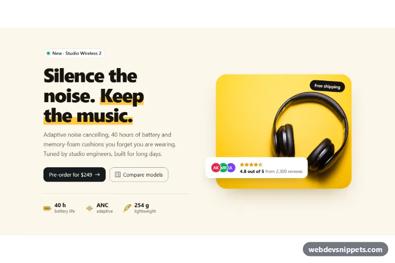
Two-column Bootstrap 6 product hero with a bold headline, two call-to-action buttons, key specs, a product photo with rating badge and a compare Dialog.

Split Hero with Image and Trust Stats – WordPress hero sections preview

Split Hero with Image and Trust Stats

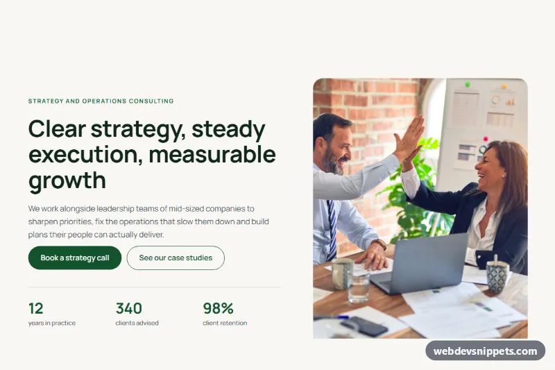
Two-column split hero for consulting and agency sites with a headline, two buttons, three trust stats and a tall team photo, built from core Gutenberg blocks.