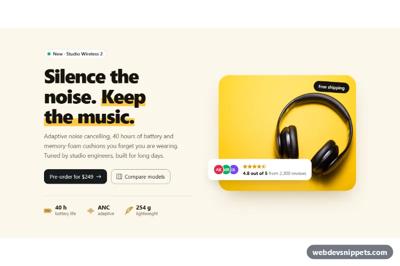
A two-column Bootstrap 6 hero for a product launch: a bold headline with a highlighter accent, a short pitch, two call-to-action buttons and three key specs on the left, and a large product photo with a floating rating card on the right. The secondary button opens a Bootstrap 6 Dialog with a model comparison table. No custom JavaScript.
How it works
The section .hic-root is pinned to data-bs-theme="light" and uses a warm cream background. The layout is a Bootstrap grid: row g-12 align-items-center with two col-12 lg:col-6 columns. Below 1024px the copy stacks above the image. From 1024px they sit side by side.
The copy column starts with a .chip that announces the new model. The .hic-mark span in the <h1> gets a yellow linear-gradient band that looks like a marker stroke. The primary call to action is a link styled as btn-solid theme-inverse btn-lg, so it renders near-black on the light background. The secondary button is btn-outline theme-inverse with data-bs-toggle="dialog" and data-bs-target="#hic-compare". The data API opens the native <dialog> with no init code. .hic-specs is a list of three spec pairs laid out with small CSS grids.
The media column is a <figure class="hic-media"> with the photo, a rotated .hic-tag sticker and a <figcaption class="hic-rating"> card. That card combines the Bootstrap 6 avatar-stack and avatar avatar-sm theme-* initials with a star rating.
The dialog (dialog.dialog.dialog-lg.hic-dialog) holds a .table inside .table-responsive. The .hic-col-new cells highlight the new model.
Customization
--hic-sunon.hic-root: the highlighter color behind "Keep the music."; it also fits the yellow photo.--hic-cream,--hic-inkand--hic-mutedon.hic-root: background, heading and body text colors.--hic-radiuson.hic-root: rounds the product photo; set0.75remfor a sharper look.- Change
theme-inverseon the buttons totheme-primaryortheme-accentfor a colored call to action. - Add
lg:order-1to the image column (andlg:order-2to the copy column) to put the photo on the left. - Rows in
.hic-tableand the.hic-col-newclass: edit the comparison or highlight a different column. - Remove
.hic-tagor change its text for another sticker such as "Limited edition".
The product photo comes from Unsplash. Replace it with your own image and update the alt text.
Use cases
- Product launches: bold headline, two buttons and key specs sit beside a large product photo
- E-commerce landing pages: a floating rating card adds social proof on the image
- Hardware and gadget sites: the secondary button opens a model comparison table in a dialog
- Campaign pages: three key specs give visitors the main facts quickly
Accessibility
The headline is the section's <h1> and labels the section. Icons are aria-hidden, and the star rating is spelled out in text ("4.8 out of 5"). The spec list has an aria-label. The dialog is a native modal <dialog> labelled by its title. It traps focus, closes with Escape or the close button, and returns focus to the trigger. Table check marks include visually hidden "Yes"/"No" text. The arrow nudge on the call to action is disabled under prefers-reduced-motion.
Bootstrap 6 notes
Bootstrap 5's btn btn-dark becomes btn-solid theme-inverse, col-lg-6 becomes lg:col-6, and the Modal becomes <dialog class="dialog"> opened with data-bs-toggle="dialog". chip and avatar-stack are new Bootstrap 6 components. Built on Bootstrap 6.0.0-alpha.1, so APIs may still change.