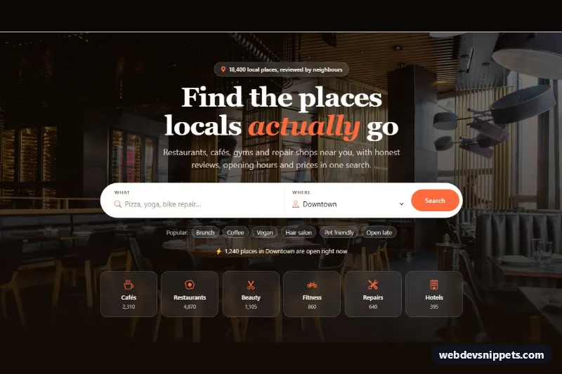
A Bootstrap 6 hero for directory and local-listing sites. A large pill-shaped search bar sits over a dimmed restaurant photo. It pairs a free-text "What" field with a searchable "Where" Combobox, and below it are popular search chips, a live status line and six category tiles. It fits city guides, marketplaces and job boards.
How it works
The root .hsb-hero paints two backgrounds: the --hsb-overlay gradient over the --hsb-photo image. The headline uses a serif stack with an accent-colored italic word. On mobile .hsb-search is a stacked white card. From 768 px it becomes a three-column grid with a divider between the fields and a round Search button.
The "What" field is a Bootstrap 6 form-control form-adorn label holding a search icon and a borderless form-ghost input. "Where" is the new Bootstrap 6 Combobox: a combobox-toggle button with data-bs-toggle="combobox", data-bs-search="true" and data-bs-name="area", followed by a .menu of menu-item buttons. Downtown starts as selected, and Combobox creates a hidden area input for form submission.
script.js (an ES module) handles submit. An empty query adds .is-invalid to the form, shows .hsb-error and focuses the input. A valid query disables the button, shows a spinner-border spinner-sm, and after a short timeout writes a result count into the role="status" line. Each .hsb-chip fills the input and calls requestSubmit(). Picking a new area fires change.bs.combobox, which re-runs the search.
Customization
--hsb-photoon.hsb-hero: swap in your own background image. The photo comes from Unsplash; replace it with one of your city or venues.--hsb-overlay: make the gradient lighter or darker to balance contrast with your photo.--hsb-accentand--hsb-accent-dark: recolor the button, icons and italic word. The--bs-primary-*overrides beside them keep the Bootstrap button in sync.- Add or remove
menu-itembuttons with adata-bs-valueto change the areas. Move theselectedclass to change the default. - Edit the
.hsb-chipbuttons for your own popular searches. Their text is what gets searched. - Replace the
setTimeoutin the submit handler with afetch()to your search API. Read the area from the hiddenareainput. - Change
grid-template-columnsin.hsb-catsto show four or eight category tiles.
Use cases
- City guides: a large pill search bar sits over a photo with a What field and a Where field
- Marketplaces: popular search chips under the bar offer one-click starting points
- Job boards: a searchable area picker helps visitors choose a location
- Directory sites: six category tiles below the search help people browse
Accessibility
The form has role="search" and an aria-label. Each field has a visible label, and the error text is linked with aria-describedby and aria-invalid. The chips are real buttons with aria-pressed, and the result line is a polite live region. The Combobox supports arrow keys, Home/End, typing in its search box and Escape. All interactive elements have a visible focus ring, and the tile hover lift is turned off under prefers-reduced-motion.
Bootstrap 6 notes
The Combobox replaces a Bootstrap 5 form-select plus a third-party search plugin. The icon-in-input pattern uses form-adorn and form-ghost instead of an input-group. The button is btn-solid theme-primary, and the spinner size is spinner-sm. Built on Bootstrap 6.0.0-alpha.1, so APIs may change. In alpha.1 the Combobox logs a harmless "more than one instance" console message. Icons come from Bootstrap Icons.