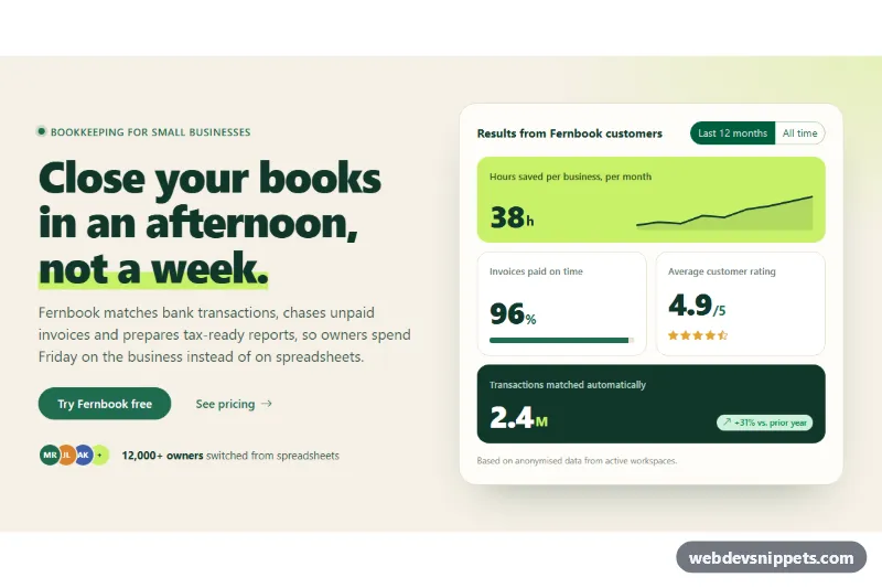
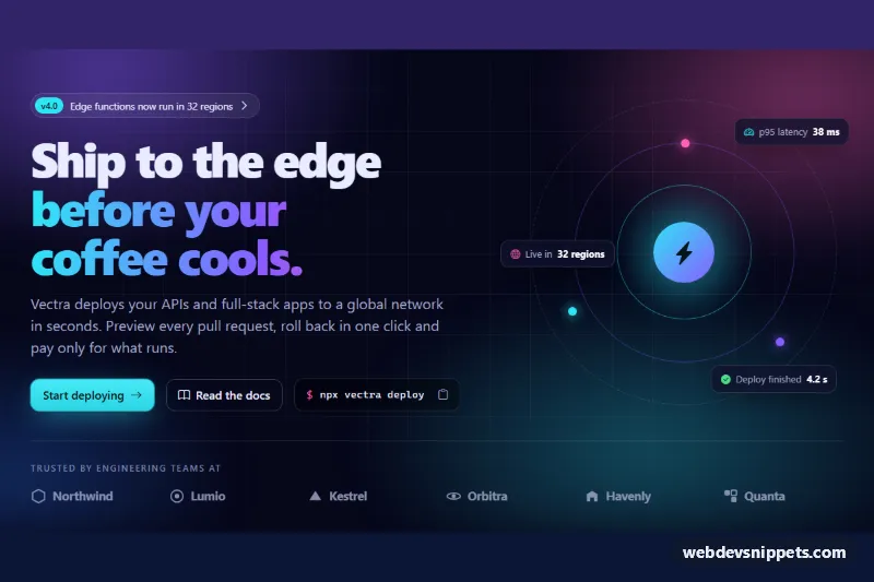
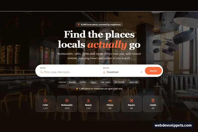
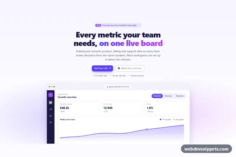
A two-column hero for Bootstrap 6. The left side holds a headline with a highlighter-style underline, a short pitch, two buttons and avatar social proof. The right side shows a bento grid of key results that visitors can switch between "Last 12 months" and "All time". It suits SaaS, fintech or service landing pages that want numbers above the fold.
How it works
The layout uses the Bootstrap 6 grid with the new responsive prefix: two lg:col-6 columns inside a row g-12. They stack on screens under 1024 px. The root .shs-hero sets a cream background with a lime glow. The highlighted words in the h1 get a lime band from a linear-gradient background.
The social proof row uses the new CSS-only avatar-stack with avatar avatar-sm initials. The stats panel .shs-panel holds a description list (dl.shs-stats) laid out as a two-column CSS grid. .shs-stat-feature spans the full width and adds an inline SVG sparkline. The second tile has a Bootstrap progress bar. The rating tile shows Bootstrap Icons stars, and .shs-stat-dark spans the last row with a badge badge-subtle theme-success delta.
The range switch is a Bootstrap 6 radio button group: btn-check btn-outline theme-primary labels with the input inside. script.js listens for change on the radios. It swaps every element that has data-year and data-all attributes, replays a short fade (.is-changing), updates the progress bar through --shs-p and its aria-valuenow, and announces the new range in .shs-live. Without JavaScript the 12-month numbers stay visible.
Customization
--shs-green,--shs-limeand--shs-inkon.shs-hero: change the brand, highlight and text colors. The--bs-primary-*overrides use these values to recolor the Bootstrap buttons.--shs-creamand--shs-card: set the page and panel backgrounds.data-yearanddata-allon each.shs-numand.shs-delta-text: edit the numbers and captions for both ranges.- Add another radio with a new
value(e.g.quarter) and matchingdata-quarterattributes to support a third range. - Remove
.shs-stat-featureor.shs-stat-darkfrom a tile to turn it into a regular half-width card. - Edit the
dattribute of.shs-spark-lineand.shs-spark-areato draw your own trend. max-widthon.shs-hero .container: makes the hero wider or narrower on large screens.
Use cases
- SaaS landing pages: headline and buttons on the left, key results in a bento grid on the right
- Fintech sites: visitors switch the numbers between Last 12 months and All time
- Service businesses: avatar social proof sits right below the call to action
- Agency pages: show numbers above the fold to build trust quickly
Accessibility
Stats are a real dl with dt labels and dd values, labelled by the panel heading. The range buttons are native radios, so arrow keys and screen readers work out of the box. The progress bar has role="progressbar", a label and an updated aria-valuenow. A polite live region reports the range change. Decorative avatars and the sparkline are hidden from assistive technology. The fade and bar transition are turned off under prefers-reduced-motion.
Bootstrap 6 notes
Bootstrap 5's col-lg-6 becomes lg:col-6, and g-5 becomes g-12 because the spacing scale changed. Toggle buttons put the input inside a label.btn-check. btn-primary is now btn-solid theme-primary, and btn-link styling uses btn-text theme-primary. The avatar and avatar-stack components are new in Bootstrap 6. Built on 6.0.0-alpha.1, so details may still change. Icons come from Bootstrap Icons.