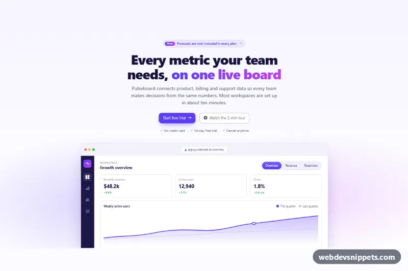
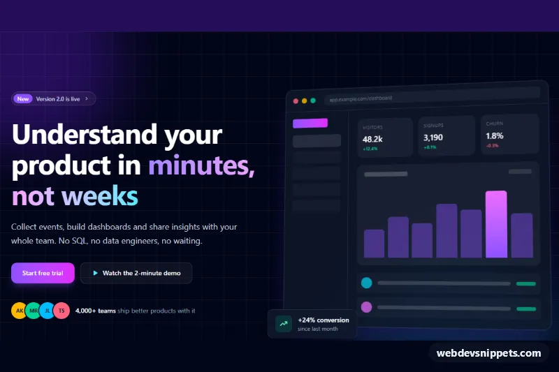
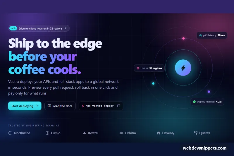
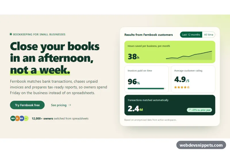
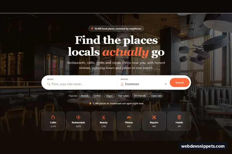
A SaaS landing page hero built with Bootstrap 6. It has a "New" announcement badge, a two-tone gradient headline, two calls to action and a product screenshot inside a browser frame. The screenshot is built in HTML and SVG, so it stays sharp, and its three views switch with tabs. A Bootstrap 6 Dialog opens a short product tour.
How it works
The root .ssh-hero sets a dotted grid background, and .ssh-glow adds blurred brand light behind the screenshot. The badge is a badge badge-subtle theme-primary rounded-pill link with a gradient .ssh-badge-new label. The primary button is btn-solid theme-primary btn-lg. The secondary button is btn-outline theme-secondary with data-bs-toggle="dialog" and data-bs-target="#ssh-tour" and opens the dialog without init code.
In the browser window .ssh-frame, .ssh-bar holds the dots and address pill, and .ssh-app holds a dark icon sidebar (from 768 px up) and .ssh-main. The view switcher is a nav nav-pills tab list using the Bootstrap 6 Tab plugin. Each .tab-pane holds three .ssh-kpi tiles and a chart: an inline SVG area chart, CSS bars (.ssh-b) or a cohort grid (.ssh-cohort).
script.js is a module. On shown.bs.tab it copies the tab's data-ssh-path into .ssh-url-path, so the address bar follows the active view. In the dialog, .ssh-play toggles aria-pressed and an is-playing class that runs the progress bar. .ssh-chapter buttons update the poster title; playback stops on hidden.bs.dialog.
Customization
--ssh-brandand--ssh-brand-2on.ssh-hero: change the gradient headline, badge, chart and sidebar logo. The--bs-primary-*overrides next to them recolor the Bootstrap buttons and pills to match.--ssh-bgand--ssh-lineon.ssh-hero: set the page tint and the border color of the frame and tiles.- Replace
.ssh-appwith an<img>of your real screenshot (withwidth,heightandalt) if you prefer a static image. Keep.ssh-barfor the browser chrome. data-ssh-pathon each tab button: sets the path shown in the fake address bar.- Bar heights live in the
.ssh-b:nth-child(n) .b1rules instyle.css. Cohort shades use the classesl0tol5. --bs-dialog-widthon.ssh-dialog: makes the tour dialog wider or narrower (640px by default). Put your video embed inside.ssh-poster.
Use cases
- SaaS landing pages: a New badge, gradient headline and two calls to action introduce the product
- Software marketing: the screenshot sits in a browser frame and switches between three views with tabs
- Product tours: a button opens a short tour in a dialog
- Startup sites: the screenshot is built from markup and SVG, so it stays sharp on any screen
Accessibility
The section is labelled by its h1. The tabs use role="tablist", role="tab", aria-selected and aria-controls, and arrow keys move between them. Decorative chrome is aria-hidden, and each chart has role="img" and a text label. The dialog is a native <dialog> labelled by its title, with Escape and focus return handled by Bootstrap. The play button reports its state through aria-pressed and a changing label. The progress animation is replaced by a static bar under prefers-reduced-motion.
Bootstrap 6 notes
This hero uses btn-solid theme-primary and btn-outline theme-secondary where Bootstrap 5 used btn-primary and btn-outline-secondary. badge-subtle theme-primary replaces text-bg-primary, and the tour uses <dialog class="dialog dialog-lg"> with data-bs-dismiss="dialog" instead of a .modal. Built on Bootstrap 6.0.0-alpha.1, so class names and APIs can still change. Icons come from Bootstrap Icons. Give tabs and dialog unique IDs when using two copies.