Skip to content

Dark Gradient Hero

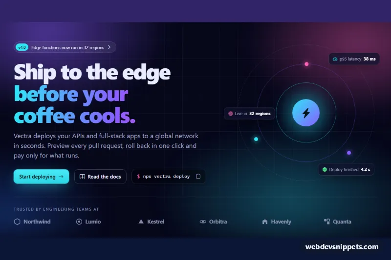
Dark Bootstrap 6 hero with a blurred gradient mesh, gradient headline, glowing CTA, copyable install command, decorative orb with stats and a row of trust logos.

Also known as: dark hero with gradient background, developer tool hero, hero with install command, gradient mesh hero

Dark Gradient Hero live demo

Open in new tab

Bootstrap 6 code (HTML, CSS, JS)

A dark Bootstrap 6 hero for developer tools and tech products. A blurred gradient mesh and a faint grid sit behind a large headline with gradient text, a glowing call to action, a copyable install command and a decorative orbit with three floating stat cards. A row of trust logos closes the section.

How it works

The root .dgh-hero carries data-bs-theme="dark", so every Bootstrap component inside it uses dark tokens whatever the visitor's OS setting. Two absolutely positioned layers make the background. .dgh-mesh stacks four radial-gradients and blurs them, and .dgh-grid-lines draws a 56 px grid faded out with mask-image.

The layout is a Bootstrap 6 row with lg:col-7 text and a lg:col-5 visual. The visual is hidden below 1024 px with d-none lg:d-block, so phones get only the text. The headline's second line is .dgh-gradient, a cyan-violet-pink gradient clipped to the text. The main button is btn-solid btn-styled theme-primary, which adds Bootstrap 6's built-in gradient and shadow, plus a cyan glow. The orb is CSS only: three .dgh-ring circles (the outer one slowly rotates), a glowing .dgh-core, colored .dgh-node dots and three .dgh-float stat cards.

.dgh-cmd shows a shell command with a btn-icon copy button. Its "Copy to clipboard" tooltip comes from data-bs-toggle="tooltip"; in Bootstrap 6 tooltips set themselves up on first hover or focus, so there is no init loop. script.js copies with navigator.clipboard.writeText() and falls back to execCommand('copy'). It swaps the icon to a check and announces the result in .dgh-copy-status. The trust logos are fictional inline SVG marks with text names.

Customization

  • --dgh-cyan, --dgh-violet and --dgh-pink on .dgh-hero: change the gradient text, glows and orb colors. The --bs-primary-* overrides keep the Bootstrap button in the same cyan.
  • --dgh-bg, --dgh-text and --dgh-muted: set the page background and the two text tones.
  • Edit the radial-gradient positions in .dgh-mesh to move the color blobs.
  • Change the .dgh-cmd-text content to your own CLI or package command. The copy button always copies whatever text is inside it.
  • Replace each li in .dgh-logos with your customers' SVG logos. Set the column count in grid-template-columns (six from 768 px).
  • Edit the .dgh-float text, or move the cards with the top/left/right values in .dgh-float-1 to .dgh-float-3.

Use cases

  • Developer tools: a copyable install command sits right under the headline
  • Tech products: a gradient mesh background and glowing call to action set a modern mood
  • Open source projects: a decorative orbit shows three floating stat cards
  • Product launches: a row of trust logos closes the hero section

Accessibility

The section is labelled by its h1. The decorative orb, grid and mesh are aria-hidden. The copy button has an aria-label, a tooltip and a role="status" message, so screen reader users hear whether copying worked. Text colors are light enough on the near-black background to meet WCAG AA. Links and buttons keep a visible cyan focus ring. The rotating ring stops under prefers-reduced-motion.

Bootstrap 6 notes

Dark mode is the data-bs-theme="dark" attribute; Bootstrap 6 has no bg-dark or navbar-dark style switches. Buttons use btn-solid btn-styled theme-primary and btn-outline theme-secondary, and the badge is badge theme-primary. Responsive classes use the prefix syntax lg:col-7 and lg:d-block instead of col-lg-7 and d-lg-block. Built on 6.0.0-alpha.1, so APIs may still change. Icons come from Bootstrap Icons.
Dark Gradient Hero at a glance

Framework
Bootstrap 6
Code
HTML, CSS, JavaScript
JavaScript
Vanilla JavaScript, no jQuery
Dependencies
Bootstrap 6, Bootstrap Icons
Layout
Responsive, works on mobile, dark design
Category
Hero Sections
License
Free for personal and commercial use

Questions about this template

Can I use the Dark Gradient Hero code for free?

Yes. You can copy or download the code and use it in personal and commercial projects, including client work. No sign-up is needed. Reselling it as part of a component library or template collection is not allowed; see the license.

How do I add it to my website?

Load Bootstrap 6 and Bootstrap Icons from a CDN (the links are under Requirements). Paste the HTML where the component should appear, add the CSS to your stylesheet and load the JavaScript before the closing </body> tag. Download HTML gives you a complete page with everything already linked.

Does it need jQuery or a JavaScript framework?

No. The script is plain vanilla JavaScript, so it works without jQuery, React or Vue. You can still use the markup inside those frameworks.

Does it work on mobile?

Yes. The layout adapts to small screens. Use the Mobile and Tablet buttons above the live demo to check it at phone and tablet width.

Requirements

Add these to your page (already included in the download):

  • <link rel="stylesheet" href="https://cdn.jsdelivr.net/npm/bootstrap@6.0.0-alpha.1/dist/css/bootstrap.min.css">
  • <script type="module" src="https://cdn.jsdelivr.net/npm/bootstrap@6.0.0-alpha.1/dist/js/bootstrap.bundle.min.js"></script>
  • <link rel="stylesheet" href="https://cdn.jsdelivr.net/npm/bootstrap-icons@1.11.3/font/bootstrap-icons.min.css">

Built for Bootstrap 6.0.0-alpha.1. Bootstrap 6 ships as an ES module, so its script and this component's JavaScript load with type="module". Alpha releases can still change before the stable version.

Dark Gradient Hero – Bootstrap 6 hero sections component screenshot
Dark Gradient Hero · Bootstrap 6 Hero Sections

More Hero Sections

Split Hero with Diagonal Photo Clip – Pure CSS hero sections preview

Split Hero with Diagonal Photo Clip

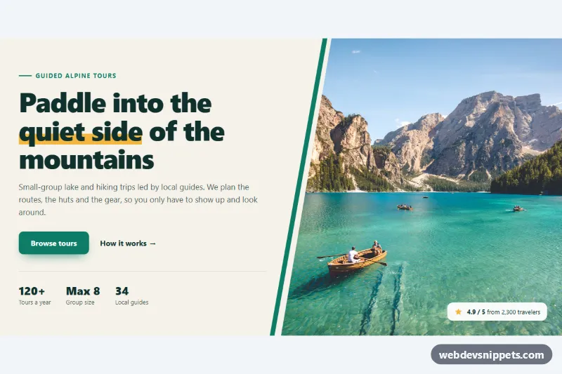
Pure CSS split hero with headline, buttons and stats beside a full-height photo cut on a diagonal with clip-path, plus an accent stripe and rating badge.

Hero with Rotating Words – Pure CSS hero sections preview

Hero with Rotating Words

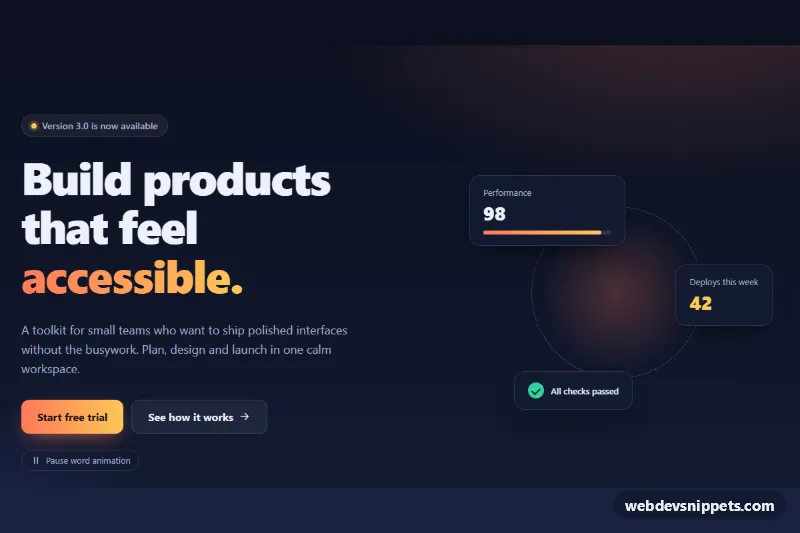
Dark hero section whose headline cycles through words with a slide-and-fade animation, a pause button and decorative stat cards.

Split Hero with App Screenshot – Tailwind CSS hero sections preview

Split Hero with App Screenshot

Dark Tailwind CSS split hero with gradient headline, two CTA buttons and an animated mock app dashboard built entirely from divs.

Split Hero with Stats – Bootstrap 6 hero sections preview

Split Hero with Stats

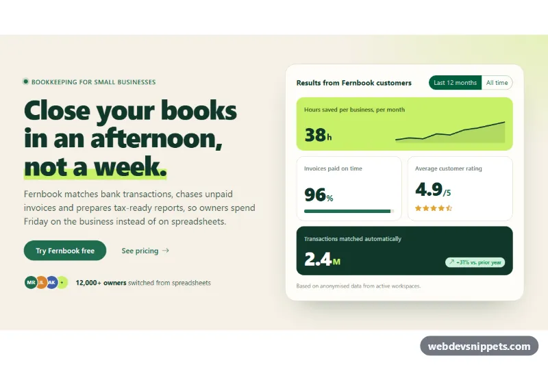
Bootstrap 6 split hero with a highlighted headline, CTAs and avatar social proof beside a bento grid of key stats with a 12-month / all-time toggle.

Hero with Search Bar – Bootstrap 6 hero sections preview

Hero with Search Bar

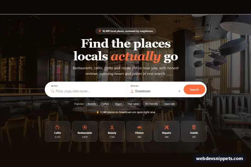
Bootstrap 6 directory hero on a photo background with a large pill search bar, a searchable area Combobox, popular search chips and category tiles.

SaaS Hero with App Screenshot – Bootstrap 6 hero sections preview

SaaS Hero with App Screenshot

Bootstrap 6 SaaS hero with a New badge, gradient headline, two CTAs and an app screenshot in a browser frame with switchable tabs and a tour Dialog.