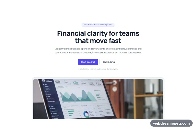
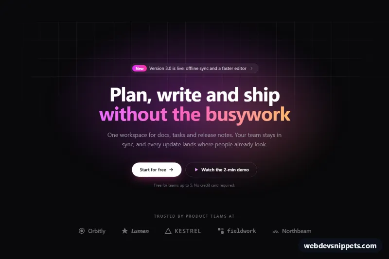
Centered SaaS hero section for the block editor with a headline, two buttons and a framed product dashboard screenshot, ready to paste as a Gutenberg pattern.
Also known as: gutenberg hero section, saas landing page hero, hero with product screenshot, wordpress hero block, software homepage header
A centered SaaS hero with a product screenshot, built as a WordPress block pattern from core blocks only. It gives a software homepage or landing page header a clear announcement badge, a large headline, a short pitch, two calls to action and a wide dashboard image in a soft frame, the classic layout of a startup homepage hero.
How it works
The outer Group is full width with a white background and a 1160px content width. Inside, a narrower Group (780px) holds the centered text: a pill-shaped Group with a light indigo background as the announcement badge, an H1 heading, a lead paragraph, a Buttons block with a filled and an outlined button, and a small reassurance line ("14-day free trial · No credit card required"). Below, a wide-aligned Group with a light gray background, a 1px border and a 24px radius frames an Image block with 14px rounded corners, so the screenshot looks like it sits in an app window.
Use cases
SaaS and app homepages: introduce the product, show the dashboard and send visitors to a free trial
Product launch pages: the badge announces a new feature right above the headline
Fintech and analytics tools: the dashboard photo supports a data-driven message
Agency client sites: a ready-made startup hero that only needs new text and a screenshot
How to use it
Copy the block markup.
Paste it into an empty paragraph in the block editor; WordPress converts it into blocks.
Replace the headline, text, button links and the screenshot with your own.
Customization
Announcement badge: select the inner Group around "New: AI cash-flow forecasting is here" and change Color > Background (#eef2ff) and Border (#c7d2fe, radius 999px), or delete it.
Headline: the H1 uses Typography > Font size 60px, weight 800, line height 1.08 and Color > Text #0f172a.
Primary button: Color > Background #4f46e5 sets the indigo accent; change it to your brand color and update the badge text color (#4338ca) to match.
Secondary button: Border width 1px, color #cbd5e1 and a white background give the outline look.
Text width: the inner Group's Layout > Content width is 780px; lower it for shorter lines.
Screenshot frame: the wide Group uses Color > Background #f1f5f9, Dimensions > Padding 12px and Border radius 24px; set padding to 0 to drop the frame.
Image: select the Image block and use Replace to add your own product screenshot (a 2:1 image works best).
Section spacing: the outer Group has Dimensions > Padding 104px top and bottom.
The dashboard photo comes from Unsplash; replace it with a real screenshot of your product.
Accessibility
The headline is the page's H1 and the image has descriptive alt text; update it when you swap in your screenshot. Slate text (#475569) on white and white text on indigo #4f46e5 both meet WCAG AA contrast. Buttons are real links, so keyboard users can tab to them and the theme's focus styles apply.
Can I use the SaaS Hero with Product Screenshot code for free?
Yes. You can copy or download the block markup and use it in personal and commercial projects, including client work. No sign-up is needed. Reselling it as part of a component library or template collection is not allowed; see the license.
How do I add it to my WordPress site?
Copy the block markup, open a page in the block editor, click into an empty paragraph and paste. WordPress turns it into regular blocks that you can edit like any other content. You can also paste it in the Code editor view (Options menu > Code editor).
Does it need a page builder or plugin?
No. The pattern is built only from core blocks such as Group, Columns, Heading, Image and Buttons, so it works without Elementor, Spectra, Kadence or any other plugin. Colors and spacing are set on the blocks themselves; headings and text use your theme's fonts.
Will it look the same in my theme?
The layout, colors and spacing come with the blocks, so they carry over. Fonts, link styles and the content width follow your theme, so small differences are normal. The live demo shows the pattern in the default Twenty Twenty-Five theme. It works best with block themes; in classic themes the block editor still renders it, with your theme's styles.
Does it work on mobile?
Yes. The layout adapts to small screens. Use the Mobile and Tablet buttons above the live demo to check it at phone and tablet width.
How to install
Copy the block markup above.
Open a page or post in the WordPress block editor, click into an empty paragraph and paste. The editor turns the markup into blocks.
Replace the sample text and images. To reuse it, select the blocks and choose Create pattern from the block toolbar menu.
Uses only core WordPress blocks, so no plugin is needed. Tested with WordPress 6.8 and later. Fonts come from your theme; the live demo uses the default Twenty Twenty-Five theme. WebDevSnippets is not affiliated with or endorsed by the WordPress Foundation.
SaaS Hero with Product Screenshot · WordPress Hero Sections
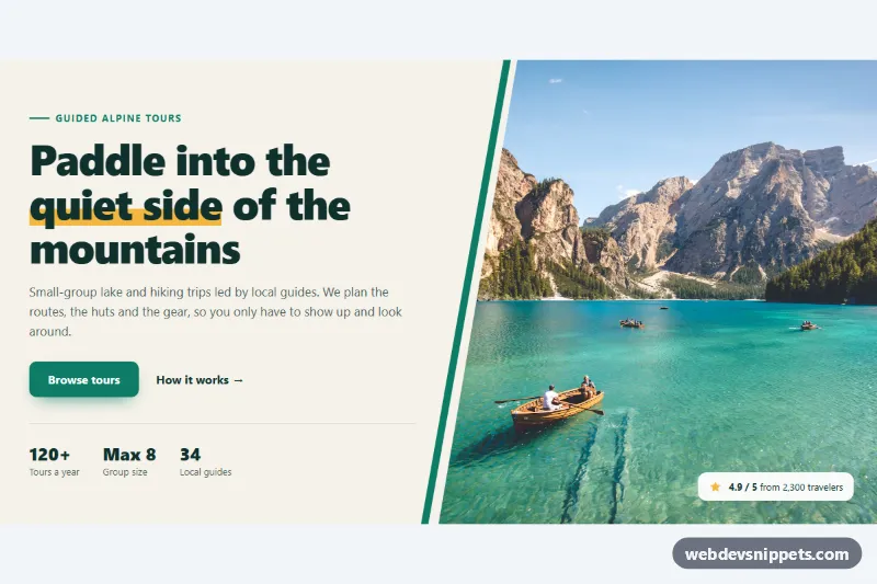
Pure CSS split hero with headline, buttons and stats beside a full-height photo cut on a diagonal with clip-path, plus an accent stripe and rating badge.
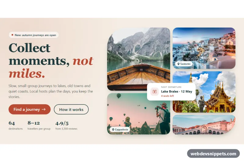
Bootstrap 5 hero section with a serif headline, call-to-action buttons and stats on the left and a five-photo collage grid with a floating card on the right.