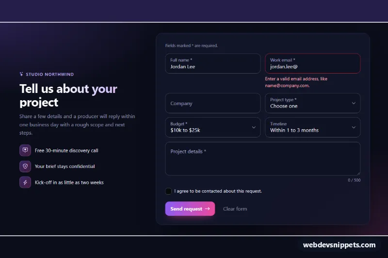
A dark project-request form for agency and studio sites. It shows Bootstrap 6 floating labels on text inputs, selects and a textarea, with CSS-only validation, a character counter and a simulated submit. The intro column with perks makes it a ready-made contact section.
How it works
The root .flf-root uses data-bs-theme="dark" and splits into .flf-intro and the .flf-form card. Each field is a .form-field.flf-field that holds a .form-floating wrapper, with the <label> placed before its control as Bootstrap 6 requires, plus an .invalid-feedback message. Text inputs need a placeholder because the label floats via :placeholder-shown. Selects always show the floated label.
The form has data-bs-validate and novalidate, so Bootstrap colors fields red through :user-invalid only after the visitor edits them or tries to submit. Bootstrap does not show feedback that sits after a .form-floating wrapper. A small rule in style.css therefore shows .invalid-feedback when its .flf-field contains an invalid control. The email field starts with a server-style .is-invalid state, so the error design is visible right away. script.js removes that class once the visitor edits the field.
The script also updates the .flf-count counter (it turns amber near maxlength) and keeps aria-invalid in sync. On submit it focuses the first :invalid field. If the form is valid, it shows a spinner, resets the form and reveals the .flf-success alert. Label animations start only after load, via the .flf-animate class.
Customization
--flf-violetand--flf-pinkon.flf-root: change the accent and the submit button gradient. The root also maps Bootstrap's--bs-primary-*,--bs-focus-ring-colorand--bs-control-checked-bgto the accent.--flf-message-heighton.flf-root: sets the textarea height through--bs-form-floating-height. Avoid therowsattribute with floating labels.data-bs-validate="valid"on.flf-form: also shows green success styling on valid fields.- Remove
is-invalidandaria-invalidfrom#flf-emailand clear itsvaluefor a clean first state. - Replace the
setTimeoutin the submit handler withfetch()to your endpoint. Keep theform.reset()call for the success path. .flf-gridswitches to two columns at 576px. Add.flf-spanto a field to make it full width.
Use cases
- Agency and studio websites: a project request form with an intro column of perks beside it
- Contact sections: floating label inputs, selects and a textarea keep a compact, modern form
- Briefing and inquiry forms: a character counter on the message field guides how much detail visitors write
- Lead capture pages: validation errors appear only after editing, then a success alert confirms the send
Accessibility
Every control has a real label (required ones end in *, explained in a note linked with aria-describedby). Error messages are linked with aria-describedby, and aria-invalid is set on blur and on submit. Focus moves to the first invalid field. The success alert uses role="status". Focus rings use the violet accent on a dark background with strong contrast.
Bootstrap 6 notes
form-select is gone: selects use form-control. The floating <label> now comes before the input, and the mb-3 wrapper becomes .form-field. form-check markup becomes a single input.check with a .form-field-content column. Validation uses data-bs-validate instead of the Bootstrap 5 was-validated JavaScript. Spinners use spinner-sm. Built on Bootstrap 6.0.0-alpha.1, so APIs may still change. Icons come from Bootstrap Icons.