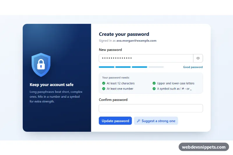
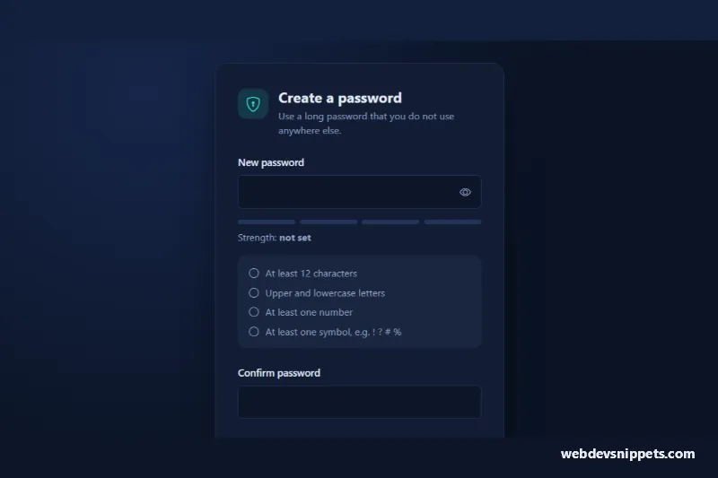
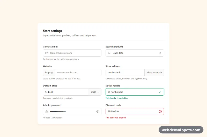
A password creation card for sign-up, reset and account settings pages. It is built around the new Bootstrap 6 Strength component. The field has a show/hide toggle, a four-segment strength meter with a text label and a live checklist of requirements. A confirm field checks that both passwords match, a Caps Lock hint appears while typing, and a button suggests a strong random password.
How it works
The root .pwm-root has a decorative .pwm-art panel with an inline SVG shield and the .pwm-form. The password sits in an .input-group with a .pwm-toggle button. Below it, .pwm-meter holds the Bootstrap .strength element with four .strength-segment children and a .strength-text label.
script.js imports Strength and creates the meter with Strength.getOrCreateInstance(). It passes the password input, custom messages and a scorer function. scorePassword() gives up to 8 points for length (8, 12 and 16 characters), lower case, upper case, digits, one symbol and two symbols. Bootstrap's default thresholds turn the score into weak, fair, good or strong. Bootstrap then sets data-bs-strength on the meter and colors the active segments. The checklist uses the same RULES object, so the meter and the ticks always agree.
The toggle switches both fields between password and text and updates aria-pressed, aria-label and the eye icon. The confirm field gets .is-valid or .is-invalid. "Suggest a strong one" creates a 16-character password with crypto.getRandomValues(), fills both fields and reveals them. Submit only succeeds with a good or strong password that matches the confirm field.
Customization
--pwm-weak,--pwm-fair,--pwm-goodand--pwm-strongon.pwm-root: change the segment and label colors. They feed Bootstrap's--bs-strength-*-colortokens on.pwm-strength.--pwm-blueon.pwm-root: recolors the buttons and focus rings through the scoped--bs-primary-*tokens.RULESandscorePassword()inscript.js: change the checklist rules or the scoring. Keep the.pwm-ruleitems in sync.messagesin theStrength.getOrCreateInstance()call: set the text shown for each level.generatePassword(length)inscript.js: change the default length or the character sets.- Remove the
valueattribute from#pwm-passwordfor an empty first state, and replace the success message with afetch()call.
Use cases
- Sign-up pages: a live strength meter and requirements checklist guide users to a strong password
- Password reset screens: confirm field checks that both passwords match before submitting
- Account settings: show and hide toggle lets users verify what they typed, with a Caps Lock hint
- Security-focused apps: a suggest button fills both fields with a random 16-character password
Accessibility
The strength text is an aria-live region and is linked to the password field with aria-describedby, together with the checklist. Each rule includes hidden "(done)" or "(missing)" text, because the icon color alone does not carry meaning. The toggle is a real button with aria-pressed and aria-controls. Feedback, the Caps Lock badge and status messages are text, not only color. Copy and paste are never blocked.
Bootstrap 6 notes
The Strength meter (.strength, .strength-segment, .strength-text) is new in Bootstrap 6. Bootstrap 5 needed a custom progress bar for this. Input group buttons use btn-outline theme-secondary input-group-btn, and badges use badge badge-subtle theme-warning. Built on Bootstrap 6.0.0-alpha.1, so APIs may still change. Icons come from Bootstrap Icons.