Skip to content

Input Groups with Icons and Buttons

Bootstrap 6 input group examples in a settings card: icon and text prefixes, suffixes, a currency menu, stepper, copy button and validated coupon field.

Also known as: input group examples, input with icon and button, currency input field, number stepper input, copy to clipboard input

Bootstrap 6 Inputs Responsive #button #form #icons #input #input-group

Input Groups with Icons and Buttons live demo

Open in new tab

Bootstrap 6 code (HTML, CSS, JS)

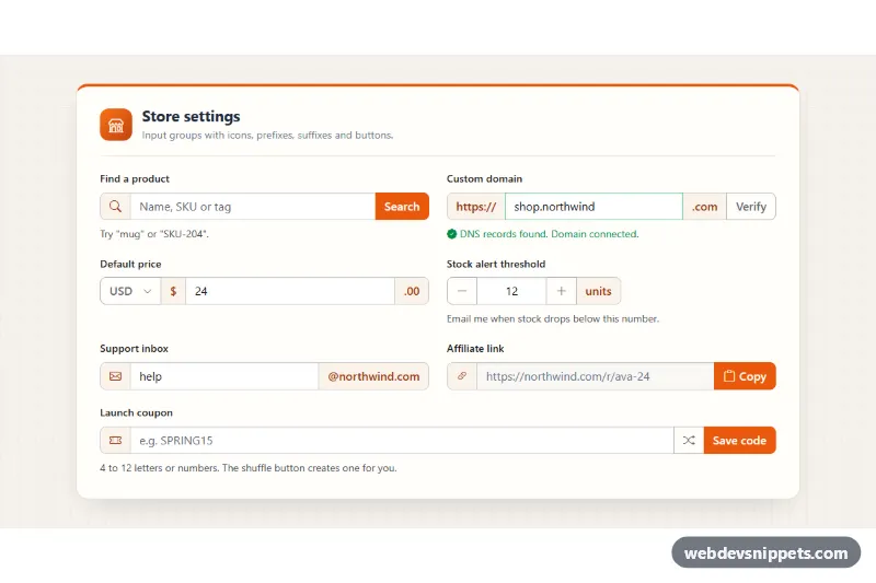
A set of Bootstrap 6 input groups in a store settings card. It covers the patterns you need most: icon prefixes, text prefixes and suffixes, inline buttons, a currency menu, a number stepper, a copy-to-clipboard field and a validated coupon code. Each group works, so you can copy one field or the whole card into an admin panel or checkout.

How it works

The root .igb-root holds an .igb-card with a responsive .igb-grid form. Every field is a .form-field.igb-field with a form-label, an .input-group and optional help or feedback text after the group. Add-ons are .input-group-text spans: Bootstrap Icons for icons, plain text for https://, .com, .00 or @northwind.com. Buttons inside a group use a variant plus input-group-btn, for example btn-solid theme-primary input-group-btn.

script.js adds the behavior:

  • Search filters a small CATALOG array on click or Enter and writes the result into a polite live region.
  • Verify checks the domain against DOMAIN_PATTERN, simulates a DNS lookup and toggles .is-valid / .is-invalid.
  • Currency is a Bootstrap 6 Menu (data-bs-toggle="menu"). Clicking an item with data-igb-currency and data-igb-symbol updates .igb-symbol and the button label.
  • Stepper buttons with data-igb-step add or subtract and clamp to the input's min and max.
  • Copy uses the Clipboard API with a timeout and a select() fallback for sandboxed frames.
  • Coupon creates a random code with the shuffle button and validates with COUPON_PATTERN on submit.

Customization

  • --igb-orange on .igb-root: changes the accent. The root maps Bootstrap's --bs-primary-* and --bs-focus-ring-color to it, so solid buttons and focus rings follow.
  • --igb-addon-bg on .igb-root: sets the background of every .input-group-text add-on.
  • data-igb-currency and data-igb-symbol on the .menu-item buttons: add currencies such as JPY / ¥.
  • data-igb-step on the stepper buttons: use 5 and -5 for bigger steps. Change min and max on .igb-stock for the limits.
  • COUPON_PATTERN and DOMAIN_PATTERN in script.js: adjust what counts as a valid coupon or domain.
  • Add input-group-sm or input-group-lg to any .input-group to resize all its parts.

Use cases

  • Admin panels and store settings: icon prefixes, text suffixes and inline buttons fit settings fields
  • Checkout and pricing forms: a currency menu and number stepper handle amounts and quantities
  • Developer dashboards: a copy field lets users grab an API key or link in one click
  • Promotions and discounts: a coupon field with a shuffle button and validated code format

Accessibility

Every input has a visible <label>. Decorative icon add-ons are aria-hidden, and icon-only buttons have an aria-label. Help and feedback text is linked with aria-describedby, and invalid fields get aria-invalid. The currency button's aria-label reflects the chosen currency, and the menu supports arrow keys and Escape. Buttons inside groups get a visible focus outline that sits above neighbouring add-ons.

Bootstrap 6 notes

Buttons in input groups need the new input-group-btn class, and btn-outline-secondary becomes btn-outline theme-secondary. Bootstrap 5's dropdown-menu becomes a flat .menu with .menu-item buttons and a .menu-header. Feedback goes after the .input-group, inside .form-field. Built on Bootstrap 6.0.0-alpha.1, so APIs may still change.
Input Groups with Icons and Buttons at a glance

Framework
Bootstrap 6
Code
HTML, CSS, JavaScript
JavaScript
Vanilla JavaScript, no jQuery
Dependencies
Bootstrap 6, Bootstrap Icons
Layout
Responsive, works on mobile
Category
Inputs
License
Free for personal and commercial use

Questions about this template

Can I use the Input Groups with Icons and Buttons code for free?

Yes. You can copy or download the code and use it in personal and commercial projects, including client work. No sign-up is needed. Reselling it as part of a component library or template collection is not allowed; see the license.

How do I add it to my website?

Load Bootstrap 6 and Bootstrap Icons from a CDN (the links are under Requirements). Paste the HTML where the component should appear, add the CSS to your stylesheet and load the JavaScript before the closing </body> tag. Download HTML gives you a complete page with everything already linked.

Does it need jQuery or a JavaScript framework?

No. The script is plain vanilla JavaScript, so it works without jQuery, React or Vue. You can still use the markup inside those frameworks.

Does it work on mobile?

Yes. The layout adapts to small screens. Use the Mobile and Tablet buttons above the live demo to check it at phone and tablet width.

Requirements

Add these to your page (already included in the download):

  • <link rel="stylesheet" href="https://cdn.jsdelivr.net/npm/bootstrap@6.0.0-alpha.1/dist/css/bootstrap.min.css">
  • <script type="module" src="https://cdn.jsdelivr.net/npm/bootstrap@6.0.0-alpha.1/dist/js/bootstrap.bundle.min.js"></script>
  • <link rel="stylesheet" href="https://cdn.jsdelivr.net/npm/bootstrap-icons@1.11.3/font/bootstrap-icons.min.css">

Built for Bootstrap 6.0.0-alpha.1. Bootstrap 6 ships as an ES module, so its script and this component's JavaScript load with type="module". Alpha releases can still change before the stable version.

Input Groups with Icons and Buttons – Bootstrap 6 inputs component screenshot
Input Groups with Icons and Buttons · Bootstrap 6 Inputs

More Inputs

Password Strength Meter – Bootstrap 5 inputs preview

Password Strength Meter

Bootstrap 5 password input with show/hide toggle, four-step strength meter, live requirements checklist and confirmation match check.

Inputs with Icons and Add-ons – Tailwind CSS inputs preview

Inputs with Icons and Add-ons

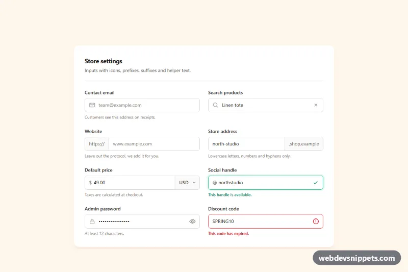
Tailwind CSS input group examples with leading icons, text prefixes and suffixes, a currency select, password toggle, clear button and helper text.

OTP Code Input – Bootstrap 6 inputs preview

OTP Code Input

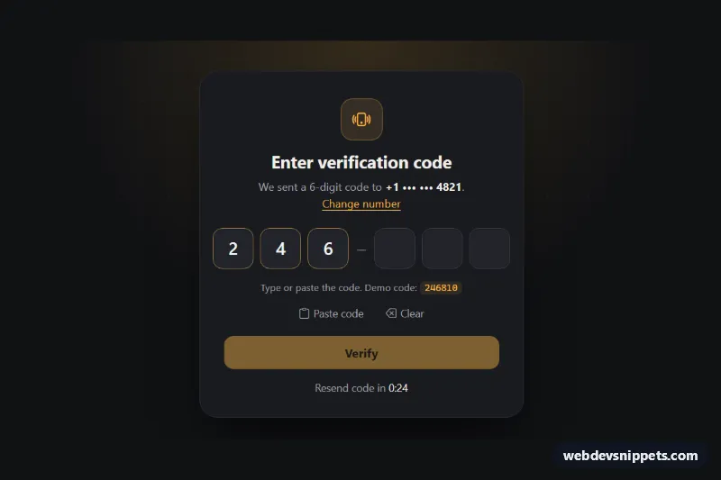
Dark Bootstrap 6 OtpInput verification card with 6 digit slots, paste support, auto-advance, auto-verify on complete, error state and a resend countdown.

Password Input with Strength Meter – Bootstrap 6 inputs preview

Password Input with Strength Meter

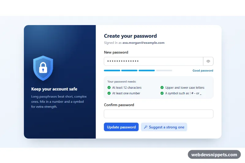
Bootstrap 6 password field with show/hide toggle, the Strength meter, a live requirement checklist, confirm match, Caps Lock hint and a password generator.

Floating Label Form Fields – Bootstrap 6 inputs preview

Floating Label Form Fields

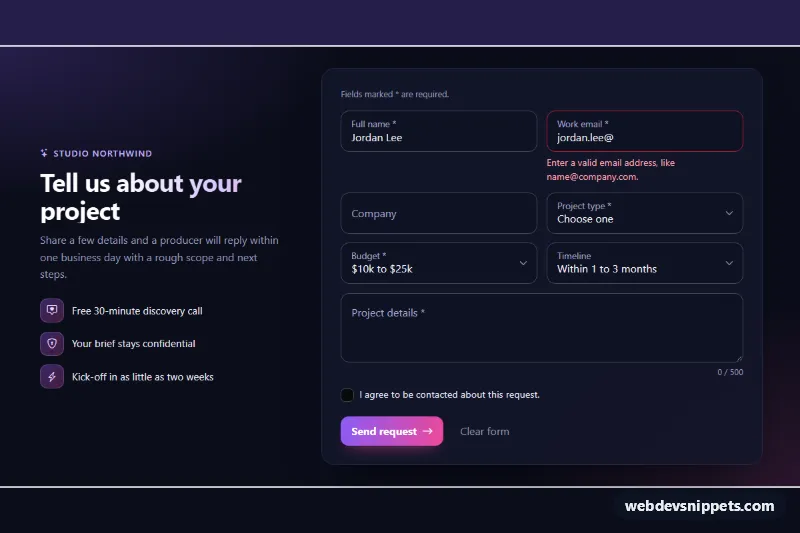
Dark Bootstrap 6 project request form with floating label inputs, selects and a textarea, CSS-only validation, a character counter and simulated submit.

Tag Input with Removable Chips – Tailwind CSS inputs preview

Tag Input with Removable Chips

Tailwind CSS tag input that turns typed words into removable chips, with Enter and comma support, paste splitting, a tag limit and suggestions.