Skip to content

OTP Code Input

Dark Bootstrap 6 OtpInput verification card with 6 digit slots, paste support, auto-advance, auto-verify on complete, error state and a resend countdown.

Also known as: otp input, verification code input, one time password field, 6 digit pin input

Bootstrap 6 Inputs Responsive Dark #dark #form #input #otp #verification

OTP Code Input live demo

Open in new tab

Bootstrap 6 code (HTML, CSS, JS)

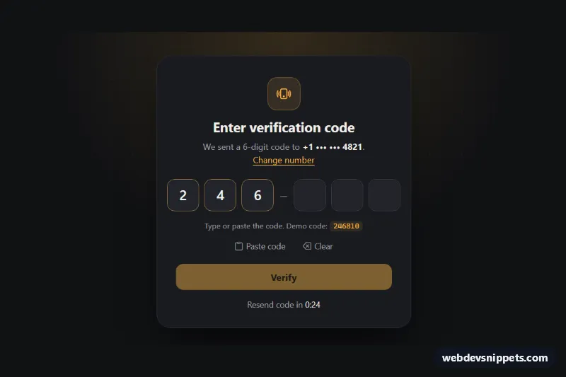
A dark verification screen built on the new Bootstrap 6 OtpInput component. Six digit slots split into two groups, with paste support, auto-advance, automatic verification when the last digit is entered, an error state and a resend countdown. Use it for two-factor login, phone confirmation or email codes.

How it works

The root .ocv-root (with data-bs-theme="dark") centers an .ocv-card. The code field is a single <input> inside <div class="otp otp-lg ocv-otp" data-bs-otp>. Bootstrap reads maxlength="6", hides the real input and draws six .otp-slot boxes. data-bs-groups="[3,3]" adds a separator in the middle. Because it stays one text field, typing moves to the next slot automatically. Backspace, arrow keys and SMS autofill (autocomplete="one-time-code") work, and pasting "246-810" strips the dash.

script.js gets the instance with OtpInput.getOrCreateInstance(). It listens to two Bootstrap events. input.bs.otpInput clears the error and enables the Verify button once all slots are filled. complete.bs.otpInput calls verify(), which shows a spinner and compares the value with DEMO_CODE. A wrong code adds .is-invalid to the .otp wrapper, which colors the slots red and shows the .ocv-error message. A correct code swaps the form for the .ocv-success panel.

"Paste code" reads the clipboard with otp.setValue() and falls back to a hint when clipboard access is blocked. "Clear" calls otp.clear(). The resend link stays hidden until the RESEND_SECONDS countdown in .ocv-timer reaches zero. The demo starts with three digits filled in.

Customization

  • DEMO_CODE and verify() in script.js: replace the local comparison with a fetch() to your server.
  • RESEND_SECONDS in script.js: change how long the visitor waits before requesting a new code.
  • maxlength on the input and data-bs-groups on .ocv-otp: use maxlength="4" without groups for a PIN. data-bs-separator sets the divider character.
  • Add data-bs-type="alphanumeric" to .ocv-otp for letter codes, or data-bs-mask="true" to show dots.
  • --bs-otp-size, --bs-otp-gap and --bs-otp-slot-border-radius on .ocv-otp: resize and reshape the slots. Add otp-connected for joined boxes.
  • --ocv-amber on .ocv-root: changes the accent, the Verify button (via the scoped --bs-warning-* tokens) and the focus rings.
  • Remove value="246" from the input for an empty first state.

Use cases

  • Two-factor login: six digit slots auto-advance and verify as soon as the last digit is entered
  • Phone number confirmation: SMS autofill and paste support make entering a texted code quick
  • Email verification screens: an error state and resend countdown handle wrong or expired codes
  • Banking and secure checkout: grouped slots with a clear error message confirm a user's identity

Accessibility

Screen readers announce one labelled text field, not six. The slots are aria-hidden, and help and error text are linked with aria-describedby. Errors set aria-invalid and are announced through a role="status" live region, and the success panel receives focus. Paste and autofill are never blocked, as WCAG 3.3.8 requires. The blinking caret stops under prefers-reduced-motion.

Bootstrap 6 notes

Bootstrap 5 had no OTP component. Developers usually built six separate inputs with custom focus-jumping JavaScript. Bootstrap 6's OtpInput (.otp, data-bs-otp, otp-lg, otp-connected) replaces all of that. Buttons use btn-solid theme-warning, and spinner-border-sm is now spinner-sm. Built on Bootstrap 6.0.0-alpha.1, so APIs may still change.
OTP Code Input at a glance

Framework
Bootstrap 6
Code
HTML, CSS, JavaScript
JavaScript
Vanilla JavaScript, no jQuery
Dependencies
Bootstrap 6, Bootstrap Icons
Layout
Responsive, works on mobile, dark design
Category
Inputs
License
Free for personal and commercial use

Questions about this template

Can I use the OTP Code Input code for free?

Yes. You can copy or download the code and use it in personal and commercial projects, including client work. No sign-up is needed. Reselling it as part of a component library or template collection is not allowed; see the license.

How do I add it to my website?

Load Bootstrap 6 and Bootstrap Icons from a CDN (the links are under Requirements). Paste the HTML where the component should appear, add the CSS to your stylesheet and load the JavaScript before the closing </body> tag. Download HTML gives you a complete page with everything already linked.

Does it need jQuery or a JavaScript framework?

No. The script is plain vanilla JavaScript, so it works without jQuery, React or Vue. You can still use the markup inside those frameworks.

Does it work on mobile?

Yes. The layout adapts to small screens. Use the Mobile and Tablet buttons above the live demo to check it at phone and tablet width.

Requirements

Add these to your page (already included in the download):

  • <link rel="stylesheet" href="https://cdn.jsdelivr.net/npm/bootstrap@6.0.0-alpha.1/dist/css/bootstrap.min.css">
  • <script type="module" src="https://cdn.jsdelivr.net/npm/bootstrap@6.0.0-alpha.1/dist/js/bootstrap.bundle.min.js"></script>
  • <link rel="stylesheet" href="https://cdn.jsdelivr.net/npm/bootstrap-icons@1.11.3/font/bootstrap-icons.min.css">

Built for Bootstrap 6.0.0-alpha.1. Bootstrap 6 ships as an ES module, so its script and this component's JavaScript load with type="module". Alpha releases can still change before the stable version.

OTP Code Input – Bootstrap 6 inputs component screenshot
OTP Code Input · Bootstrap 6 Inputs

More Inputs

Password Strength Meter – Bootstrap 5 inputs preview

Password Strength Meter

Bootstrap 5 password input with show/hide toggle, four-step strength meter, live requirements checklist and confirmation match check.

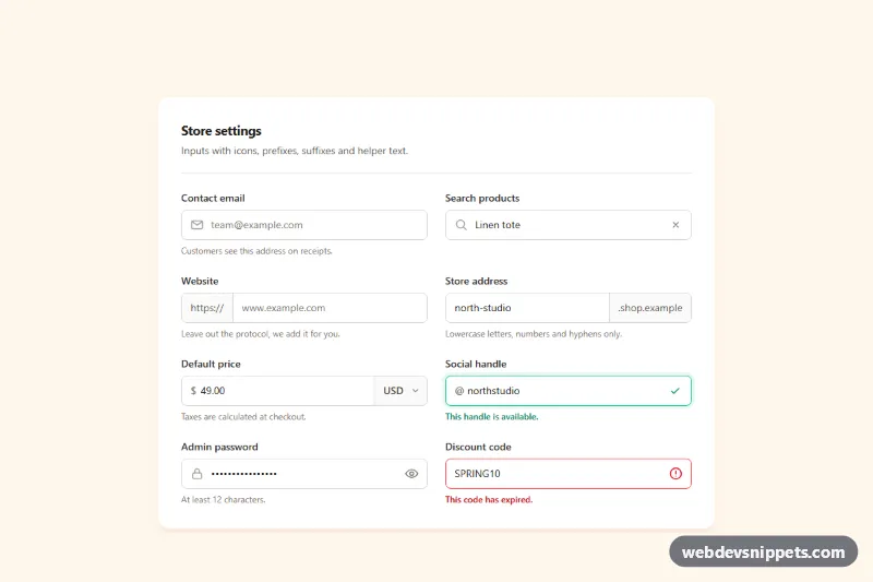
Inputs with Icons and Add-ons – Tailwind CSS inputs preview

Inputs with Icons and Add-ons

Tailwind CSS input group examples with leading icons, text prefixes and suffixes, a currency select, password toggle, clear button and helper text.

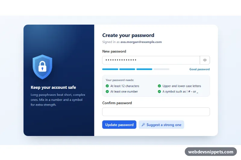
Password Input with Strength Meter – Bootstrap 6 inputs preview

Password Input with Strength Meter

Bootstrap 6 password field with show/hide toggle, the Strength meter, a live requirement checklist, confirm match, Caps Lock hint and a password generator.

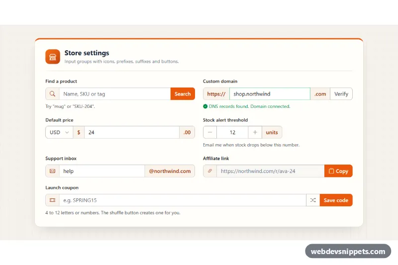
Input Groups with Icons and Buttons – Bootstrap 6 inputs preview

Input Groups with Icons and Buttons

Bootstrap 6 input group examples in a settings card: icon and text prefixes, suffixes, a currency menu, stepper, copy button and validated coupon field.

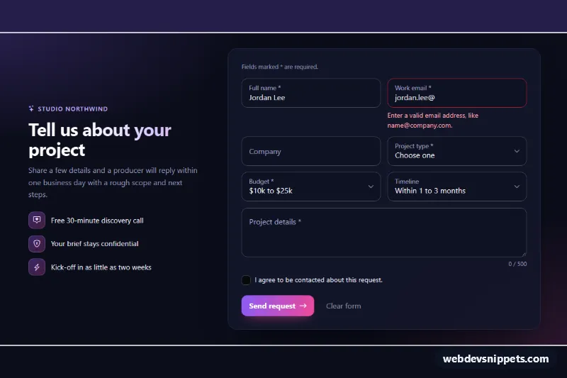
Floating Label Form Fields – Bootstrap 6 inputs preview

Floating Label Form Fields

Dark Bootstrap 6 project request form with floating label inputs, selects and a textarea, CSS-only validation, a character counter and simulated submit.

Tag Input with Removable Chips – Tailwind CSS inputs preview

Tag Input with Removable Chips

Tailwind CSS tag input that turns typed words into removable chips, with Enter and comma support, paste splitting, a tag limit and suggestions.