Skip to content

Login and Signup Tabs

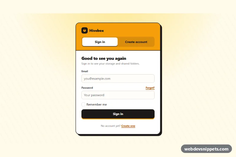
Bootstrap 6 card with segmented tabs that switch between a sign-in form and a create-account form, with validation, cross-links and simulated submits.

Also known as: login and register tabs, sign in sign up tabs, combined auth form, account card with tabs

Bootstrap 6 Login & Sign Up Responsive #card #form #login #signup #tabs

Login and Signup Tabs live demo

Open in new tab

Bootstrap 6 code (HTML, CSS, JS)

A bold Bootstrap 6 account card that puts Sign in and Create account behind one segmented tab control. Visitors switch forms without leaving the page. It uses an amber header, a hard black offset shadow and a dark primary button, and it fits as the account page of a SaaS product, an online shop or a community site.

How it works

.lst-root centers one .lst-card. The amber .lst-top header holds the brand and a ul.nav.nav-pills.lst-tabs with role="tablist". Each tab is a <button class="nav-link" data-bs-toggle="tab" data-bs-target="#…"> with role="tab", aria-controls and aria-selected, so the Bootstrap 6 Tab plugin works through the data API with no init code. The panes live in .tab-content: #lst-signin starts with tab-pane show active, and Bootstrap 6 fades panes on its own, so no .fade class is needed. CSS turns the pills into a two-column segmented control, and the active tab becomes a white chip.

script.js does two jobs. First, the "Create one" and "Sign in" links at the bottom of each pane (.lst-goto with data-lst-goto) call Tab.getOrCreateInstance(trigger).show(). After shown.bs.tab, focus moves to the first field of the new form. Second, every .lst-form is validated on submit with checkValidity(). Invalid fields and the terms .check get .is-invalid and aria-invalid, and Bootstrap 6 shows the sibling .invalid-feedback. A valid form shows a spinner, waits for a simulated request, resets, and shows the .lst-done success alert. The text depends on data-lst-form (signin or signup).

Customization

  • --lst-amber, --lst-amber-deep and --lst-ink on .lst-root: change the header color, link color and the black outline, shadow and button. They are mapped to --bs-primary-*, --bs-control-checked-bg and --bs-focus-ring.
  • box-shadow: 8px 8px 0 on .lst-card: remove it, or use a soft shadow, for a calmer look.
  • Swap the active class, aria-selected and tabindex between the two tab buttons, and show active between the panes, to open on Create account.
  • Add a third pane, such as "Magic link", with one more nav-item and tab-pane. Change grid-template-columns in .lst-tabs to repeat(3, 1fr).
  • Replace the setTimeout in the submit handler with fetch('/api/' + form.dataset.lstForm, …) to post to your login and signup endpoints.
  • minlength="8" on #lst-up-password: change the password rule, together with its .form-text and feedback.

Use cases

  • SaaS products: one card switches between Sign in and Create account without a page reload
  • Online shops: a single account page handles both returning and new customers
  • Community sites: cross-links let visitors move between the two forms
  • Account pages: each form validates input and runs a simulated submit

Accessibility

The tablist, tabs and tabpanels use the WAI-ARIA tabs pattern. Bootstrap updates aria-selected and moves focus with the arrow keys, and inactive tabs get tabindex="-1". Panes are focusable with a visible dashed outline. Every input has a visible label, errors set aria-invalid, and success messages use role="status". The button press effect is turned off under prefers-reduced-motion.

Bootstrap 6 notes

Tab markup is the same as in Bootstrap 5. The trigger must sit inside a .nav or [role=tablist], or the alpha.1 plugin throws. Panes no longer need .fade. btn-solid theme-primary replaces the old primary button class, .form-field replaces mb-3 wrappers, and checkboxes are a single .check. Built on Bootstrap 6.0.0-alpha.1, so class names may still change. IDs are fixed, so give each copy unique IDs if you use the card twice on a page.
Login and Signup Tabs at a glance

Framework
Bootstrap 6
Code
HTML, CSS, JavaScript
JavaScript
Vanilla JavaScript, no jQuery
Dependencies
Bootstrap 6, Bootstrap Icons
Layout
Responsive, works on mobile
Category
Login & Sign Up
License
Free for personal and commercial use

Questions about this template

Can I use the Login and Signup Tabs code for free?

Yes. You can copy or download the code and use it in personal and commercial projects, including client work. No sign-up is needed. Reselling it as part of a component library or template collection is not allowed; see the license.

How do I add it to my website?

Load Bootstrap 6 and Bootstrap Icons from a CDN (the links are under Requirements). Paste the HTML where the component should appear, add the CSS to your stylesheet and load the JavaScript before the closing </body> tag. Download HTML gives you a complete page with everything already linked.

Does it need jQuery or a JavaScript framework?

No. The script is plain vanilla JavaScript, so it works without jQuery, React or Vue. You can still use the markup inside those frameworks.

Does it work on mobile?

Yes. The layout adapts to small screens. Use the Mobile and Tablet buttons above the live demo to check it at phone and tablet width.

Requirements

Add these to your page (already included in the download):

  • <link rel="stylesheet" href="https://cdn.jsdelivr.net/npm/bootstrap@6.0.0-alpha.1/dist/css/bootstrap.min.css">
  • <script type="module" src="https://cdn.jsdelivr.net/npm/bootstrap@6.0.0-alpha.1/dist/js/bootstrap.bundle.min.js"></script>
  • <link rel="stylesheet" href="https://cdn.jsdelivr.net/npm/bootstrap-icons@1.11.3/font/bootstrap-icons.min.css">

Built for Bootstrap 6.0.0-alpha.1. Bootstrap 6 ships as an ES module, so its script and this component's JavaScript load with type="module". Alpha releases can still change before the stable version.

Login and Signup Tabs – Bootstrap 6 login & sign up component screenshot
Login and Signup Tabs · Bootstrap 6 Login & Sign Up

More Login & Sign Up

Login Form with Floating Labels – Pure CSS login & sign up preview

Login Form with Floating Labels

Clean pure CSS login card with animated floating labels, show/hide password, inline validation and a simulated sign-in state in vanilla JavaScript.

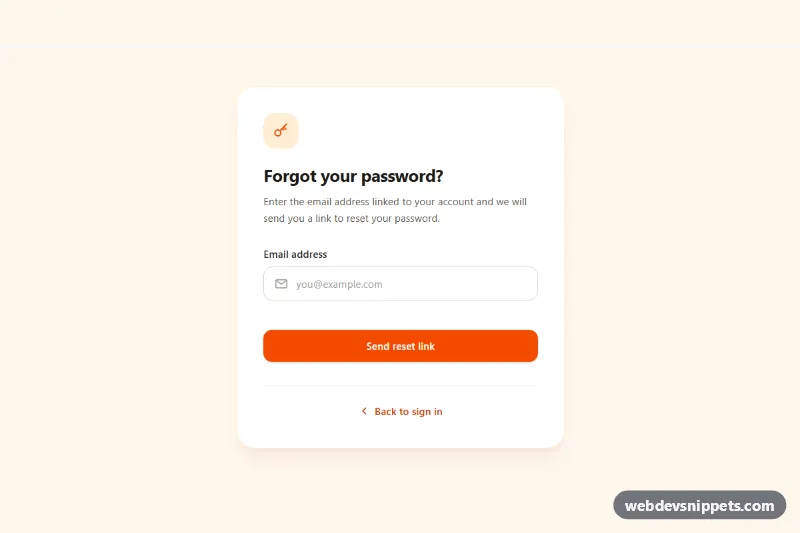
Forgot Password Form – Tailwind CSS login & sign up preview

Forgot Password Form

Tailwind CSS forgot password form with email validation, loading spinner, check-your-inbox success state and a resend cooldown timer.

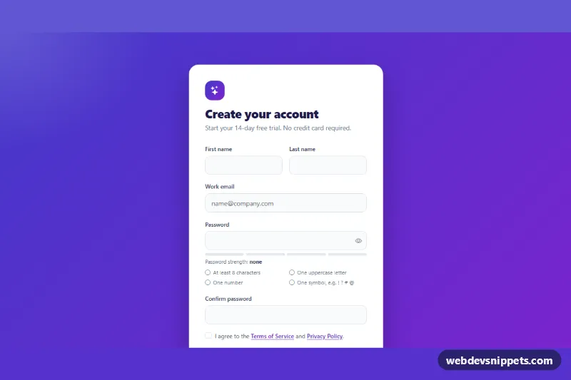
Signup Form with Validation – Bootstrap 5 login & sign up preview

Signup Form with Validation

Bootstrap 5 signup form with live password rules, a strength meter, show/hide toggle, password confirmation and a required terms checkbox.

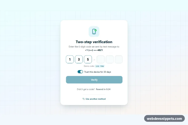
OTP Verification Form – Bootstrap 6 login & sign up preview

OTP Verification Form

Bootstrap 6 two-factor verification card using the new OtpInput component, with grouped digit slots, auto-submit, attempt limit, resend countdown and trust-device switch.

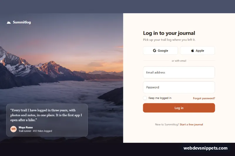
Split Login Page with Image – Bootstrap 6 login & sign up preview

Split Login Page with Image

Bootstrap 6 split-screen login page with a full-height photo and testimonial on one side and a floating-label form with Google and Apple sign-in on the other.

Signup Form with Password Strength – Bootstrap 6 login & sign up preview

Signup Form with Password Strength

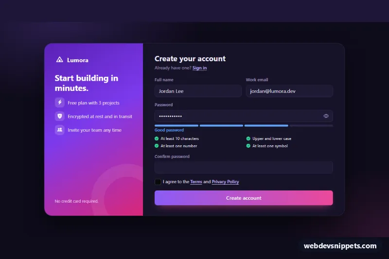
Dark Bootstrap 6 signup form using the new Strength component, with a live password checklist, show/hide toggle, confirm field, terms checkbox and success state.