Skip to content

Split Login Page with Image

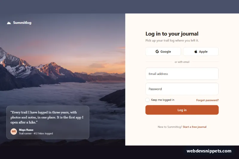
Bootstrap 6 split-screen login page with a full-height photo and testimonial on one side and a floating-label form with Google and Apple sign-in on the other.

Also known as: split screen login, login page with image, login page with testimonial, two column login page

Split Login Page with Image live demo

Open in new tab

Bootstrap 6 code (HTML, CSS, JS)

A split-screen Bootstrap 6 login page. One half is a full-height mountain photo with the brand and a glass testimonial card. The other half is a clean sign-in form with Google and Apple buttons, floating labels, "Keep me logged in" and a forgot-password link. Use it as the login route of a consumer app, a membership site or a travel product.

How it works

.slp-root is a CSS grid. On phones it is one column: the photo becomes a short banner above the form and the testimonial is hidden. From 768px it switches to two columns, and the testimonial .slp-quote appears at the bottom of the photo. .slp-photo is a real <img> with object-fit: cover, positioned behind a gradient overlay (.slp-media::after) so the white text stays readable. It is not lazy-loaded, because it is above the fold.

The form uses Bootstrap 6 floating labels. In Bootstrap 6 the <label> comes before the input inside .form-floating. Validation is the new CSS-only mode: data-bs-validate on the <form> makes Bootstrap show each .invalid-feedback through :user-invalid, so no validation classes are toggled. script.js only stops the real submit, keeps aria-invalid in sync, focuses the first invalid field, and simulates the request with a spinner. Then it writes a welcome message into the .slp-status live region. The provider buttons show a "Redirecting to …" message where your OAuth redirect would go.

Customization

  • --slp-accent and --slp-accent-dark on .slp-root: change the button, link and checkbox color. They are mapped to --bs-primary-*, --bs-control-checked-bg and --bs-focus-ring.
  • Replace the src of .slp-photo with your own image. The photo comes from Unsplash and should be swapped for your brand's imagery. Adjust object-position to keep the subject in view.
  • --slp-photo-bg on .slp-root: the tint shown while the photo loads.
  • Change grid-template-columns in the min-width: 1024px rule to make the photo wider or narrower than the form.
  • Remove .slp-quote if you do not want a testimonial, or replace it with a feature list.
  • Replace the setTimeout in the submit handler with fetch('/api/login', { method: 'POST', body: new FormData(form) }), and point the .slp-provider buttons at your OAuth routes.

Use cases

  • Consumer apps: a full-height photo with a testimonial card sits beside the sign-in form
  • Membership sites: Google and Apple buttons offer a quick way in
  • Travel products: floating labels and a Keep me logged in option keep the form tidy
  • Mobile visitors: the layout stacks into one column on phones

Accessibility

The page heading labels the section, and the photo has descriptive alt text. Every input has a real <label>, and invalid fields get aria-invalid="true" together with a visible message. Status messages are announced through role="status". Buttons and links have brand-colored focus outlines, and the dark overlay keeps the white text on the photo readable.

Bootstrap 6 notes

Floating labels still use .form-floating, but the label now comes first. data-bs-validate replaces BS5's validation classes and the JavaScript that toggled them. btn-solid theme-primary and btn-outline theme-secondary replace the old per-color button classes, and the checkbox is a single .check inside .form-field. Built on Bootstrap 6.0.0-alpha.1, so details may still change. Icons come from Bootstrap Icons.
Split Login Page with Image at a glance

Framework
Bootstrap 6
Code
HTML, CSS, JavaScript
JavaScript
Vanilla JavaScript, no jQuery
Dependencies
Bootstrap 6, Bootstrap Icons
Layout
Responsive, works on mobile
Category
Login & Sign Up
License
Free for personal and commercial use

Questions about this template

Can I use the Split Login Page with Image code for free?

Yes. You can copy or download the code and use it in personal and commercial projects, including client work. No sign-up is needed. Reselling it as part of a component library or template collection is not allowed; see the license.

How do I add it to my website?

Load Bootstrap 6 and Bootstrap Icons from a CDN (the links are under Requirements). Paste the HTML where the component should appear, add the CSS to your stylesheet and load the JavaScript before the closing </body> tag. Download HTML gives you a complete page with everything already linked.

Does it need jQuery or a JavaScript framework?

No. The script is plain vanilla JavaScript, so it works without jQuery, React or Vue. You can still use the markup inside those frameworks.

Does it work on mobile?

Yes. The layout adapts to small screens. Use the Mobile and Tablet buttons above the live demo to check it at phone and tablet width.

Requirements

Add these to your page (already included in the download):

  • <link rel="stylesheet" href="https://cdn.jsdelivr.net/npm/bootstrap@6.0.0-alpha.1/dist/css/bootstrap.min.css">
  • <script type="module" src="https://cdn.jsdelivr.net/npm/bootstrap@6.0.0-alpha.1/dist/js/bootstrap.bundle.min.js"></script>
  • <link rel="stylesheet" href="https://cdn.jsdelivr.net/npm/bootstrap-icons@1.11.3/font/bootstrap-icons.min.css">

Built for Bootstrap 6.0.0-alpha.1. Bootstrap 6 ships as an ES module, so its script and this component's JavaScript load with type="module". Alpha releases can still change before the stable version.

Split Login Page with Image – Bootstrap 6 login & sign up component screenshot
Split Login Page with Image · Bootstrap 6 Login & Sign Up

More Login & Sign Up

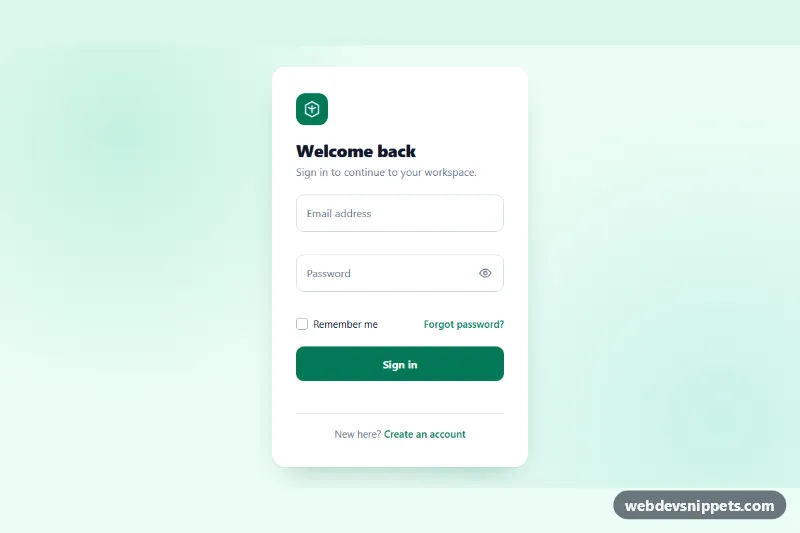
Login Form with Floating Labels – Pure CSS login & sign up preview

Login Form with Floating Labels

Clean pure CSS login card with animated floating labels, show/hide password, inline validation and a simulated sign-in state in vanilla JavaScript.

Forgot Password Form – Tailwind CSS login & sign up preview

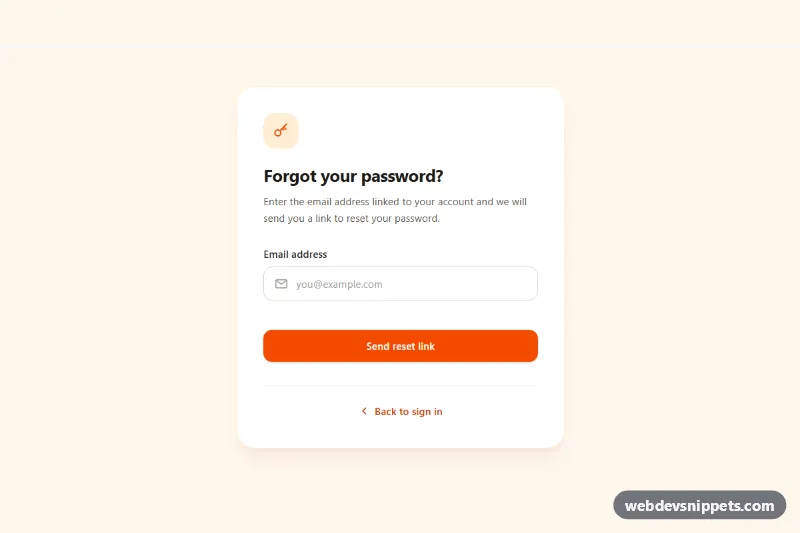
Forgot Password Form

Tailwind CSS forgot password form with email validation, loading spinner, check-your-inbox success state and a resend cooldown timer.

Signup Form with Validation – Bootstrap 5 login & sign up preview

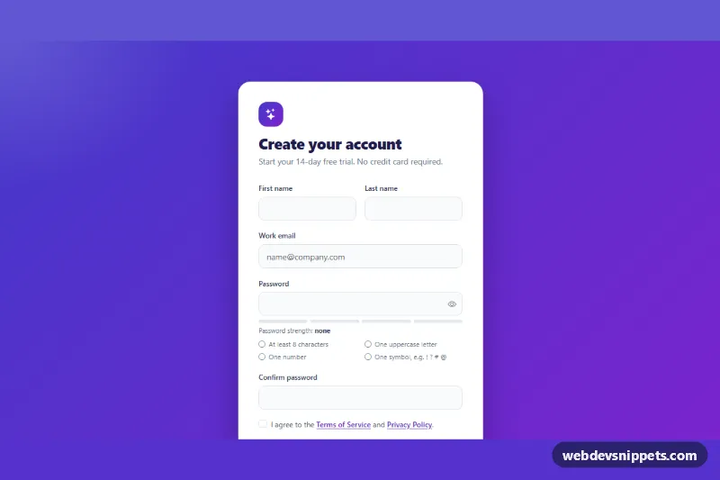
Signup Form with Validation

Bootstrap 5 signup form with live password rules, a strength meter, show/hide toggle, password confirmation and a required terms checkbox.

Login and Signup Tabs – Bootstrap 6 login & sign up preview

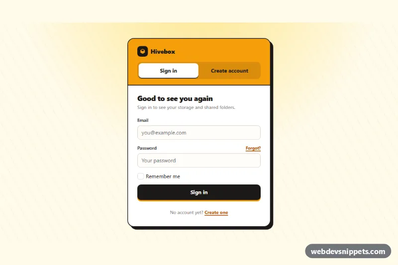
Login and Signup Tabs

Bootstrap 6 card with segmented tabs that switch between a sign-in form and a create-account form, with validation, cross-links and simulated submits.

OTP Verification Form – Bootstrap 6 login & sign up preview

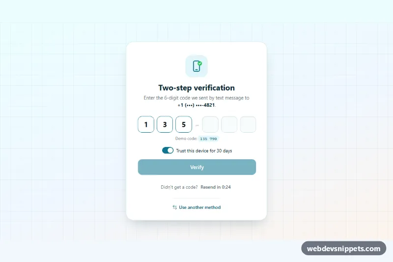
OTP Verification Form

Bootstrap 6 two-factor verification card using the new OtpInput component, with grouped digit slots, auto-submit, attempt limit, resend countdown and trust-device switch.

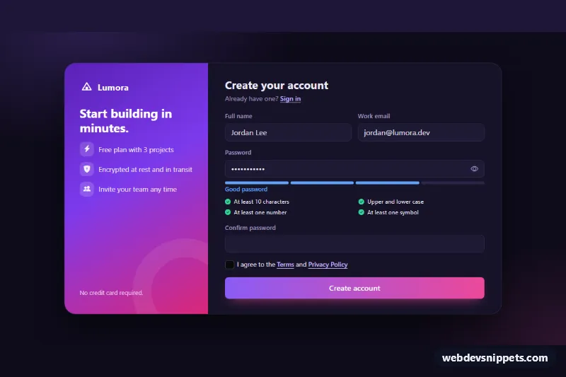
Signup Form with Password Strength – Bootstrap 6 login & sign up preview

Signup Form with Password Strength

Dark Bootstrap 6 signup form using the new Strength component, with a live password checklist, show/hide toggle, confirm field, terms checkbox and success state.