Skip to content

OTP Verification Form

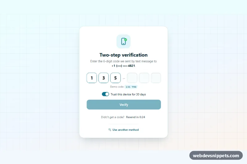
Bootstrap 6 two-factor verification card using the new OtpInput component, with grouped digit slots, auto-submit, attempt limit, resend countdown and trust-device switch.

Also known as: otp input, two step verification form, two factor authentication form, one time password screen

OTP Verification Form live demo

Open in new tab

Bootstrap 6 code (HTML, CSS, JS)

A Bootstrap 6 two-factor verification card built on the new OtpInput component. A single input is drawn as six digit slots in two groups. The form submits itself when the last digit is entered or a full code is pasted. It also has an attempt limit, a resend countdown and a "Trust this device" switch. Use it after a password login, for phone or email confirmation, or before sensitive account changes.

How it works

The code field is Bootstrap 6 markup: <div class="otp otp-lg" data-bs-otp> around one <input class="otp-input" maxlength="6">. The data API turns it into visual .otp-slot boxes while the real input stays underneath. So typing, deleting, pasting and SMS autofill (autocomplete="one-time-code" is added for you) all work as in a normal field. data-bs-groups="[3,3]" splits the slots with a data-bs-separator dash.

script.js gets the instance with OtpInput.getOrCreateInstance() and listens to two events. input.bs.otpInput enables the Verify button only when all digits are present. complete.bs.otpInput calls form.requestSubmit(). The submit handler simulates a server check against data-otv-code. A wrong code adds .is-invalid to .otp (red slots and a short shake), shows the message in .otv-error with the remaining attempts, and calls otp.clear(). After MAX_ATTEMPTS the input is disabled until a new code is requested.

The resend link starts disabled with a countdown from data-otv-resend seconds, shown in .otv-seconds. When it reaches zero, the button is enabled and a polite live region says so. A correct code shows the .otv-pane--done success state.

Customization

  • data-otv-code on .otv-root: the demo code. In production, verify on the server and remove this attribute and the .otv-hint line.
  • data-otv-resend on .otv-root: the resend delay in seconds (30 by default).
  • MAX_ATTEMPTS in script.js: how many wrong codes are allowed before a resend is required.
  • maxlength on .otp-input and data-bs-groups on .otp: change the code length or grouping, e.g. 8 digits as [4,4].
  • --bs-otp-size, --bs-otp-gap and --bs-otp-slot-border-radius on .otv-otp: resize and reshape the slots.
  • --otv-accent on .otv-root: the brand color for the button, switch, filled slots and focus rings.
  • Remove data-otv-demo to start with empty slots. Replace the setTimeout calls with fetch('/api/otp/verify') and fetch('/api/otp/resend').

Use cases

  • Two-factor login: a six-digit code is entered after the password step
  • Phone or email confirmation: the form submits itself when the last digit or a pasted code arrives
  • Sensitive account changes: an attempt limit blocks repeated wrong guesses
  • Trusted devices: a resend countdown and a Trust this device switch finish the flow

Accessibility

The input has a visually hidden <label> and is described by the hint and the error message. The decorative slots are aria-hidden, so screen readers read the single input. Errors use role="alert", resend availability is announced politely, and focus moves to the success heading after verification. The shake animation is turned off under prefers-reduced-motion.

Bootstrap 6 notes

Bootstrap 5 had no OTP field, so developers built rows of separate inputs. Bootstrap 6.0.0-alpha.1 adds .otp with data-bs-otp, plus otp-connected, otp-sm/otp-lg and the complete.bs.otpInput event. The switch uses the new .switch wrapper with a native switch attribute, and the button is btn-solid theme-primary. Alpha APIs can still change. Icons come from Bootstrap Icons.
OTP Verification Form at a glance

Framework
Bootstrap 6
Code
HTML, CSS, JavaScript
JavaScript
Vanilla JavaScript, no jQuery
Dependencies
Bootstrap 6, Bootstrap Icons
Layout
Responsive, works on mobile
Category
Login & Sign Up
License
Free for personal and commercial use

Questions about this template

Can I use the OTP Verification Form code for free?

Yes. You can copy or download the code and use it in personal and commercial projects, including client work. No sign-up is needed. Reselling it as part of a component library or template collection is not allowed; see the license.

How do I add it to my website?

Load Bootstrap 6 and Bootstrap Icons from a CDN (the links are under Requirements). Paste the HTML where the component should appear, add the CSS to your stylesheet and load the JavaScript before the closing </body> tag. Download HTML gives you a complete page with everything already linked.

Does it need jQuery or a JavaScript framework?

No. The script is plain vanilla JavaScript, so it works without jQuery, React or Vue. You can still use the markup inside those frameworks.

Does it work on mobile?

Yes. The layout adapts to small screens. Use the Mobile and Tablet buttons above the live demo to check it at phone and tablet width.

Requirements

Add these to your page (already included in the download):

  • <link rel="stylesheet" href="https://cdn.jsdelivr.net/npm/bootstrap@6.0.0-alpha.1/dist/css/bootstrap.min.css">
  • <script type="module" src="https://cdn.jsdelivr.net/npm/bootstrap@6.0.0-alpha.1/dist/js/bootstrap.bundle.min.js"></script>
  • <link rel="stylesheet" href="https://cdn.jsdelivr.net/npm/bootstrap-icons@1.11.3/font/bootstrap-icons.min.css">

Built for Bootstrap 6.0.0-alpha.1. Bootstrap 6 ships as an ES module, so its script and this component's JavaScript load with type="module". Alpha releases can still change before the stable version.

OTP Verification Form – Bootstrap 6 login & sign up component screenshot
OTP Verification Form · Bootstrap 6 Login & Sign Up

More Login & Sign Up

Login Form with Floating Labels – Pure CSS login & sign up preview

Login Form with Floating Labels

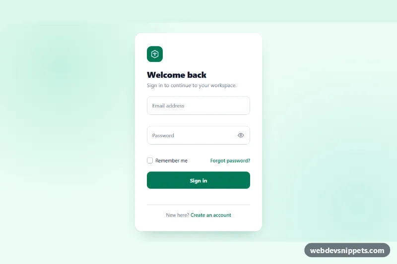
Clean pure CSS login card with animated floating labels, show/hide password, inline validation and a simulated sign-in state in vanilla JavaScript.

Forgot Password Form – Tailwind CSS login & sign up preview

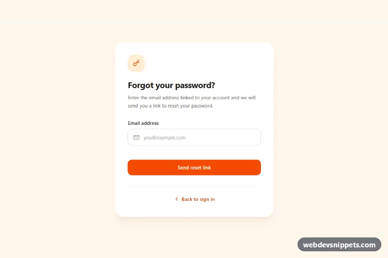
Forgot Password Form

Tailwind CSS forgot password form with email validation, loading spinner, check-your-inbox success state and a resend cooldown timer.

Signup Form with Validation – Bootstrap 5 login & sign up preview

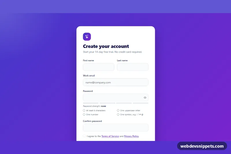
Signup Form with Validation

Bootstrap 5 signup form with live password rules, a strength meter, show/hide toggle, password confirmation and a required terms checkbox.

Login and Signup Tabs – Bootstrap 6 login & sign up preview

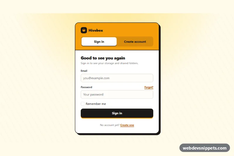
Login and Signup Tabs

Bootstrap 6 card with segmented tabs that switch between a sign-in form and a create-account form, with validation, cross-links and simulated submits.

Split Login Page with Image – Bootstrap 6 login & sign up preview

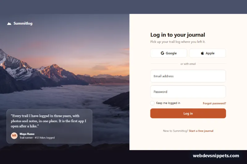
Split Login Page with Image

Bootstrap 6 split-screen login page with a full-height photo and testimonial on one side and a floating-label form with Google and Apple sign-in on the other.

Signup Form with Password Strength – Bootstrap 6 login & sign up preview

Signup Form with Password Strength

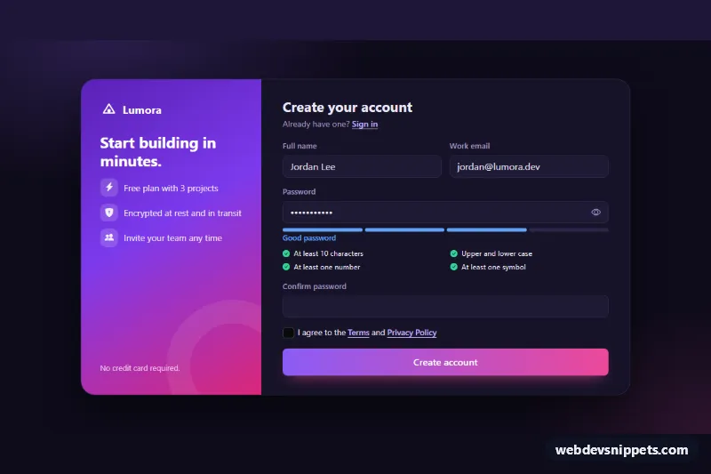
Dark Bootstrap 6 signup form using the new Strength component, with a live password checklist, show/hide toggle, confirm field, terms checkbox and success state.