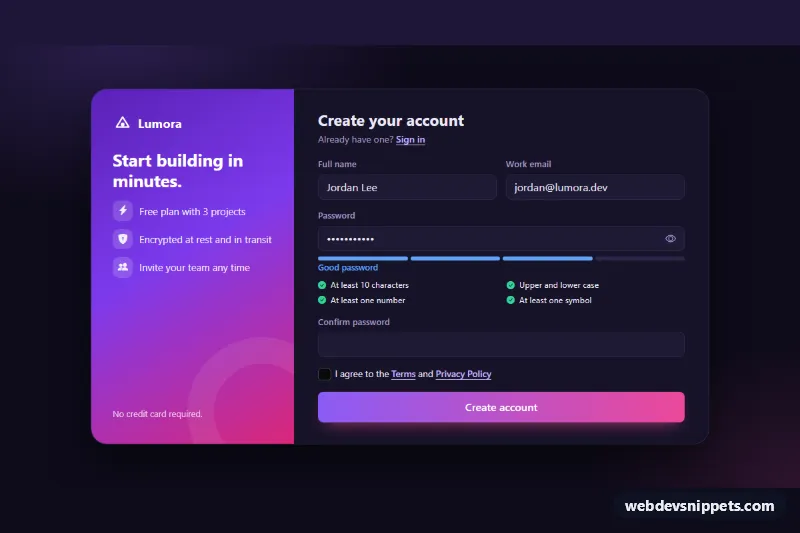
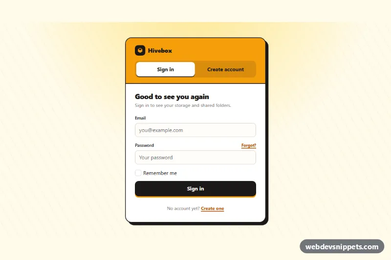
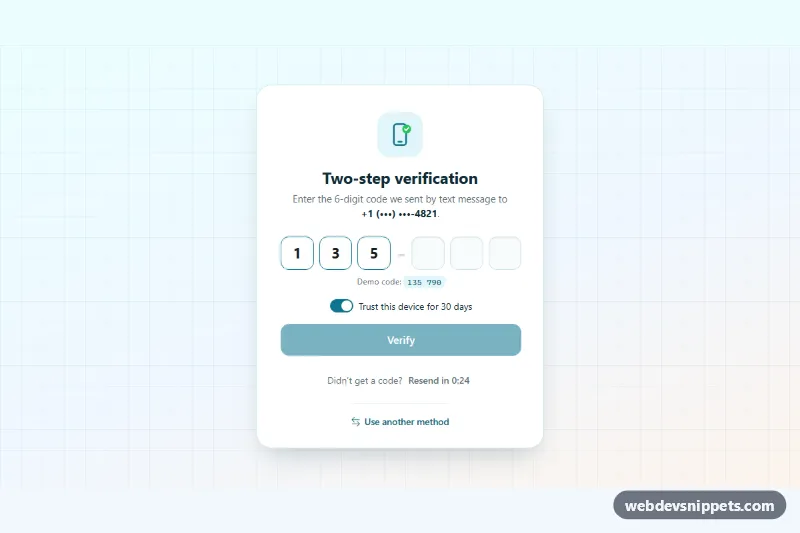
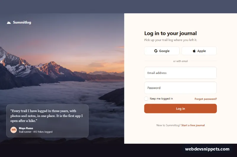
A dark Bootstrap 6 signup form built around the new Strength component. A four-segment meter rates the password as it is typed, and a live checklist shows which rules are met. The form also has a show/hide toggle, a confirm-password check, a terms checkbox and a "check your inbox" success state. It suits SaaS onboarding, developer tools and any create-account page.
How it works
.sps-root holds a two-column .sps-shell. The gradient .sps-aside lists plan benefits, and .sps-main holds the form. On narrow screens the columns stack.
The meter is Bootstrap 6 markup: <div class="strength" data-bs-strength> with four .strength-segment children and a sibling .strength-text. Strength finds the password input inside the same parent and colors the active segments by level (weak, fair, good, strong). data-bs-min-length="10" and the JSON in data-bs-messages set the length rule and the labels shown in .strength-text. The script gets the instance with Strength.getOrCreateInstance() and reads getStrength() on submit. Only "good" and "strong" (the ACCEPTED array) pass.
The .sps-rules list is separate from the meter. Each <li data-sps-rule> is checked by a function in the RULES object (length, case, number, symbol) on every input event. Met rules get .is-met and a filled check icon.
On submit, every field is validated. Errors set .is-invalid and aria-invalid, and focus moves to the first invalid field. The confirm field must match the password, and the terms .check must be ticked. After a simulated request, .sps-pane--done replaces the form. "Use a different email" resets the form and calls meter.evaluate() to clear the meter.
Customization
--sps-violet,--sps-pinkand--sps-okon.sps-root: change the brand gradient, the button and the "met" color. They are also mapped to--bs-primary-*for focus rings and checks.--bs-strength-weak-color…--bs-strength-strong-coloron.sps-strength: recolor the meter levels.data-bs-messageson.sps-strength: change the label for each level.data-bs-min-lengthchanges the length the meter rewards.RULESinscript.js: add or change checklist rules, and add a matching<li data-sps-rule="…">.ACCEPTEDinscript.js: set it to['strong']to require a strong password.- Remove
data-sps-demofrom.sps-rootin production. It fills sample values for the preview. - Replace the
setTimeoutin the submit handler withfetch('/api/signup', { method: 'POST', body: new FormData(form) }).
Use cases
- SaaS onboarding: a four-segment meter rates the password as the user types
- Developer tools: a live checklist shows which password rules are already met
- Account creation: a confirm field and terms checkbox complete the form
- Signup flows: a check your inbox screen appears after a successful submit
Accessibility
Each input has a visible label. The password input is described by the strength text and the rule list via aria-describedby, and .strength-text is a polite live region. The reveal button uses aria-pressed and a changing aria-label. After signup, focus moves to the success heading.
Bootstrap 6 notes
Bootstrap 5 had no password meter. Here it is .strength with data-bs-strength, initialised by the data API. btn-solid theme-primary replaces BS5's primary button class, and a plain .check in .form-field replaces the old checkbox wrapper. In 6.0.0-alpha.1, Strength also writes data-bs-strength onto .strength-text. If you set a value before DOMContentLoaded, the data API starts a second meter on that text, so the demo fill waits for load. Alpha APIs may still change. Icons are Bootstrap Icons.