Skip to content

Login Form with Remember Me

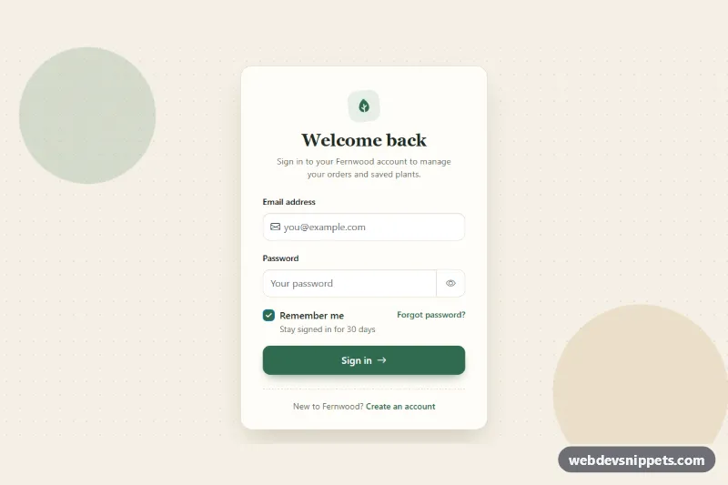
Bootstrap 6 login card with an email field, show/hide password toggle, Caps Lock hint, Remember me checkbox that recalls the email, forgot link and validation.

Also known as: login form, sign in form, login card with remember me, login with show password

Login Form with Remember Me live demo

Open in new tab

Bootstrap 6 code (HTML, CSS, JS)

A warm, light Bootstrap 6 login card with an email field, a show/hide password toggle, a "Remember me" checkbox and a "Forgot password?" link. It fits shop accounts, member areas and SaaS sign-in pages. When "Remember me" is checked, the card also recalls the email on the next visit and offers a "Not you?" reset.

How it works

The root .lrm-root centers one .lrm-card on a dotted cream background. The email field uses the Bootstrap 6 form-adorn pattern: a <label class="form-control form-adorn"> wraps an envelope icon in .form-adorn-icon and a borderless .form-ghost input. The password sits in an .input-group with an input-group-btn reveal button. "Remember me" is a plain .check inside a .form-field with a .form-field-content column for the label and hint.

script.js is an ES module. On submit it calls preventDefault(), then checks each field with checkValidity() and toggles .is-invalid and aria-invalid. Bootstrap 6 shows the matching .invalid-feedback for adorned fields and input groups. Once a field has been flagged, it is checked again on every keystroke. The .lrm-reveal button switches the input type and updates aria-pressed, the label and the icon. A keydown/keyup listener reads getModifierState('CapsLock') and shows .lrm-caps.

A valid submit shows the spinner, waits for a simulated request and then shows the .lrm-success alert. If remember is checked, the email is saved to localStorage under lrm-remembered-email and the .lrm-remembered strip appears with an avatar initial. All storage access is wrapped in try/catch, so the form still works in sandboxed iframes and private windows.

Customization

  • --lrm-green and --lrm-green-dark on .lrm-root: change the brand color. The same block maps them to --bs-primary-* and --bs-control-checked-bg, so the button and checkbox follow.
  • --lrm-bg, --lrm-card and --lrm-line on .lrm-root: set the page background, card surface and borders.
  • STORAGE_KEY at the top of script.js: rename the storage key, or remove the store.set() call to keep the checkbox purely server-side.
  • Replace the setTimeout in the submit handler with fetch('/api/login', { method: 'POST', body: new FormData(form) }) and send remember to the server so it can issue a longer session cookie.
  • minlength="8" on #lrm-password: change the minimum length. Update the .invalid-feedback text to match.
  • Remove checked from #lrm-remember to make "Remember me" opt-in.

Use cases

  • Shop accounts: email, password and a Forgot password link in one clean card
  • Member areas: a Remember me checkbox recalls the email on the next visit
  • SaaS sign-in pages: a show/hide toggle and Caps Lock hint help users type passwords correctly
  • Returning visitors: a Not you? link resets the remembered email

Accessibility

Every input has a visible label. Error messages are linked with aria-describedby, and aria-invalid is set together with .is-invalid. Focus moves to the first invalid field. The reveal button is a real <button> with aria-pressed and a changing aria-label. The success alert uses role="status", so screen readers announce it. Links and buttons have visible focus outlines. The arrow hover animation is turned off under prefers-reduced-motion.

Bootstrap 6 notes

btn-primary becomes btn-solid theme-primary, and form-check with form-check-input becomes a single .check inside .form-field. The mb-3 wrapper is replaced by .form-field, and form-adorn with form-ghost replaces the old icon-in-input workarounds. Built on Bootstrap 6.0.0-alpha.1, so class names may still change. Icons come from Bootstrap Icons.
Login Form with Remember Me at a glance

Framework
Bootstrap 6
Code
HTML, CSS, JavaScript
JavaScript
Vanilla JavaScript, no jQuery
Dependencies
Bootstrap 6, Bootstrap Icons
Layout
Responsive, works on mobile
Category
Login & Sign Up
License
Free for personal and commercial use

Questions about this template

Can I use the Login Form with Remember Me code for free?

Yes. You can copy or download the code and use it in personal and commercial projects, including client work. No sign-up is needed. Reselling it as part of a component library or template collection is not allowed; see the license.

How do I add it to my website?

Load Bootstrap 6 and Bootstrap Icons from a CDN (the links are under Requirements). Paste the HTML where the component should appear, add the CSS to your stylesheet and load the JavaScript before the closing </body> tag. Download HTML gives you a complete page with everything already linked.

Does it need jQuery or a JavaScript framework?

No. The script is plain vanilla JavaScript, so it works without jQuery, React or Vue. You can still use the markup inside those frameworks.

Does it work on mobile?

Yes. The layout adapts to small screens. Use the Mobile and Tablet buttons above the live demo to check it at phone and tablet width.

Requirements

Add these to your page (already included in the download):

  • <link rel="stylesheet" href="https://cdn.jsdelivr.net/npm/bootstrap@6.0.0-alpha.1/dist/css/bootstrap.min.css">
  • <script type="module" src="https://cdn.jsdelivr.net/npm/bootstrap@6.0.0-alpha.1/dist/js/bootstrap.bundle.min.js"></script>
  • <link rel="stylesheet" href="https://cdn.jsdelivr.net/npm/bootstrap-icons@1.11.3/font/bootstrap-icons.min.css">

Built for Bootstrap 6.0.0-alpha.1. Bootstrap 6 ships as an ES module, so its script and this component's JavaScript load with type="module". Alpha releases can still change before the stable version.

Login Form with Remember Me – Bootstrap 6 login & sign up component screenshot
Login Form with Remember Me · Bootstrap 6 Login & Sign Up

More Login & Sign Up

Login Form with Floating Labels – Pure CSS login & sign up preview

Login Form with Floating Labels

Clean pure CSS login card with animated floating labels, show/hide password, inline validation and a simulated sign-in state in vanilla JavaScript.

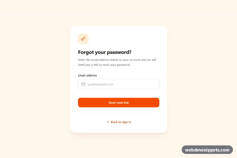
Forgot Password Form – Tailwind CSS login & sign up preview

Forgot Password Form

Tailwind CSS forgot password form with email validation, loading spinner, check-your-inbox success state and a resend cooldown timer.

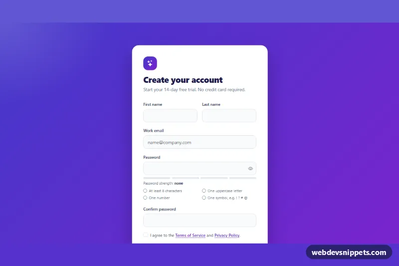
Signup Form with Validation – Bootstrap 5 login & sign up preview

Signup Form with Validation

Bootstrap 5 signup form with live password rules, a strength meter, show/hide toggle, password confirmation and a required terms checkbox.

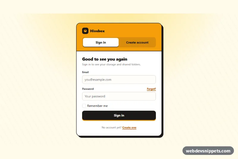
Login and Signup Tabs – Bootstrap 6 login & sign up preview

Login and Signup Tabs

Bootstrap 6 card with segmented tabs that switch between a sign-in form and a create-account form, with validation, cross-links and simulated submits.

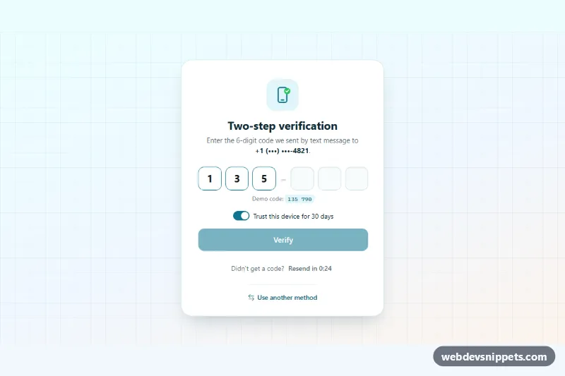
OTP Verification Form – Bootstrap 6 login & sign up preview

OTP Verification Form

Bootstrap 6 two-factor verification card using the new OtpInput component, with grouped digit slots, auto-submit, attempt limit, resend countdown and trust-device switch.

Split Login Page with Image – Bootstrap 6 login & sign up preview

Split Login Page with Image

Bootstrap 6 split-screen login page with a full-height photo and testimonial on one side and a floating-label form with Google and Apple sign-in on the other.