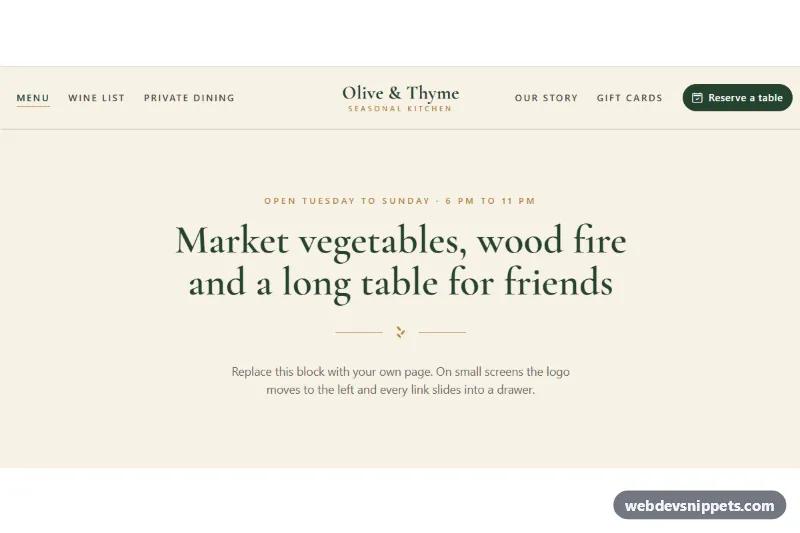
An elegant Bootstrap 6 navbar with the logo in the middle and the links split to its left and right, finished with a pill "Reserve a table" button. The cream, forest green and gold palette with a serif wordmark fits restaurants, boutiques, hotels and wedding sites. On smaller screens the logo moves to the left and all links slide into a Bootstrap 6 Drawer.
How it works
.clg-root is pinned to data-bs-theme="light" and contains nav.navbar.lg:navbar-expand.clg-navbar. Inside .clg-inner are the .clg-brand logo (inline SVG emblem, .clg-wordmark and .clg-tagline), the toggler and a <dialog class="drawer drawer-start">. The drawer body holds .clg-split, which contains the left link list .clg-links-start and .clg-end with the right links and the .clg-cta button.
When the navbar is at least 1024px wide, a container query in style.css takes over: .clg-split becomes a three-column grid (1fr, --clg-logo-space, 1fr) and the brand is absolutely positioned in the exact center of .clg-inner, over the empty middle column. Below that width the brand returns to normal flow next to the toggler, and the drawer stacks both lists and the button. A thin gold underline grows under hovered and active links using a ::after pseudo-element.
.clg-split is a separate wrapper on purpose: in Bootstrap 6.0.0-alpha.1 the expanded navbar forces display: flex !important on every element whose class contains "drawer", including .drawer-body, so the grid lives on a child element. script.js only keeps aria-expanded on the toggler in sync with the drawer.
Customization
--clg-green,--clg-goldand--clg-creamon.clg-root: the three brand colors used by the CTA, the underlines and the background.--clg-serif: font stack for the wordmark and headings (Cormorant Garamond from Google Fonts by default).--clg-logo-space(default12.5rem): width of the middle column; increase it for a wider logo.- Move list items between
.clg-links-startand the list inside.clg-endto rebalance both sides. - Replace the
.clg-ctatext and icon with your own call to action, or delete it for links only. - Remove the
section.clg-demoblock; it is sample content only.
Use cases
- Restaurants: links split around a centered logo with a pill Reserve a table button
- Boutiques and hotels: a cream, green and gold palette with a serif wordmark suits upscale brands
- Wedding sites: a thin gold underline grows under hovered and active links
- Mobile screens: the logo moves left and all links slide into a drawer
Accessibility
The navbar has aria-label="Main", the logo link has a clear aria-label and the current page uses aria-current="page". The drawer is a native modal <dialog> with a labelled title and an accessible close button. All links and the button show a gold focus outline, and the underline animation is disabled when the visitor prefers reduced motion. Text colors meet contrast on the cream background.
Bootstrap 6 notes
Compared with Bootstrap 5, navbar-expand-lg becomes lg:navbar-expand, navbar-collapse becomes a drawer dialog and btn-primary becomes btn-solid theme-primary, here recolored through --bs-theme-bg. Expansion is driven by the navbar's own width through container queries. Built on 6.0.0-alpha.1; alpha APIs can still change.