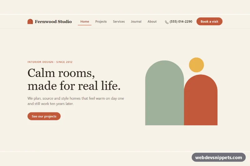
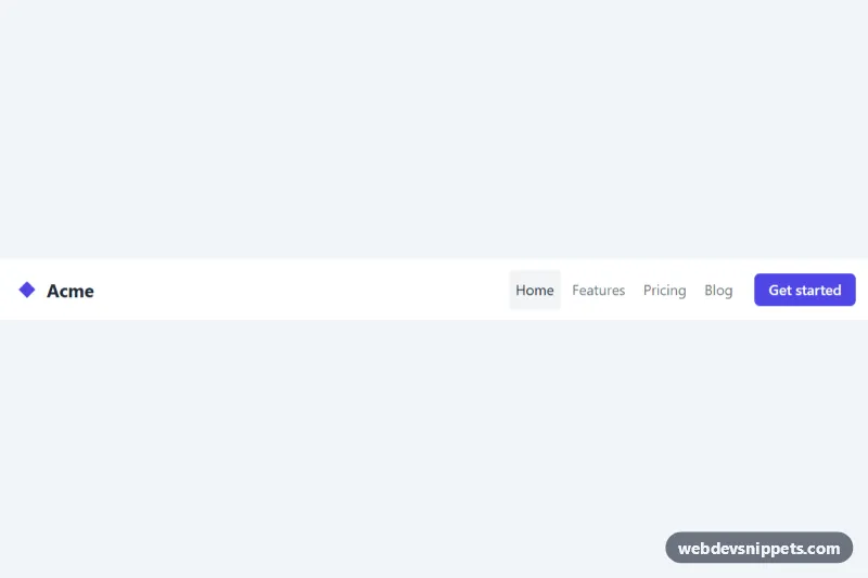
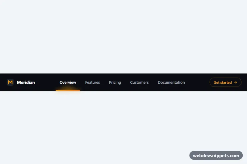
A responsive Bootstrap 6 navbar for a small business site. On wide screens it shows the brand, an inline link row, a phone number and a booking button. On phones and tablets the same markup becomes a slide-in Bootstrap 6 Drawer from the left, with larger tap targets, link icons, studio hours and social buttons. The warm cream and terracotta palette suits studios, agencies and local services.
How it works
The navbar uses lg:navbar-expand, the Bootstrap 6 replacement for navbar-expand-lg. Inside .container sit the brand, the .ndw-toggler button and a <dialog class="drawer drawer-start ndw-panel">. Below a navbar width of 1024px the toggler is visible, and data-bs-toggle="drawer" with data-bs-target="#ndw-panel" opens the drawer as a modal dialog with a blurred backdrop. From 1024px Bootstrap renders the same <dialog> inline, hides its .drawer-header and lays out .drawer-body as a row. No markup is duplicated.
style.css styles both states. A named container query, @container ndw (width >= 1024px), hides .ndw-link-icon and the .ndw-extra info card. It also turns the active link into an underline and places .ndw-actions in a row. The navbar is a query container in Bootstrap 6, so the layout follows the navbar's width, not the viewport.
script.js imports Drawer from the bundle. When a link is clicked it moves .active and aria-current="page", then closes the drawer if it is open. It also keeps aria-expanded on the toggler in sync through shown.bs.drawer and hidden.bs.drawer.
Customization
--ndw-accenton.ndw-root: recolors the logo, the active link, the link icons and both.ndw-ctabuttons.--ndw-creamand--ndw-sandon.ndw-root: change the navbar and drawer background and the hours card.- Replace
drawer-startwithdrawer-end,drawer-topordrawer-bottomon.ndw-panelto slide the menu in from another side. --bs-drawer-widthon.ndw-panel: sets the drawer width (defaultmin(340px, 88vw)).- Change
lg:navbar-expandtomd:navbar-expandand the container query to768pxso the inline layout starts earlier. - Delete
.ndw-extraif you only need links in the drawer. - Remove
event.preventDefault()inscript.jsso the links follow their realhref.
Use cases
- Small business sites: inline links, phone number and booking button on desktop, one drawer on phones
- Studios and agencies: the mobile drawer adds link icons, studio hours and social buttons
- Local services: larger tap targets make navigation comfortable on phones and tablets
- Salons and clinics: a booking button stays easy to reach in the header
Accessibility
The navbar is a labelled <nav>. The toggler has aria-controls, aria-expanded and an aria-label. The drawer is a native <dialog> labelled by its title. It traps focus while open, closes with Escape or the close button, and returns focus to the toggler. The current page uses aria-current="page". Icon-only social buttons carry aria-labels, and every interactive element has a visible terracotta focus outline.
Bootstrap 6 notes
Bootstrap 5 used .offcanvas plus .navbar-collapse for this pattern. Bootstrap 6 uses a single <dialog class="drawer"> inside the navbar, closed with data-bs-dismiss="drawer". Avoid custom class names that contain the word "drawer" inside an expanding navbar: Bootstrap's [class*=drawer] selector would match them. Built on Bootstrap 6.0.0-alpha.1, so APIs may still change. Icons come from Bootstrap Icons.