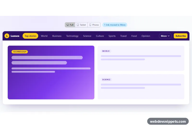
A news-style Bootstrap 6 navbar built on the new NavOverflow component, a "Priority+" pattern: as many section links as fit stay visible, and the rest move into a "More" menu automatically. No hamburger is needed. A small demo toolbar lets you switch the preview between full, tablet and phone widths to watch the links move.
How it works
.nof-root is pinned to data-bs-theme="light"; the nav.navbar.navbar-expand.nof-navbar inside .nof-frame uses data-bs-theme="dark" on a deep purple background. Between the brand and the .nof-subscribe button sits div.nof-overflow with data-bs-toggle="nav-overflow". Bootstrap initializes it on page load: it measures the width of that wrapper (not the viewport), hides the items that do not fit and copies them as menu-item links into a generated "More" .menu. The first item has nav-overflow-keep, so "Top stories" never moves.
Options are plain data attributes: data-bs-more-text="More" sets the toggle label and data-bs-icon-placement="end" puts the icon after it. The chevron comes from the inline SVG marked with data-bs-overflow-icon, which Bootstrap uses instead of its default three-dot icon.
script.js imports NavOverflow from the bundle only for the demo. The width radios set --nof-frame-width on .nof-root; after the change the script calls NavOverflow.getOrCreateInstance(...).update() and refreshes the .nof-count chip, which also listens for the overflow.bs.navoverflow event.
Customization
- Add or remove
li.nav-itementries inul.nof-nav; NavOverflow recalculates on every resize. - Put
nav-overflow-keepon any item that must always stay visible. data-bs-more-text: rename the toggle, for example "Sections"; remove the attribute to get Bootstrap's default label.data-bs-collapse-below="md"on.nof-overflow: move every link into the menu when the wrapper is narrower than that breakpoint.--nof-navbar-bgand--nof-accenton.nof-root: change the bar color and the yellow accent of the active pill, logo and Subscribe button.- Delete
.nof-controlsand.nof-page(and the demo code inscript.js) for production; the navbar works with no script at all.
Use cases
- News sites: as many section links as fit stay visible and the rest move into a More menu
- Magazines and blogs: many categories fit in one bar without a hamburger button
- Content portals: the first link, such as Top stories, can be pinned so it never moves
- Responsive testing: demo buttons switch between full, tablet and phone widths to watch links move
Accessibility
The navbar has aria-label="Sections" and the current section uses aria-current="page". The generated "More" button is a real button with aria-expanded, and its menu supports keyboard navigation and Escape through Bootstrap's Menu. The demo width switch is a labelled radio btn-group, and the counter chip is a polite role="status" region. Focus outlines use the yellow accent, and the frame resize transition respects prefers-reduced-motion.
Bootstrap 6 notes
There is no Bootstrap 5 equivalent: in Bootstrap 5 you would hide links with d-lg-none or build a custom script. Here NavOverflow, Menu (replacing dropdown-menu), btn-check labels with the input inside, and the new chip component do the work. Built on 6.0.0-alpha.1; avoid Menu dropdowns inside the overflowing list for now, because relocated submenus can log a console error after a resize in this alpha.