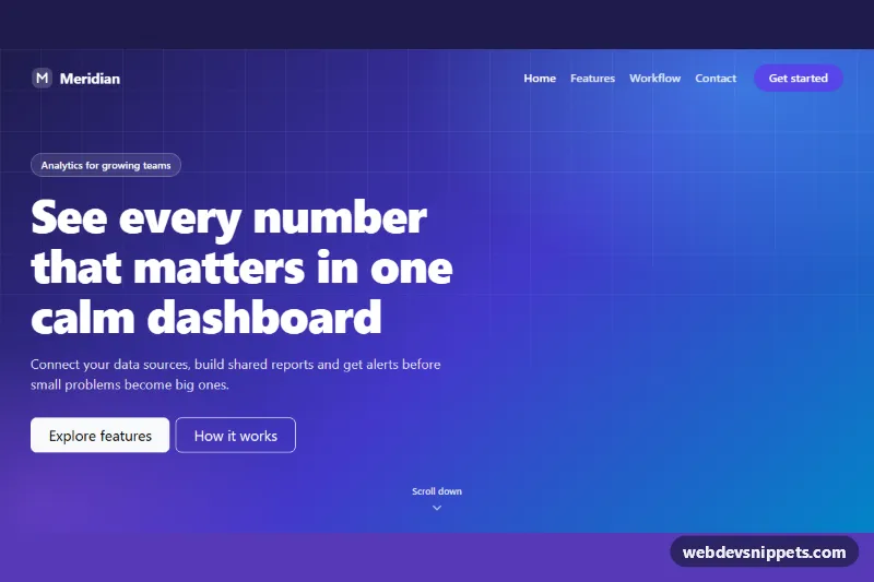
A Bootstrap 6 transparent navbar that floats over a full-height photo hero and turns into a solid, frosted white bar as soon as the visitor scrolls. It suits travel, hospitality, portfolio and landing pages where the first screen should be all image.
How it works
.tnh-root holds three parts: nav.navbar.md:navbar-expand.fixed-top.tnh-navbar, the header.tnh-hero and a short .tnh-after section that gives the page something to scroll. The navbar starts with data-bs-theme="dark" and --bs-navbar-bg: transparent, so white links sit directly on the photo. The hero uses the Unsplash image from --tnh-hero-image as a CSS background with a dark gradient overlay for text contrast and min-height: max(100vh, 34rem).
script.js listens to the window scroll event (passive). When window.scrollY passes the value in data-tnh-offset, it adds .tnh-solid and Bootstrap's navbar-translucent class and switches the navbar to data-bs-theme="light". The CSS then swaps the navbar colors, shrinks the padding and adds a shadow, while navbar-translucent gives the white bar its backdrop blur. Scrolling back to the top restores the transparent state. Because the color mode flips too, the Destinations Menu and the mobile drawer always match the bar.
Below 768px the links collapse into a <dialog class="drawer drawer-top"> opened by the toggler; the script keeps the toggler's aria-expanded in sync.
Customization
data-tnh-offset="40"on.tnh-root: scroll distance in pixels before the bar turns solid.--tnh-hero-imageon.tnh-root: point it at your own photo.--tnh-accent(default orange#f97316): colors both.tnh-ctabuttons and the active link in the solid state.--tnh-solid-bg: background color of the scrolled navbar.- The
linear-gradientin.tnh-hero: raise the alpha values for a darker overlay behind light photos. - Replace
drawer-topwithdrawer-endfor a side panel on mobile.
The hero photo is from Unsplash; replace it with your own image.
Use cases
- Travel and hospitality sites: white links float over a full-height photo until the visitor scrolls
- Portfolio pages: the first screen stays all image, then a frosted solid bar appears
- Landing pages: an orange call-to-action button stays in the header in both states
- Mobile visitors: links collapse into a top drawer on screens under 768px
Accessibility
The navbar has aria-label="Main" and the current link uses aria-current="page". Text on the photo sits on a dark gradient for contrast, and the solid state uses dark text on white. The Menu toggle is a button with aria-expanded, the drawer is a native modal <dialog> with a labelled title, and all custom focus states show an orange outline. The padding transition only runs when prefers-reduced-motion allows it.
Usage notes
The bar uses fixed-top, so place the component at the very top of the page; the hero's top padding keeps the headline clear of the bar. Use one instance per page.
Bootstrap 6 notes
Bootstrap 5's navbar-dark/navbar-light pair is replaced by toggling data-bs-theme on the navbar, offcanvas by drawer, and dropdown-menu by menu. The orange buttons use btn-solid theme-warning with the theme variables --bs-theme-bg and --bs-theme-contrast overridden in .tnh-cta. Built on Bootstrap 6.0.0-alpha.1; alpha APIs can still change.