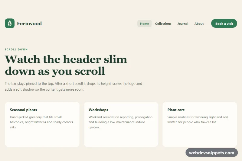
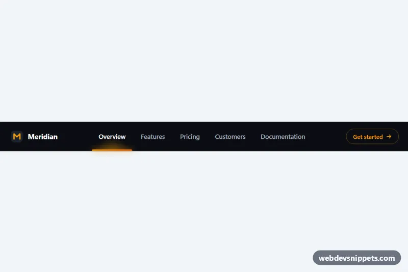
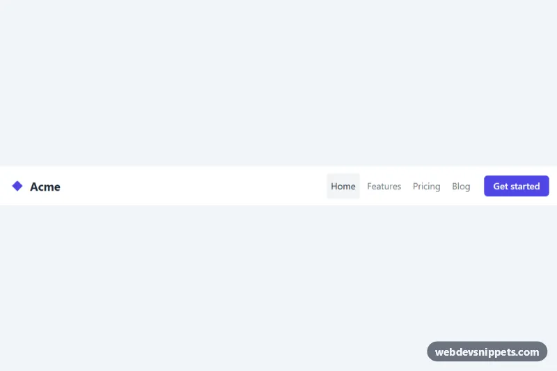
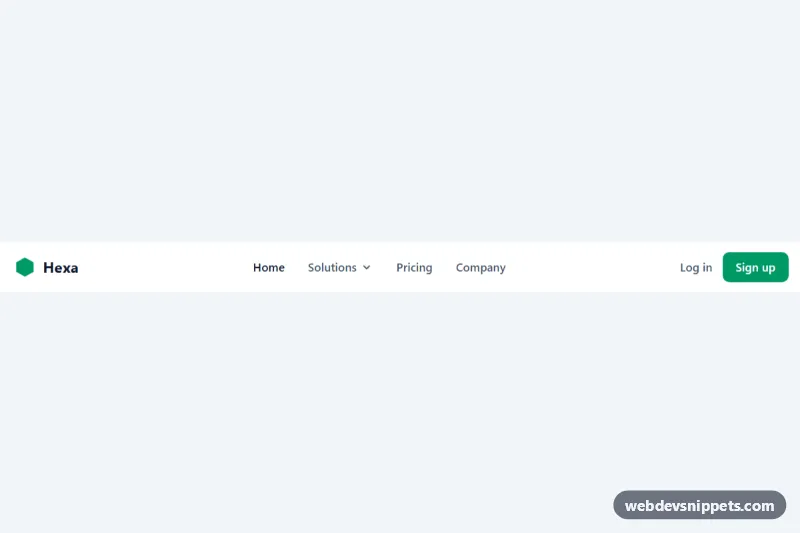
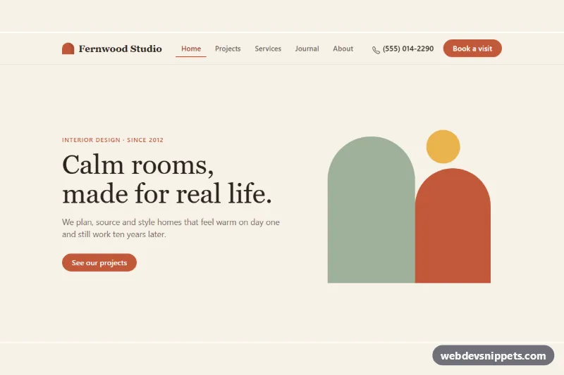
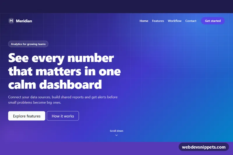
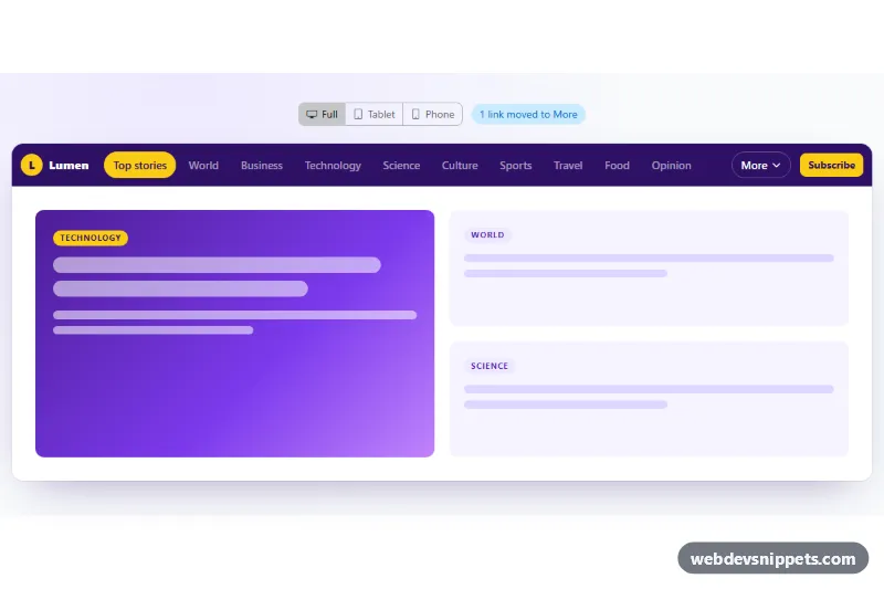
A sticky website header built with plain CSS and a small vanilla JavaScript helper that shrinks its height, logo and wordmark once the visitor starts scrolling. It suits landing pages, shops and blogs where you want the navigation always within reach without a tall bar eating screen space.
How it works
The root .shk-page wraps everything. Its first child is an invisible .shk-sentinel positioned at the top of the page with a height of --shk-threshold. The header.shk-header uses position: sticky; top: 0, so it stays pinned while the page scrolls underneath.
The script creates an IntersectionObserver for the sentinel. As soon as the sentinel leaves the viewport, it adds .shk-header--compact to the header; scrolling back to the top removes it. The compact class swaps --shk-height for --shk-height-compact on .shk-bar, shrinks .shk-logo from --shk-logo to --shk-logo-compact, reduces the .shk-wordmark font size and tightens the .shk-cta padding. It also adds a soft shadow and a translucent, blurred background (with a solid fallback when backdrop-filter is not supported). All of these changes are animated with CSS transitions, so the script only flips one class and never touches inline styles. Older browsers without IntersectionObserver fall back to a passive scroll listener.
Below 860 px the links collapse into a dropdown. The .shk-toggle button opens .shk-nav by toggling .is-open and updating aria-expanded. The hamburger lines morph into a cross, and the panel closes again on Escape, on a link click or when the viewport grows to desktop width.
Customization
--shk-heightand--shk-height-compacton.shk-page: the full and scrolled bar heights, e.g. 110px and 56px for a more dramatic shrink.--shk-logoand--shk-logo-compact: the logo size before and after scrolling.--shk-threshold: how far the page must scroll before the header shrinks; the sentinel takes this height.--shk-speed: duration of every height, size and shadow transition.--shk-accent,--shk-bgand--shk-ink: the green brand color, the cream background and the text color.- Replace the inline SVG inside
.shk-brandand the.shk-wordmarktext with your own logo and name. - Remove the
main.shk-contentdemo block and place the header at the top of your own page; keep.shk-sentinelright before it.
Use cases
- Landing pages: the header stays pinned and shrinks its height and logo after a short scroll
- Online shops: navigation stays in reach with a call-to-action button
- Blogs: a blurred translucent backdrop keeps the bar light over content
- Mobile sites: below 860 px the links collapse into a dropdown with a hamburger toggle
- Content sites: the current page link is marked and Escape closes the menu
Accessibility
The navigation is a nav landmark with aria-label="Main", and the current page link carries aria-current="page". The mobile toggle is a real button with aria-expanded and aria-controls, plus a visually hidden label. All interactive elements show a clear focus outline, and Escape returns focus to the toggle. With prefers-reduced-motion: reduce the header still changes size, but instantly.
Usage notes
Sticky positioning stops working if an ancestor of .shk-header has overflow: hidden or overflow: auto. Several .shk-page roots on one page are supported because the script scopes all queries to each root.