Skip to content

Styled Form Select Sizes

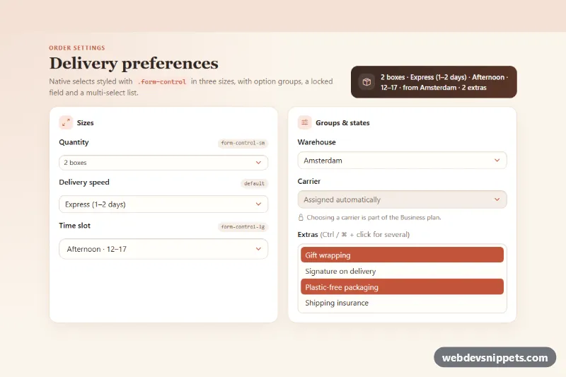
Bootstrap 6 native selects styled with .form-control in small, default and large sizes, plus option groups, a disabled field and a multi-select with a live summary.

Also known as: select sizes, small large select, styled select dropdown, select with option groups, multiple select list

Bootstrap 6 Selects Responsive #dropdown #form #responsive #select #sizes

Styled Form Select Sizes live demo

Open in new tab

Bootstrap 6 code (HTML, CSS, JS)

A warm, card-based showcase of Bootstrap 6 native selects: small, default and large sizes, a grouped list with <optgroup>, a disabled field with help text and a multi-select list. A summary bar in the header shows the current choices in one line. It suits checkout steps, order settings and admin preference pages.

How it works

Bootstrap 6 dropped .form-select, so every <select> here uses .form-control. The left .fss-card stacks three fields: form-control form-control-sm, plain form-control and form-control form-control-lg. A .fss-size-tag next to each label names the class. Each label and select sits in a .form-field wrapper, the Bootstrap 6 grid that replaces the old mb-3 div.

The right card holds:

  • a select whose options are grouped by region with <optgroup>, with one option disabled;
  • a disabled select linked to its .form-text help line through aria-describedby;
  • .fss-multi, a multiple size="4" select. Bootstrap removes the caret on it automatically.

The look comes from Bootstrap's own custom properties, set on .fss-root .form-control: --bs-control-bg, --bs-control-border-color, --bs-control-border-radius and --bs-control-select-bg. The last one swaps the caret for a terracotta SVG stored in --fss-caret. Selected options in the multi-select get the accent color through option:checked.

script.js (an ES module) reads every select with a data-fss-key attribute when one of them fires change. It writes a short summary into the <output class="fss-output">. Each .fss-root on the page is handled on its own.

Customization

  • --fss-accent and --fss-accent-soft on .fss-root: change the eyebrow, icons, focus ring and selected options.
  • --fss-caret on .fss-root: replace the SVG data URI to change the arrow icon or its stroke color (%23c2553a).
  • --bs-control-border-radius in the .fss-root .form-control rule: use 0.25rem for sharp fields or 999px for pill selects.
  • Swap form-control-sm / form-control-lg on any select to change its height, padding and font size.
  • Add or remove data-fss-key on a select to include or skip it in the summary. Warehouse gets a "from" prefix in describe().
  • Remove the disabled attribute from #fss-carrier and add real options once the plan allows carrier choice.

Use cases

  • Checkout steps: a grouped region select with a disabled option and a disabled carrier field with help text
  • Order and preference settings: small, default and large selects match different form densities
  • Admin preference pages: a multi-select list and a live summary bar show the current choices
  • Design reference pages: all native select variants sit side by side with their class names

Accessibility

Every select has a visible <label for>. The disabled carrier field is described by its help text. The summary is an <output> with aria-live="polite", so screen readers announce the new values. The focus ring comes from --bs-focus-ring, set on the root in the accent color. Native selects keep full keyboard support, including type-ahead and multi-select with Shift/Ctrl.

Bootstrap 6 notes

.form-select from Bootstrap 5 is gone. Use .form-control on <select> with form-control-sm or form-control-lg. The mb-3 wrapper becomes .form-field. Colors are oklch() tokens, and --bs-*-rgb variables no longer exist. This snippet targets Bootstrap 6.0.0-alpha.1, so class names and variables may still change. Icons come from Bootstrap Icons.
Styled Form Select Sizes at a glance

Framework
Bootstrap 6
Code
HTML, CSS, JavaScript
JavaScript
Vanilla JavaScript, no jQuery
Dependencies
Bootstrap 6, Bootstrap Icons
Layout
Responsive, works on mobile
Category
Selects
License
Free for personal and commercial use

Questions about this template

Can I use the Styled Form Select Sizes code for free?

Yes. You can copy or download the code and use it in personal and commercial projects, including client work. No sign-up is needed. Reselling it as part of a component library or template collection is not allowed; see the license.

How do I add it to my website?

Load Bootstrap 6 and Bootstrap Icons from a CDN (the links are under Requirements). Paste the HTML where the component should appear, add the CSS to your stylesheet and load the JavaScript before the closing </body> tag. Download HTML gives you a complete page with everything already linked.

Does it need jQuery or a JavaScript framework?

No. The script is plain vanilla JavaScript, so it works without jQuery, React or Vue. You can still use the markup inside those frameworks.

Does it work on mobile?

Yes. The layout adapts to small screens. Use the Mobile and Tablet buttons above the live demo to check it at phone and tablet width.

Requirements

Add these to your page (already included in the download):

  • <link rel="stylesheet" href="https://cdn.jsdelivr.net/npm/bootstrap@6.0.0-alpha.1/dist/css/bootstrap.min.css">
  • <script type="module" src="https://cdn.jsdelivr.net/npm/bootstrap@6.0.0-alpha.1/dist/js/bootstrap.bundle.min.js"></script>
  • <link rel="stylesheet" href="https://cdn.jsdelivr.net/npm/bootstrap-icons@1.11.3/font/bootstrap-icons.min.css">

Built for Bootstrap 6.0.0-alpha.1. Bootstrap 6 ships as an ES module, so its script and this component's JavaScript load with type="module". Alpha releases can still change before the stable version.

Styled Form Select Sizes – Bootstrap 6 selects component screenshot
Styled Form Select Sizes · Bootstrap 6 Selects

More Selects

Multi-Select Dropdown with Checkboxes – Bootstrap 5 selects preview

Multi-Select Dropdown with Checkboxes

Bootstrap 5 multi-select dropdown with checkboxes, live search, select all and clear, a selected count badge and removable chips.

Multi-Select with Chips – Bootstrap 6 selects preview

Multi-Select with Chips

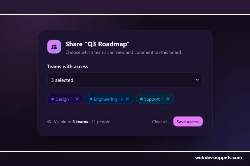
Dark Bootstrap 6 multi-select Combobox where chosen teams appear as removable Chips, with check marks, member totals, keyboard removal and a hidden form value.

Country Select with Flags – Bootstrap 6 selects preview

Country Select with Flags

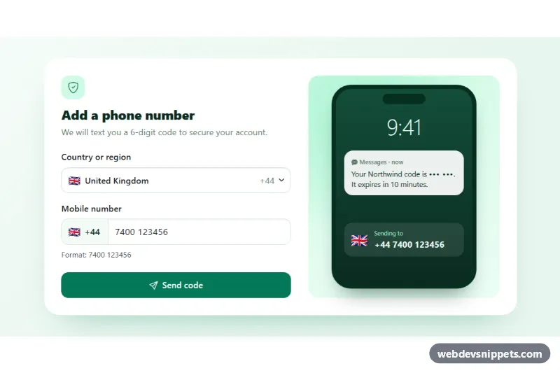
Bootstrap 6 Combobox of countries with emoji flags and dial codes, searchable by name or code, feeding a phone number field and an SMS preview.

Searchable Select with Combobox – Bootstrap 6 selects preview

Searchable Select with Combobox

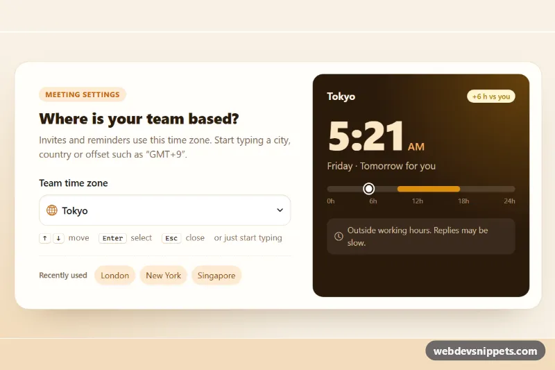
Bootstrap 6 Combobox time zone picker with live search, grouped options, type-ahead, keyboard navigation and a local-time clock card.

Styled Native Select – Pure CSS selects preview

Styled Native Select

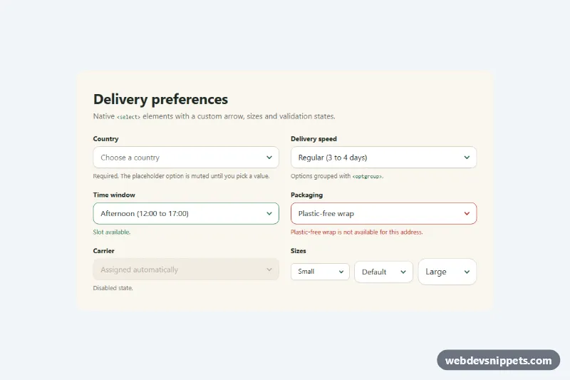
Pure CSS restyle of the native select element with a custom arrow, focus ring, error, success and disabled states, and three sizes.

Searchable Select – Tailwind CSS selects preview

Searchable Select

Accessible Tailwind CSS combobox that filters options as you type, highlights matches and supports full keyboard navigation.