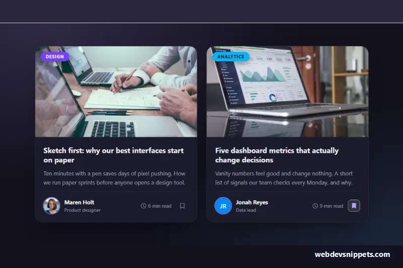
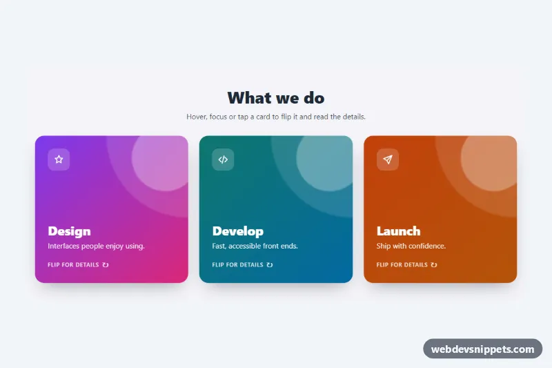
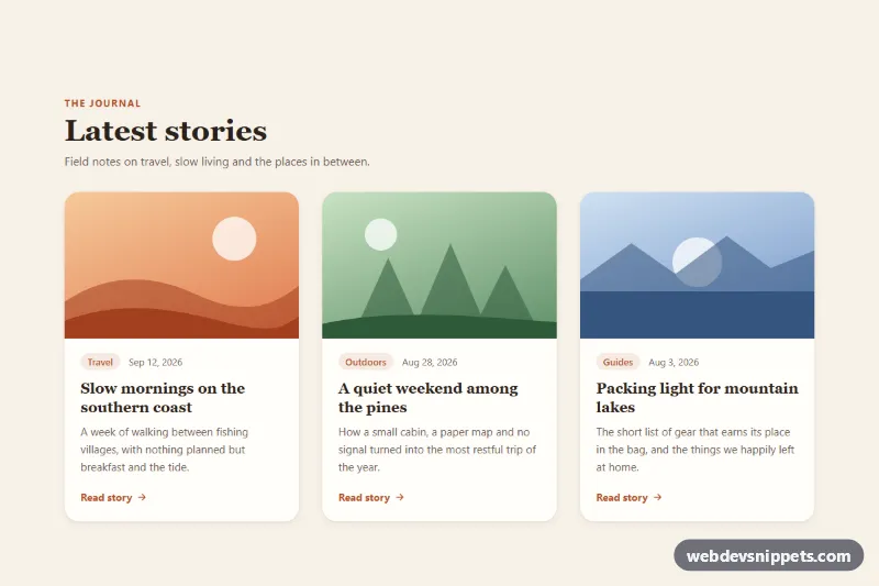
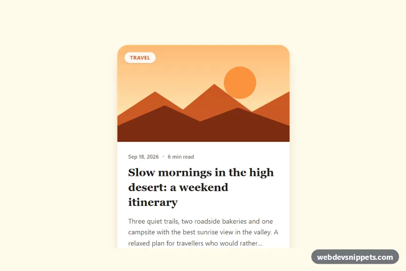
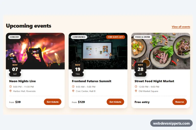
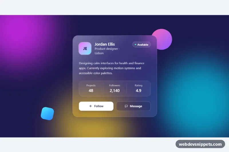
Dark Bootstrap 6 blog post cards for a magazine-style article list. Each card shows a photo with a category badge, a clickable title, a short excerpt, and an author row with avatar, name, role, reading time and a bookmark button. Use them for blog indexes, "related articles" blocks or newsletter archives.
How it works
The section .bpc-root sets data-bs-theme="dark", so Bootstrap 6's color tokens switch to dark mode for everything inside it, whatever the visitor's OS setting. The cards sit in a CSS grid, grid grid-cols-1 md:grid-cols-2 gap-7. Bootstrap 6's .grid is its own query container, so the two columns respond to the grid's width, not the viewport.
Each card is a .card with a .bpc-media wrapper. The wrapper holds the .card-img-top photo and an absolutely positioned badge theme-accent rounded-pill for the category. The title link has .stretched-link, so the whole card is clickable. The bookmark button gets position: relative; z-index: 2 to stay clickable above the link overlay. Because the stretched link covers the card, .bpc-card:has(.bpc-link:focus-visible) draws the keyboard focus ring around the whole card.
The author row .bpc-author uses the new Bootstrap 6 .avatar component. The first author uses .avatar-img with a photo, the second uses initials with avatar theme-primary. margin-top: auto pins the row to the bottom of the card. The bookmark uses the button data API: data-bs-toggle="button" toggles aria-pressed and .active, and CSS swaps the outline icon for the filled one. No script.js is needed.
Customization
--bpc-accenton.bpc-root: changes the hover border, link hover color, avatar ring and the saved bookmark color.--bpc-bg,--bpc-surface,--bpc-lineand--bpc-mutedon.bpc-root: tune the page, card, divider and secondary text colors.--bpc-img-ratioon.bpc-root: changes the photo shape, for example4 / 3for taller images.theme-accent/theme-infoon.bpc-cat: pick any Bootstrap 6 theme role per category, such astheme-successfor "Tutorials".md:grid-cols-2on.bpc-grid: switch tolg:grid-cols-3and raisemax-widthon.bpc-gridfor a three-column list.--bs-avatar-sizeon.bpc-avatar: makes the author avatar larger or smaller.- Change
data-bs-theme="dark"to"light"on.bpc-rootand update the--bpc-*colors for a light version.
The photos come from Unsplash; replace them with your own article images and author portraits.
Use cases
- Blog indexes: each card shows a photo, category badge, title and short excerpt
- Related articles blocks: author avatar, role and reading time sit in a compact row
- Newsletter archives: a bookmark button lets readers save articles
- Magazine-style lists: dark cards give a modern look to article lists
Accessibility
Each <article> is labelled by its title. The bookmark buttons have descriptive aria-labels and report their state with aria-pressed. The author photo has an empty alt because the name is printed next to it, and the initials avatar is aria-hidden. Icons are hidden from screen readers. The hover lift and image zoom are disabled under prefers-reduced-motion.
Bootstrap 6 notes
badge text-bg-primary becomes badge theme-primary, and text-muted is gone (this snippet uses its own --bpc-muted). Avatars are now a built-in component (.avatar, .avatar-img). Breakpoint classes use a colon prefix: md:grid-cols-2 instead of BS5-style infixes. Built on Bootstrap 6.0.0-alpha.1, so APIs may still change. Icons come from Bootstrap Icons.