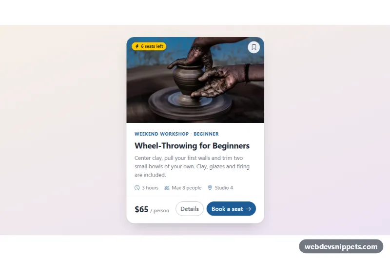
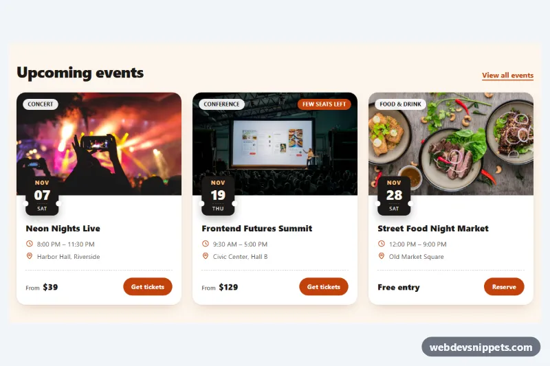
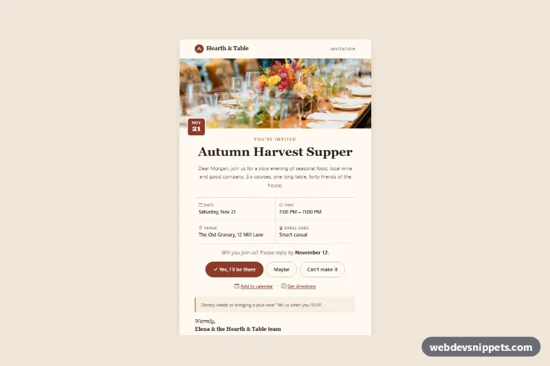
A clean Bootstrap 6 card with a photo on top, a title, a short text and two buttons: a solid primary action and an outlined secondary one. It also has a "seats left" badge, a bookmark toggle on the image, a row of meta details and a price. Use it for workshops, events, courses, tours or any listing where people book or buy.
How it works
The card is a plain article.card.cib-card inside a .cib-stage wrapper. The wrapper only centers the card and gives it a soft gradient background. The photo is a card-img-top inside .cib-media, cropped to 16:10 with aspect-ratio and object-fit: cover.
Two elements sit on top of the photo with absolute positioning:
- a
badge theme-warning rounded-pillbadge (.cib-badge) - a round bookmark button (
.cib-save)
The bookmark uses the Bootstrap 6 toggle-button data API (data-bs-toggle="button"). Bootstrap flips its aria-pressed and .active state, and CSS swaps the outline icon (.cib-save-off) for the filled one (.cib-save-on) when aria-pressed="true". No custom JavaScript is needed, so the snippet has no script.js.
The content sits in card-body. In Bootstrap 6 that is a flex column with a built-in gap, so the eyebrow, title, text and meta list need no margin utilities. card-title and card-text are kept only as semantic hooks, because Bootstrap 6 gives them no styles. The .cib-title and .cib-text classes set the type. The card-footer holds the price and the two buttons. It wraps under the price on narrow screens.
Customization
--cib-accenton.cib-stage: the deep blue accent. It re-colors the eyebrow, meta icons, the filled bookmark and the "Book a seat" button through--bs-primary-bg.--cib-radiuson.cib-stage: the corner radius of the card.max-widthon.cib-card: the card width (23rem). Remove it to let the card fill a grid column.aspect-ratioon.cib-img: use4 / 3or1 / 1for a taller photo.- Change
theme-warningon.cib-badgetotheme-successortheme-danger, or delete the badge. - Swap
btn-outline theme-secondaryon the Details button forbtn-subtle theme-primaryto get a softer secondary action.
The photo comes from Unsplash. Replace it with your own image and update the alt text.
Use cases
- Workshops and events: a photo, seats left badge, date details and a booking button in one card
- Course sites: meta details and a price help visitors compare offers quickly
- Tour operators: a bookmark toggle on the image lets visitors save a trip
- Listings: a solid primary action sits beside an outlined secondary action
Accessibility
The card is an article labelled by its heading through aria-labelledby. The image has descriptive alt text plus width and height attributes, so the layout does not shift while it loads. The icon-only bookmark has an aria-label, and its state is exposed with aria-pressed. All decorative icons are aria-hidden. Focus rings use --bs-primary-focus-ring. The arrow nudge on hover is turned off under prefers-reduced-motion.
Bootstrap 6 notes
- Buttons use
btn-solid theme-primaryandbtn-outline theme-secondaryinstead ofbtn btn-primaryandbtn btn-outline-secondary. - The badge uses
badge theme-warninginstead ofbg-warning. card-bodyis now a flex column with a gap.- Built on 6.0.0-alpha.1, so class names may still change.