Skip to content

Pricing Card with Feature List

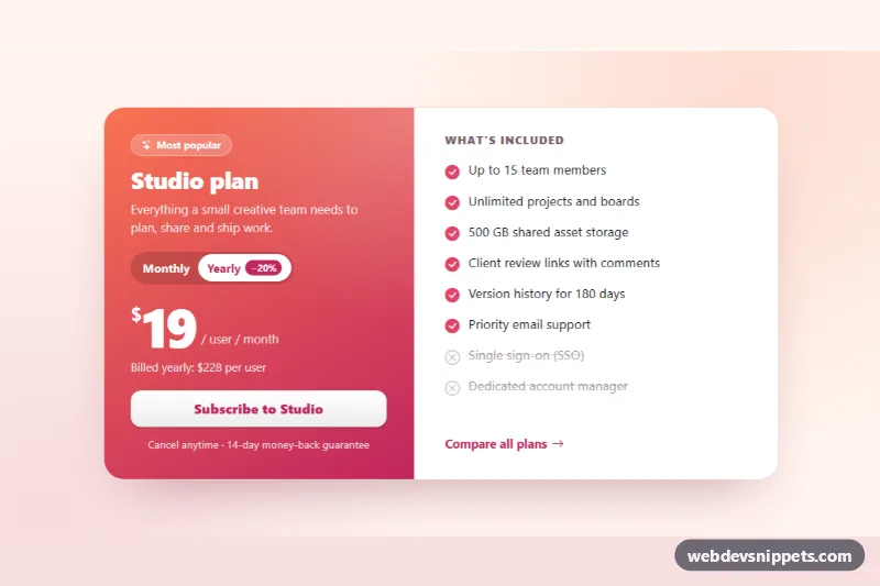
Bootstrap 6 single pricing card with a monthly/yearly toggle, large price, feature checklist with excluded items and a subscribe button with loading state.

Also known as: single pricing card, pricing card with toggle, plan card with feature list, saas plan card

Pricing Card with Feature List live demo

Open in new tab

Bootstrap 6 code (HTML, CSS, JS)

A single Bootstrap 6 pricing card for a SaaS plan. One gradient side shows the plan name, a monthly/yearly billing toggle, a large price and a subscribe button. The white side lists what is included, with excluded features crossed out. Use it on a landing page that promotes one plan, in an upgrade dialog, or as the featured tier above a full comparison table.

How it works

The card is <article class="card card-row pcf-card"> with two .card-body panels: .pcf-plan and .pcf-features. Bootstrap 6's .card-row lays them side by side and draws the divider between them. style.css stacks the panels by default and switches to a row in an @container (min-width: 680px) rule on .pcf-root, so the card responds to its own width.

The billing switch is a .btn-group of two Bootstrap 6 toggle buttons. Each label.btn-check wraps a radio input. script.js listens for change, reads data-pcf-monthly and data-pcf-yearly from .pcf-value, and rewrites the price and the .pcf-note line. Yearly billing shows the yearly total, and monthly billing shows how much the yearly plan would save. The price block is an aria-live region, so screen readers hear the new price.

The subscribe button combines btn-solid btn-styled btn-lg theme-inverse with custom --bs-theme-bg and --bs-theme-contrast values, which gives a white button with rose text on the gradient. On click it shows a .spinner-border.spinner-sm and a busy label. After a simulated request it adds .pcf-cta--done, which turns the button green, and updates the .pcf-fine status line. Picking another billing period resets the demo.

Customization

  • --pcf-from and --pcf-to on .pcf-root: set the two gradient colors of the plan panel (and the button text and link color).
  • --pcf-check on .pcf-root: changes the color of the included-feature check icons.
  • --pcf-plan-width on .pcf-root: sets how wide the plan panel is in the side-by-side layout (46% by default).
  • data-pcf-monthly and data-pcf-yearly on .pcf-value: your per-user prices. The note and savings are calculated from them.
  • Add .pcf-item--off to any .pcf-item to show it as not included (gray, struck through, with a hidden "Not included" label).
  • Replace the setTimeout in the .pcf-cta click handler with your checkout call. The current billing value is available there.
  • Change the 680px in the @container rule to control when the panels sit side by side.

Use cases

  • Landing pages: promote one plan with a large price and a feature checklist
  • Upgrade dialogs: a monthly or yearly toggle changes the price shown
  • Pricing pages: use it as the featured tier above a full comparison table
  • SaaS signups: excluded features are crossed out, and the subscribe button shows a loading state

Accessibility

The billing options are native radio inputs in a labelled role="group", so arrow keys work. Price changes are announced through aria-live, and the result of the subscribe action is announced through the role="status" line. Excluded features carry visually hidden "Not included:" text, so their meaning does not depend on the strikethrough. All icons are aria-hidden, and every control has a visible focus outline.

Bootstrap 6 notes

btn-primary becomes btn-solid theme-*, and .btn-styled adds the gradient sheen. Toggle buttons wrap their input in label.btn-check. spinner-border-sm is now spinner-sm, and horizontal cards use .card-row instead of a grid inside the card. Built on Bootstrap 6.0.0-alpha.1, so APIs may still change. Icons come from Bootstrap Icons.
Pricing Card with Feature List at a glance

Framework
Bootstrap 6
Code
HTML, CSS, JavaScript
JavaScript
Vanilla JavaScript, no jQuery
Dependencies
Bootstrap 6, Bootstrap Icons
Layout
Responsive, works on mobile
Category
Cards
License
Free for personal and commercial use

Questions about this template

Can I use the Pricing Card with Feature List code for free?

Yes. You can copy or download the code and use it in personal and commercial projects, including client work. No sign-up is needed. Reselling it as part of a component library or template collection is not allowed; see the license.

How do I add it to my website?

Load Bootstrap 6 and Bootstrap Icons from a CDN (the links are under Requirements). Paste the HTML where the component should appear, add the CSS to your stylesheet and load the JavaScript before the closing </body> tag. Download HTML gives you a complete page with everything already linked.

Does it need jQuery or a JavaScript framework?

No. The script is plain vanilla JavaScript, so it works without jQuery, React or Vue. You can still use the markup inside those frameworks.

Does it work on mobile?

Yes. The layout adapts to small screens. Use the Mobile and Tablet buttons above the live demo to check it at phone and tablet width.

Requirements

Add these to your page (already included in the download):

  • <link rel="stylesheet" href="https://cdn.jsdelivr.net/npm/bootstrap@6.0.0-alpha.1/dist/css/bootstrap.min.css">
  • <script type="module" src="https://cdn.jsdelivr.net/npm/bootstrap@6.0.0-alpha.1/dist/js/bootstrap.bundle.min.js"></script>
  • <link rel="stylesheet" href="https://cdn.jsdelivr.net/npm/bootstrap-icons@1.11.3/font/bootstrap-icons.min.css">

Built for Bootstrap 6.0.0-alpha.1. Bootstrap 6 ships as an ES module, so its script and this component's JavaScript load with type="module". Alpha releases can still change before the stable version.

Pricing Card with Feature List – Bootstrap 6 cards component screenshot
Pricing Card with Feature List · Bootstrap 6 Cards

More Cards

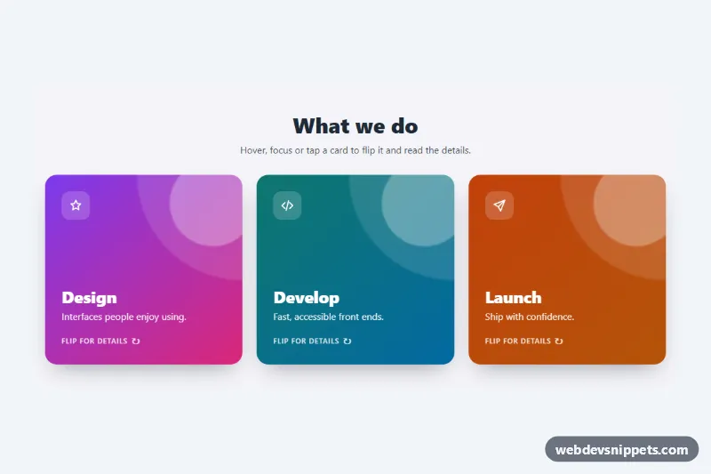
3D Flip Card – Pure CSS cards preview

3D Flip Card

Three pure CSS 3D flip cards that turn on hover, keyboard focus or tap to reveal details and a link on the back.

Cards with Hover Lift – Pure CSS cards preview

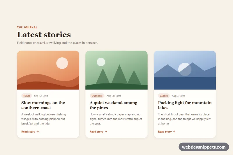
Cards with Hover Lift

Pure CSS blog card grid where each card lifts with a deeper shadow and zooms its image on hover or keyboard focus.

Blog Post Card – Tailwind CSS cards preview

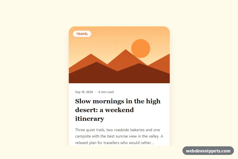
Blog Post Card

Tailwind CSS blog post card with cover illustration, category badge, date, reading time, clamped excerpt, author row and a fully clickable area.

Event Card with Photo and Date Badge – Pure CSS cards preview

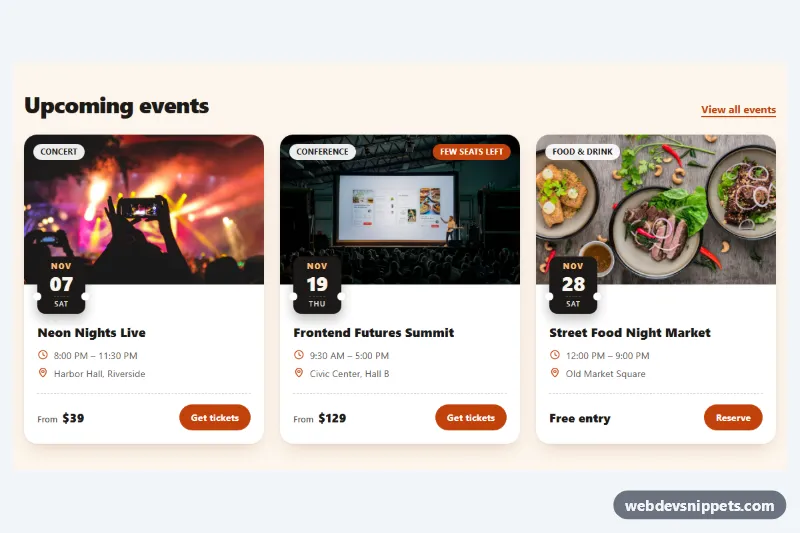
Event Card with Photo and Date Badge

Pure CSS event cards with a cover photo, ticket-stub date badge, category chip, time and venue details, price and a ticket button.

Glassmorphism Card – Tailwind CSS cards preview

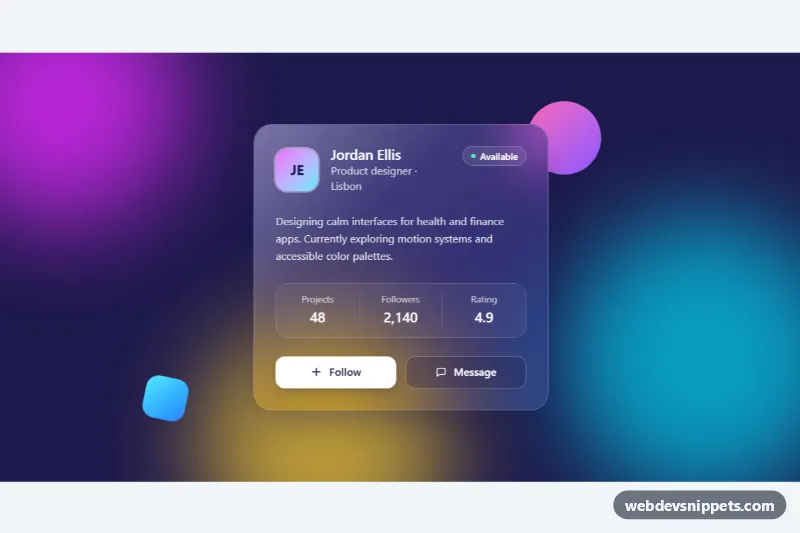
Glassmorphism Card

Frosted glass profile card in Tailwind CSS with backdrop blur, a light reflection and a follow button over colorful animated gradient blobs.

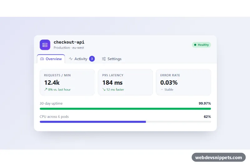
Card with Header Tabs – Bootstrap 6 cards preview

Card with Header Tabs

Bootstrap 6 card whose header holds nav tabs that switch the card body between an overview with stats, an activity feed and a settings form.