Skip to content

Form Validation Styles

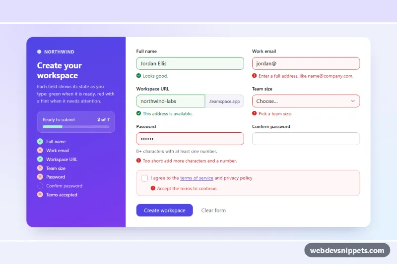
Bootstrap 6 signup form showing valid and invalid field states with specific feedback messages, a live status checklist and a simulated submit.

Also known as: form validation states, valid invalid input styles, signup form validation, form error messages, live form status checklist

Form Validation Styles live demo

Open in new tab

Bootstrap 6 code (HTML, CSS, JS)

A Bootstrap 6 signup form that shows every validation state at once: green valid fields, red invalid fields with specific hints, and an untouched neutral field. A gradient status panel beside the form lists each field with a check or cross icon and a progress bar counting how many are ready. Use it for sign-up, checkout or settings forms.

How it works

The <form class="fvs-form"> carries data-bs-validate="valid" and novalidate. That is Bootstrap 6's CSS-only validation: after the user edits a field, :user-valid and :user-invalid color it and reveal the sibling .valid-feedback or .invalid-feedback inside its .form-field. Native rules do the checking: required, type="email", minlength and pattern.

The script adds the class-based states that CSS alone cannot give. On load, fields that already have .is-valid or .is-invalid (as a server would render them) count as touched. Each change event marks a field as touched. From then on, every input event re-runs paint(), which toggles .is-valid/.is-invalid, sets aria-invalid and swaps the message. An empty field shows its data-fvs-missing text, and any other error shows the default .invalid-feedback text. data-fvs-match="fvs-pass" makes the confirmation field compare itself with the password through setCustomValidity().

updateStatus() gives each [data-fvs-for] item in .fvs-status a data-state of valid or invalid, and sets the --fvs-pct width of .fvs-progress-bar. On submit, every field is painted. If any fail, .fvs-alert lists their names and focus moves to the first one. If all pass, a spinner shows for a simulated request.

Customization

  • --fvs-accent and --fvs-accent-2 on .fvs-root: set the gradient of the status panel, the link color and the submit button.
  • --fvs-ok and --fvs-bad on .fvs-root: change the green and red of borders and feedback text.
  • data-fvs-missing on any control: the message shown when the field is left empty.
  • Edit the text inside each .invalid-feedback to change the message for format errors such as a bad email or a short password.
  • Change pattern on #fvs-pass or #fvs-slug to apply your own password or URL rules.
  • Remove the .is-valid/.is-invalid classes from the markup to start with a clean form.
  • Replace the setTimeout in the submit handler with a fetch() call to your signup endpoint.

Use cases

  • Sign-up forms: green valid and red invalid fields show specific hints for email, password and username
  • Checkout pages: a progress bar and checklist show how many fields are ready before submitting
  • Settings forms: the confirmation field compares itself with the password and flags a mismatch
  • Design systems and docs: one page shows every validation state, from untouched to valid to invalid

Accessibility

Each control points to its feedback with aria-describedby, and the script keeps aria-invalid in sync. The summary box uses role="alert", so the list of failing fields is announced, and focus moves to the first invalid field. Status icons are decorative; the field names stay as text. The progress bar has role="progressbar" with a live aria-valuenow, and its animation turns off under prefers-reduced-motion.

Bootstrap 6 notes

Bootstrap 5's needs-validation plus a script that adds was-validated is gone. Bootstrap 6 uses data-bs-validate (add ="valid" for green states) and the :user-invalid pseudo-class. The mb-3 wrappers become .form-field. form-select is now form-control on a <select>, and form-check-input is .check. In 6.0.0-alpha.1, feedback placed after an .input-group is not shown, so style.css adds a small :has() rule for it. This is an alpha release, and its APIs can still change.

Form Validation Styles at a glance

Framework
Bootstrap 6
Code
HTML, CSS, JavaScript
JavaScript
Vanilla JavaScript, no jQuery
Dependencies
Bootstrap 6, Bootstrap Icons
Layout
Responsive, works on mobile
Category
Inputs
License
Free for personal and commercial use

Questions about this template

Can I use the Form Validation Styles code for free?

Yes. You can copy or download the code and use it in personal and commercial projects, including client work. No sign-up is needed. Reselling it as part of a component library or template collection is not allowed; see the license.

How do I add it to my website?

Load Bootstrap 6 and Bootstrap Icons from a CDN (the links are under Requirements). Paste the HTML where the component should appear, add the CSS to your stylesheet and load the JavaScript before the closing </body> tag. Download HTML gives you a complete page with everything already linked.

Does it need jQuery or a JavaScript framework?

No. The script is plain vanilla JavaScript, so it works without jQuery, React or Vue. You can still use the markup inside those frameworks.

Does it work on mobile?

Yes. The layout adapts to small screens. Use the Mobile and Tablet buttons above the live demo to check it at phone and tablet width.

Requirements

Add these to your page (already included in the download):

  • <link rel="stylesheet" href="https://cdn.jsdelivr.net/npm/bootstrap@6.0.0-alpha.1/dist/css/bootstrap.min.css">
  • <script type="module" src="https://cdn.jsdelivr.net/npm/bootstrap@6.0.0-alpha.1/dist/js/bootstrap.bundle.min.js"></script>
  • <link rel="stylesheet" href="https://cdn.jsdelivr.net/npm/bootstrap-icons@1.11.3/font/bootstrap-icons.min.css">

Built for Bootstrap 6.0.0-alpha.1. Bootstrap 6 ships as an ES module, so its script and this component's JavaScript load with type="module". Alpha releases can still change before the stable version.

Form Validation Styles – Bootstrap 6 inputs component screenshot
Form Validation Styles · Bootstrap 6 Inputs

More Inputs

Password Strength Meter – Bootstrap 5 inputs preview

Password Strength Meter

Bootstrap 5 password input with show/hide toggle, four-step strength meter, live requirements checklist and confirmation match check.

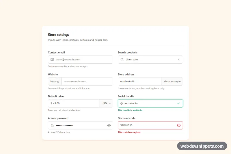
Inputs with Icons and Add-ons – Tailwind CSS inputs preview

Inputs with Icons and Add-ons

Tailwind CSS input group examples with leading icons, text prefixes and suffixes, a currency select, password toggle, clear button and helper text.

Tag Input with Chips – Bootstrap 6 inputs preview

Tag Input with Chips

Dark Bootstrap 6 tag input that turns typed values into removable Chips, with suggestions, a tag limit, keyboard shortcuts and a live post preview.

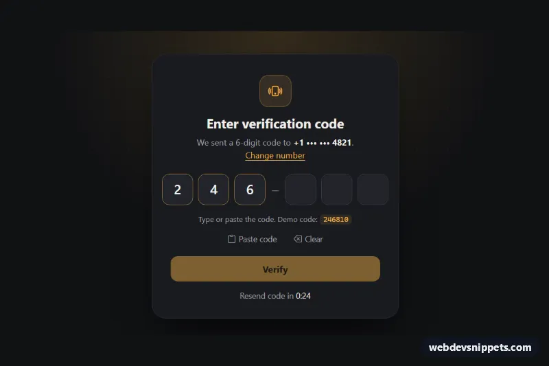
OTP Code Input – Bootstrap 6 inputs preview

OTP Code Input

Dark Bootstrap 6 OtpInput verification card with 6 digit slots, paste support, auto-advance, auto-verify on complete, error state and a resend countdown.

Password Input with Strength Meter – Bootstrap 6 inputs preview

Password Input with Strength Meter

Bootstrap 6 password field with show/hide toggle, the Strength meter, a live requirement checklist, confirm match, Caps Lock hint and a password generator.

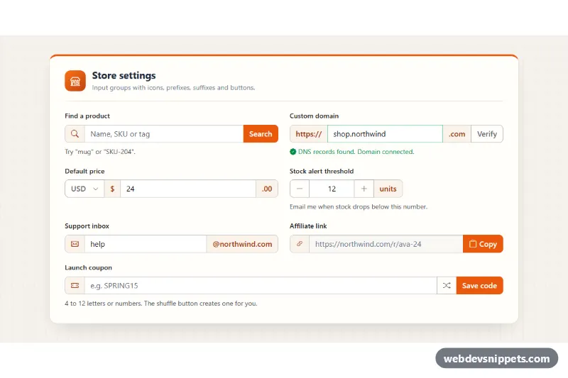
Input Groups with Icons and Buttons – Bootstrap 6 inputs preview

Input Groups with Icons and Buttons

Bootstrap 6 input group examples in a settings card: icon and text prefixes, suffixes, a currency menu, stepper, copy button and validated coupon field.