Skip to content

Tag Input with Chips

Dark Bootstrap 6 tag input that turns typed values into removable Chips, with suggestions, a tag limit, keyboard shortcuts and a live post preview.

Also known as: tag input, chip input field, keyword tags input, multiple tags input, add tags field

Bootstrap 6 Inputs Responsive Dark #chips #dark #form #input #tags

Tag Input with Chips live demo

Open in new tab

Bootstrap 6 code (HTML, CSS, JS)

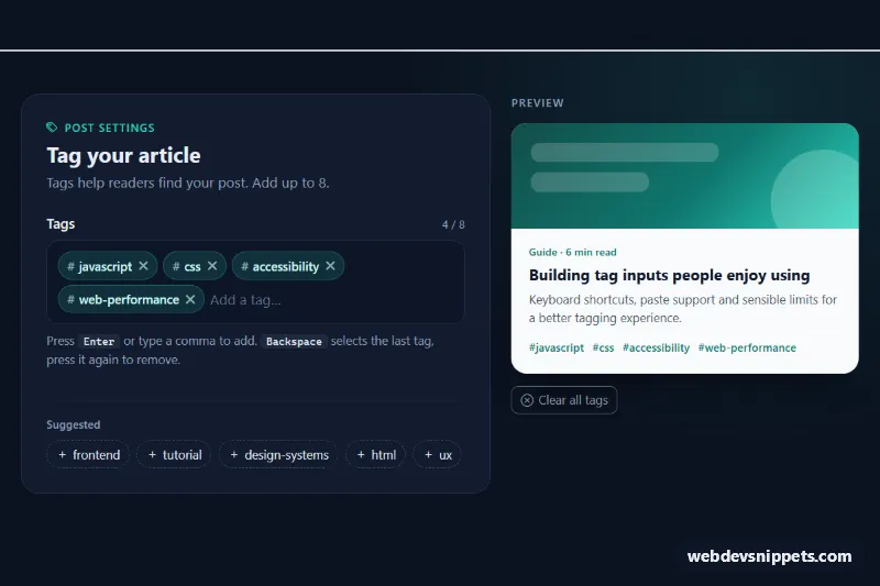
A dark Bootstrap 6 tag input built on the new Chips component. Typed values become removable chips, suggested tags can be added with one click, and a live card preview shows how the tags will look on the published post. Use it for blog editors, product attributes, skills fields or any "add a few keywords" form.

How it works

The field is a .chip-input with data-bs-chips, data-bs-max-chips="8" and data-bs-separator=",". The starting .chip elements and the .form-ghost text input sit inside it. script.js imports Chips from the Bootstrap bundle and calls Chips.getOrCreateInstance(box) before Bootstrap's own DOMContentLoaded data API runs, so both share one instance. Chips handles the core behavior. Enter or a comma creates a chip, and pasting a comma-separated list adds several at once. Backspace in an empty input selects the last chip, and a second Backspace removes it. Arrow keys, Home and End move between chips, and each chip gets a dismiss button.

The script listens to three Chips events. In add.bs.chips, the normalize() function lowercases the value, turns spaces into hyphens and strips a leading #. If the cleaned value differs, it cancels the event and adds the clean version, which also catches duplicates such as "CSS" vs "css". remove.bs.chips remembers what was removed for the announcement. change.bs.chips calls render(). That updates the hidden .tic-value input, the counter, each dismiss button's aria-label, the hidden state of .tic-suggestion buttons and the #tag list in .tic-card-tags. A capture-phase keydown listener explains why Enter did nothing when a tag already exists or the limit is reached.

Customization

  • data-bs-max-chips on .tic-input: changes the tag limit. The counter and the intro text read it automatically.
  • data-bs-separator on .tic-input: use another character, for example ;, to split pasted lists.
  • --tic-accent and --tic-chip-bg on .tic-root: change the teal accent and chip fill.
  • --tic-bg, --tic-panel and --tic-line on .tic-root: set the page, panel and border colors.
  • Add or remove .tic-suggestion buttons. Each needs a data-tic-tag value in the cleaned format.
  • Edit normalize() in script.js to allow capitals or other characters.
  • Read .tic-value (name tags) on submit; it holds the comma-separated list.

Use cases

  • Blog and CMS editors: authors type tags, press Enter or comma, and see a live post card preview
  • Product listings: sellers add attributes as removable chips, with a limit of eight tags
  • Profile and skills fields: suggested tags can be added with one click
  • Search and filter inputs: pasting a comma-separated list adds several tags at once

Accessibility

The ghost input has a real <label> and points to the help text and the status line with aria-describedby. .tic-msg is a polite live region, so adds, removals, duplicates and the limit are announced. Every dismiss button gets a specific label such as "Remove css". Suggested tags are real buttons in a labelled group, and keyboard focus moves to the next suggestion when one is used. Chips show a visible teal outline on focus.

Bootstrap 6 notes

Bootstrap 5 had no tag input, so most projects pulled in a plugin. Bootstrap 6 ships .chip, .chip-input and the Chips JavaScript component, with options as data-bs-* attributes and events such as add.bs.chips and change.bs.chips. Buttons use btn-outline theme-secondary instead of btn-outline-secondary. This is built on 6.0.0-alpha.1, and the alpha APIs may still change.
Tag Input with Chips at a glance

Framework
Bootstrap 6
Code
HTML, CSS, JavaScript
JavaScript
Vanilla JavaScript, no jQuery
Dependencies
Bootstrap 6, Bootstrap Icons
Layout
Responsive, works on mobile, dark design
Category
Inputs
License
Free for personal and commercial use

Questions about this template

Can I use the Tag Input with Chips code for free?

Yes. You can copy or download the code and use it in personal and commercial projects, including client work. No sign-up is needed. Reselling it as part of a component library or template collection is not allowed; see the license.

How do I add it to my website?

Load Bootstrap 6 and Bootstrap Icons from a CDN (the links are under Requirements). Paste the HTML where the component should appear, add the CSS to your stylesheet and load the JavaScript before the closing </body> tag. Download HTML gives you a complete page with everything already linked.

Does it need jQuery or a JavaScript framework?

No. The script is plain vanilla JavaScript, so it works without jQuery, React or Vue. You can still use the markup inside those frameworks.

Does it work on mobile?

Yes. The layout adapts to small screens. Use the Mobile and Tablet buttons above the live demo to check it at phone and tablet width.

Requirements

Add these to your page (already included in the download):

  • <link rel="stylesheet" href="https://cdn.jsdelivr.net/npm/bootstrap@6.0.0-alpha.1/dist/css/bootstrap.min.css">
  • <script type="module" src="https://cdn.jsdelivr.net/npm/bootstrap@6.0.0-alpha.1/dist/js/bootstrap.bundle.min.js"></script>
  • <link rel="stylesheet" href="https://cdn.jsdelivr.net/npm/bootstrap-icons@1.11.3/font/bootstrap-icons.min.css">

Built for Bootstrap 6.0.0-alpha.1. Bootstrap 6 ships as an ES module, so its script and this component's JavaScript load with type="module". Alpha releases can still change before the stable version.

Tag Input with Chips – Bootstrap 6 inputs component screenshot
Tag Input with Chips · Bootstrap 6 Inputs

More Inputs

Password Strength Meter – Bootstrap 5 inputs preview

Password Strength Meter

Bootstrap 5 password input with show/hide toggle, four-step strength meter, live requirements checklist and confirmation match check.

Inputs with Icons and Add-ons – Tailwind CSS inputs preview

Inputs with Icons and Add-ons

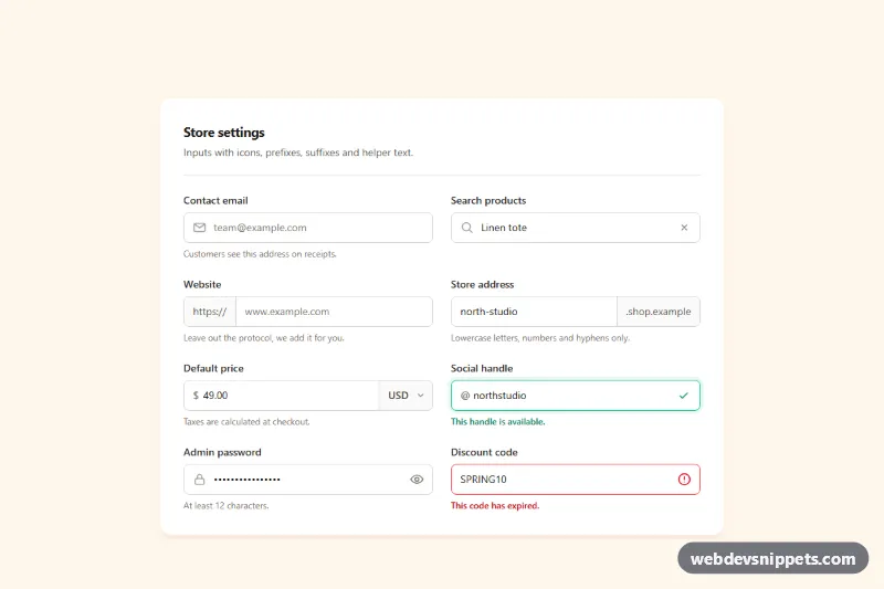
Tailwind CSS input group examples with leading icons, text prefixes and suffixes, a currency select, password toggle, clear button and helper text.

Form Validation Styles – Bootstrap 6 inputs preview

Form Validation Styles

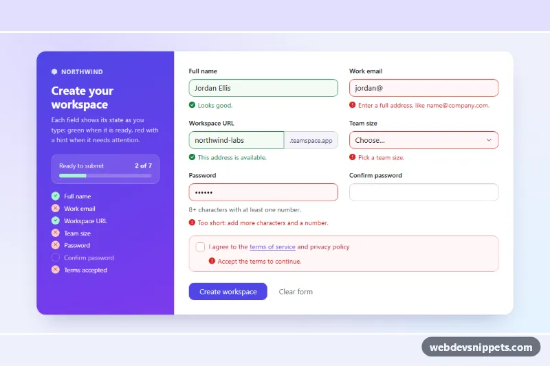
Bootstrap 6 signup form showing valid and invalid field states with specific feedback messages, a live status checklist and a simulated submit.

OTP Code Input – Bootstrap 6 inputs preview

OTP Code Input

Dark Bootstrap 6 OtpInput verification card with 6 digit slots, paste support, auto-advance, auto-verify on complete, error state and a resend countdown.

Password Input with Strength Meter – Bootstrap 6 inputs preview

Password Input with Strength Meter

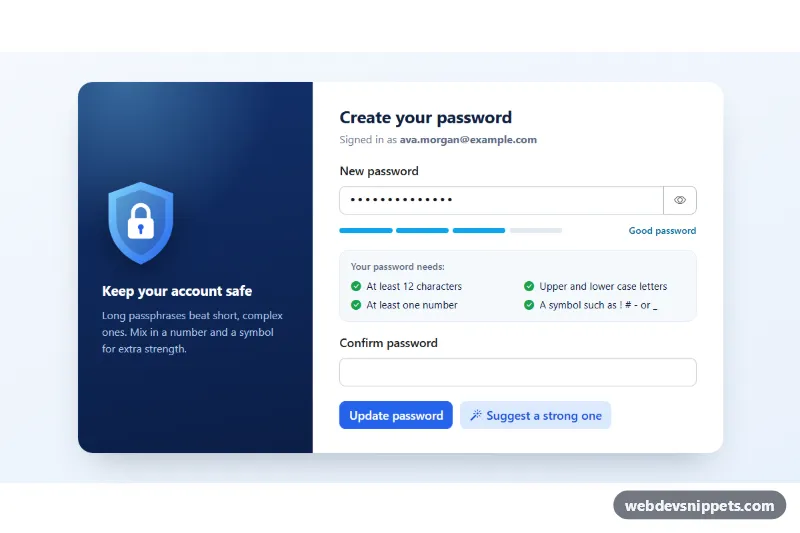
Bootstrap 6 password field with show/hide toggle, the Strength meter, a live requirement checklist, confirm match, Caps Lock hint and a password generator.

Input Groups with Icons and Buttons – Bootstrap 6 inputs preview

Input Groups with Icons and Buttons

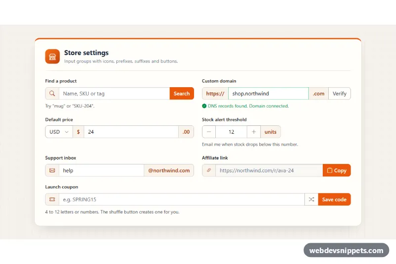
Bootstrap 6 input group examples in a settings card: icon and text prefixes, suffixes, a currency menu, stepper, copy button and validated coupon field.