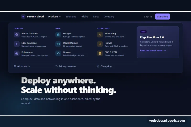
A dark Bootstrap 6 navbar whose Products item opens a wide mega menu: three columns of product links with icons and short descriptions, a featured announcement card and a row of quick links. It suits SaaS, cloud and developer-tool sites with many products. On small screens the links move into a Bootstrap 6 Drawer, and the same mega menu becomes a stacked list.
How it works
The root .mgn-root carries data-bs-theme="dark". Inside it, .navbar.lg:navbar-expand holds the brand, a .navbar-toggler and a <dialog class="drawer drawer-end">. Below 1024px of navbar width the toggler opens the drawer; from 1024px the drawer is shown inline as a normal navbar row.
The Products button uses the Bootstrap 6 Menu plugin (data-bs-toggle="menu") with data-bs-display="static", so Floating UI does not position the panel. Instead, style.css places .mgn-mega absolutely under the whole navbar inside @container mgn (width >= 1024px). The navbar is a query container and container-name: mgn targets it directly.
All headers, .menu-item links, the .mgn-feature card and the footer links are direct children of .mgn-mega. This keeps the Menu plugin's arrow-key navigation working, because it only walks direct .menu-item children. CSS grid with grid-auto-flow: row dense stacks each item into the column named by .mgn-c1, .mgn-c2 or .mgn-c3.
script.js imports Menu and Drawer from the bundle. It closes the drawer when a link inside it is clicked. When the root has data-mgn-open-on-load and the desktop layout is active, it opens the panel once without animation (.mgn-instant) so the preview shows it.
Customization
--mgn-accenton.mgn-root: changes the brand mark, column headings, CTA button and featured-card tint.--mgn-bg,--mgn-surfaceand--mgn-borderon.mgn-root: adjust the page background, the panel and drawer surface, and the divider lines.- Remove
data-mgn-open-on-loadfrom.mgn-rootso the mega menu starts closed (recommended for production). grid-template-columnsin the.mgn-megarule inside the container query: add or remove columns, then add a column class like.mgn-c3for the new column.max-width: 1100pxon.mgn-mega: make the panel full width or narrower.- Swap
.mgn-ico--violet,.mgn-ico--cyanor.mgn-ico--amberon an icon tile to recolor a product group. - Delete the
.mgn-featurelink to drop the announcement card. The three columns then use the remaining width.
Use cases
- SaaS companies: the Products item opens three columns of links with icons and short descriptions
- Developer tool sites: a featured announcement card sits inside the wide menu panel
- Cloud platforms: a row of quick links at the bottom of the panel helps people find key pages
- Mobile navigation: the same mega menu becomes a stacked list inside a drawer
Accessibility
The navbar is a labelled <nav>. The Products button has aria-expanded, which the Menu plugin updates, plus aria-controls. The caret icon is aria-hidden. Arrow keys move through the panel's items, Escape closes it and returns focus to the button, and clicking outside closes it. The drawer is a native modal <dialog> labelled by its title, with a close button. Focus outlines use the accent color, and the caret rotation is turned off under prefers-reduced-motion.
Bootstrap 6 notes
Bootstrap 5's dropdown, dropdown-menu and data-bs-toggle="dropdown" become .menu, .menu-item, .menu-header and data-bs-toggle="menu", without a wrapper. navbar-expand-lg is now lg:navbar-expand, and the collapse is replaced by a <dialog class="drawer">. .badge.badge-subtle.theme-accent replaces color-specific badge classes. Built on Bootstrap 6.0.0-alpha.1, so alpha APIs may still change. Icons come from Bootstrap Icons.