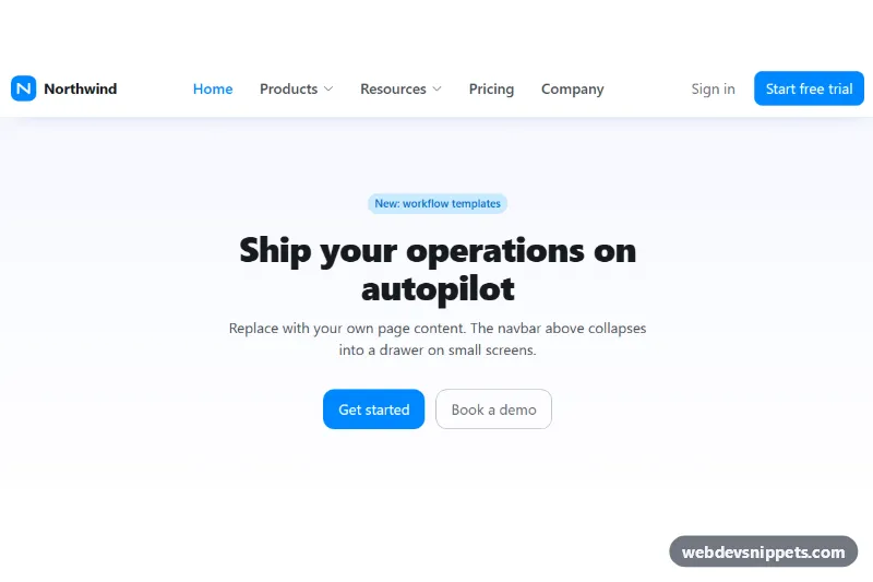
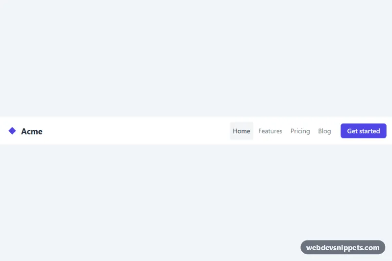
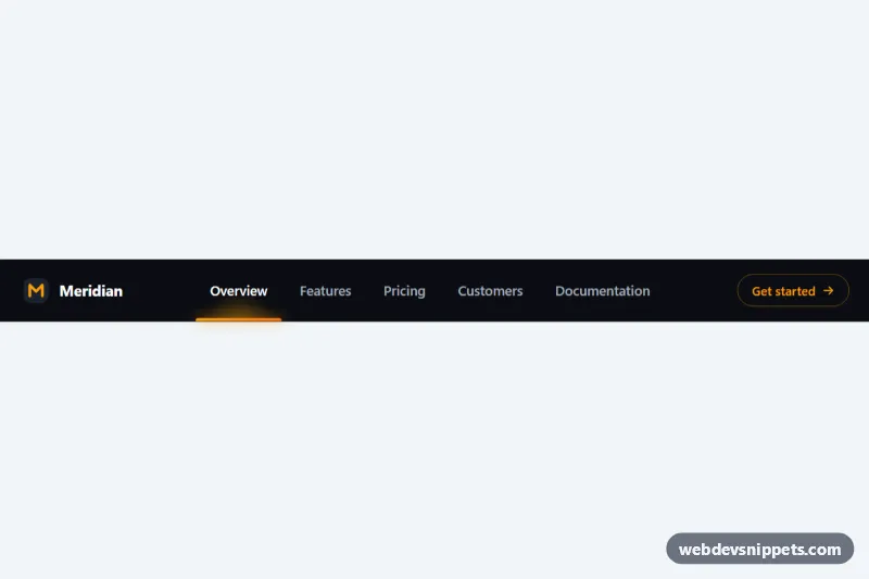
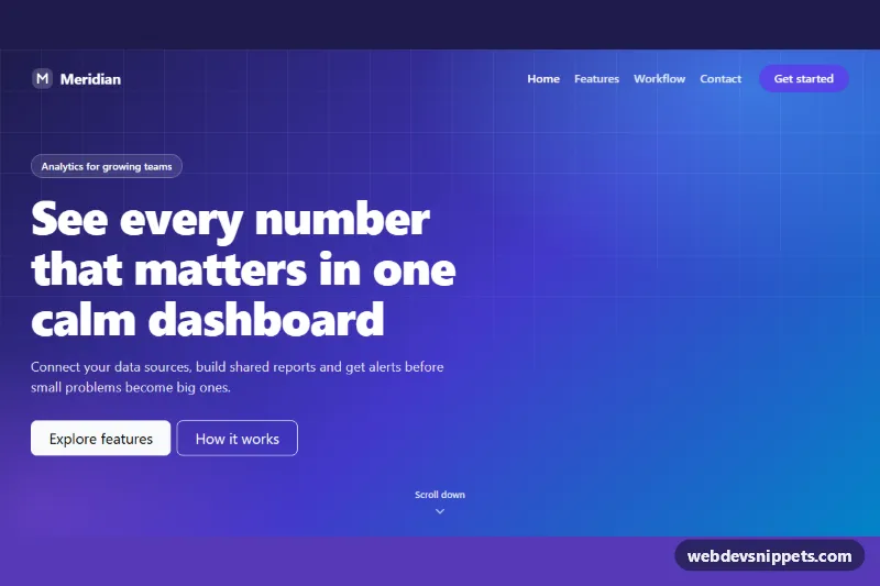
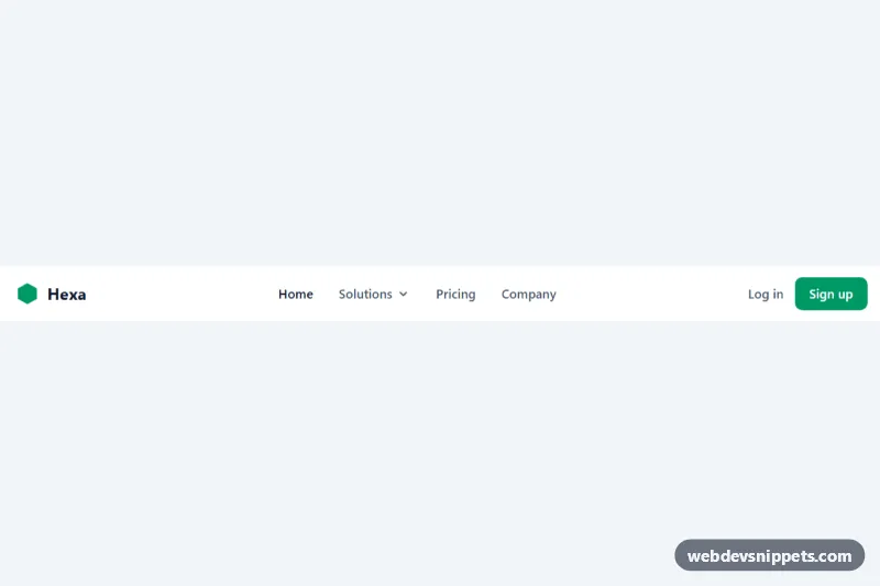
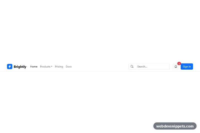
A clean, light Bootstrap 6 navbar for SaaS and company websites: logo on the left, centered links with two Menu dropdowns, and "Sign in" plus "Start free trial" actions on the right. On small screens everything moves into a Bootstrap 6 Drawer that slides in from the right.
How it works
The root .rnd-root is pinned to data-bs-theme="light" and holds a nav.navbar.md:navbar-expand.rnd-navbar. Because the Bootstrap 6 navbar is its own container query container, it expands when the navbar itself is at least 768px wide, not the viewport. Inside .rnd-inner sit the brand with an inline SVG logo, the .navbar-toggler and a <dialog class="drawer drawer-end">. When expanded, Bootstrap shows the drawer content inline; when collapsed, the toggler opens it with data-bs-toggle="drawer".
The "Products" and "Resources" items are button.nav-link.rnd-menu-toggle elements with data-bs-toggle="menu", each followed by a sibling .menu.rnd-menu. The Products menu uses menu-header, menu-item-icon, menu-item-content and menu-item-description for a mega-menu style list; Resources shows a menu-divider and a disabled item. The chevron .rnd-caret rotates when the toggle has aria-expanded="true".
script.js only listens for show.bs.drawer, hidden.bs.drawer and the native close event to keep aria-expanded on the hamburger button correct. Menus and the drawer work through the Bootstrap 6 data API without any code.
Customization
--rnd-accenton.rnd-root: changes the logo tile, the active link and the menu icons.--rnd-navbar-bgon.rnd-root: sets the navbar background (it feeds--bs-navbar-bg).--rnd-max-width(default75rem) used by.rnd-inner: widens or narrows the navbar content.- Change
md:navbar-expandtolg:navbar-expandto keep the drawer until the navbar is 1024px wide. - Swap
drawer-endfordrawer-startto slide the mobile drawer in from the left. --bs-menu-min-widthin.rnd-menu: makes the dropdown panels wider or narrower.- Delete the
section.rnd-demoblock; it is only sample page content.
Use cases
- SaaS websites: logo, product dropdowns and Sign in plus Start free trial buttons sit in one clean header
- Company sites: Products and Resources menus show icons and short descriptions for each link
- Mobile navigation: all links move into a slide-in drawer on small screens
- Marketing pages: a clear call-to-action button stays visible beside the main links
Accessibility
The navbar is a nav with aria-label="Main", and the current page link has aria-current="page". Menu toggles are real buttons; Bootstrap updates their aria-expanded and supports arrow keys and Escape. The drawer is a native <dialog> labelled by its title, traps focus while open and closes with Escape or the close button. Decorative icons use aria-hidden="true", focus outlines use the accent color, and the caret rotation only animates when prefers-reduced-motion allows it.
Bootstrap 6 notes
Bootstrap 5 developers will recognize the layout, but the classes changed: navbar-expand-md is now md:navbar-expand, the collapse area is a drawer dialog instead of navbar-collapse, dropdown-menu/dropdown-item become menu/menu-item, and buttons use btn-solid theme-primary and btn-text theme-secondary. Built and tested on Bootstrap 6.0.0-alpha.1; alpha APIs can still change before the stable release.