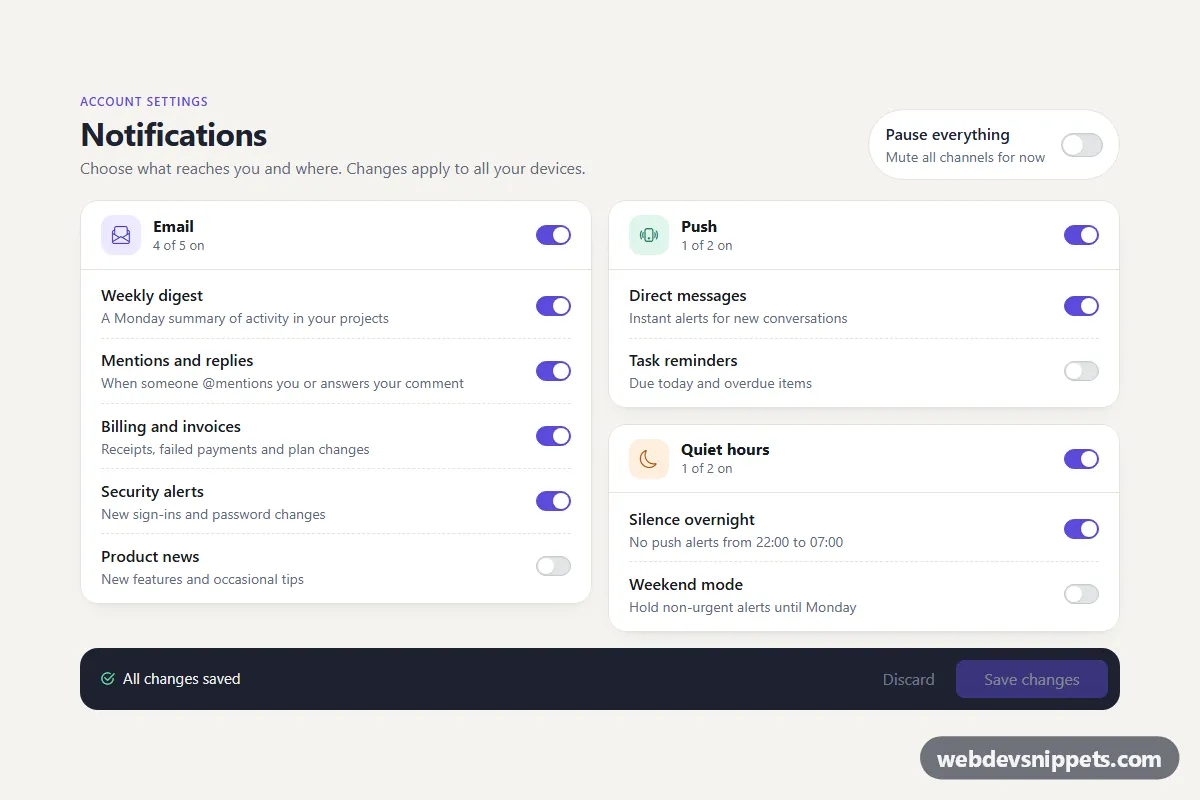
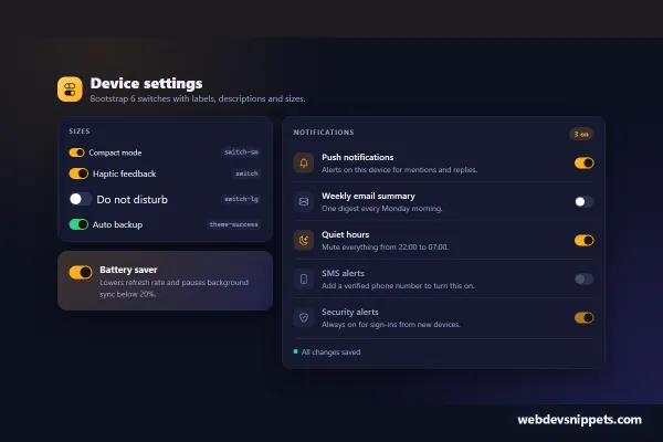
A notification settings panel built with Bootstrap 6 switches. Preferences are grouped in cards for Email, Push and Quiet hours, each with a master switch, plus a "Pause everything" toggle and a dark save bar that tracks unsaved changes. Use it on account or admin settings pages.
How it works
The root .sps-root holds one <form class="sps-form">. Every preference is a Bootstrap 6 .form-field.sps-row: a .form-field-content block with the label and a .form-text hint, followed by a .switch wrapper around <input type="checkbox" role="switch" switch class="sps-item">. Each group is a <fieldset class="card sps-card" data-sps-group>, labelled by its .sps-legend heading, with a master switch .sps-master-input in .sps-card-head.
script.js listens to the form's change event and re-renders the panel:
- A master switch that is off disables the switches of its group (their values are kept), adds
.sps-card--offand sets the.sps-oncounter to 0. .sps-pause-inputsetsdisabledon every group fieldset, which disables all controls inside at once, shows the.sps-paused-notealert and adds.sps-root--paused.- The script compares every checkbox with the last saved snapshot. The number of differences appears in
.sps-status-text("2 unsaved changes"), and Save and Discard are enabled only when something changed.
Discard restores the snapshot. Save calls preventDefault(), shows a .spinner-border.spinner-sm, locks the panel and stores a new snapshot after a timeout. Replace it with a fetch() call.
Customization
--sps-accenton.sps-root: recolors checked switches, the Save button, the focus ring and the eyebrow text.--sps-bg,--sps-card,--sps-lineand--sps-inkon.sps-root: change the page tint, card surface, dividers and the save bar.--bs-switch-checked-bgin the.sps-pause .switchrule: sets the orange color of the "Pause everything" switch.- Add a preference by copying a
.sps-rowblock into any.sps-rowscontainer. Give the input thesps-itemclass and the counters update automatically. - Add a group by copying a
fieldset[data-sps-group]with its.sps-master-input,.sps-onand.sps-total. .sps-icon--mail,.sps-icon--push,.sps-icon--quiet: the tinted icon tiles.- Add
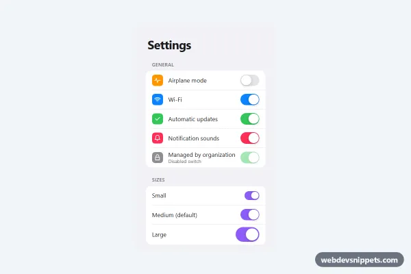
switch-smto a.switchwrapper for a smaller toggle (the pause switch already usesswitch-lg).
Use cases
- Notification preference pages: switches grouped in cards for email, push and other channels
- Account settings: a master switch per group turns all options in that card on or off
- Do not disturb controls: a pause-all toggle silences every notification at once
- Forms with explicit saving: unsaved-change tracking and a simulated save confirm what was changed
Accessibility
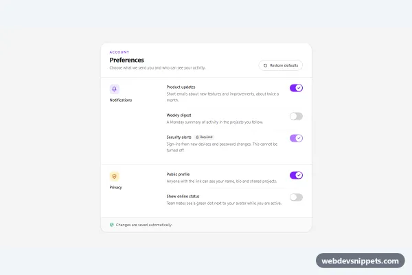
Each switch is a real checkbox with role="switch" and a <label for>, so clicking the text toggles it and screen readers announce on/off. Master switches have an aria-label naming their group, and each fieldset uses aria-labelledby to point at its heading. Disabled fieldsets take their controls out of the tab order. The counters and the save status are polite live regions, so "1 unsaved change" or "Preferences saved" is announced. Focus rings use the accent color. The card fade transition is turned off under prefers-reduced-motion.
Bootstrap 6 notes
Bootstrap 5's .form-check.form-switch with .form-check-input becomes a .switch wrapper around an <input switch>, placed in a .form-field grid. btn-primary is now btn-solid theme-primary, alert-warning is alert theme-warning, and spinner-border-sm is spinner-sm. The panel is pinned to light mode with data-bs-theme="light". It is built on 6.0.0-alpha.1, so class names may still change before the stable release. Icons come from Bootstrap Icons.