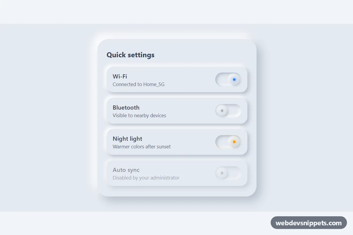
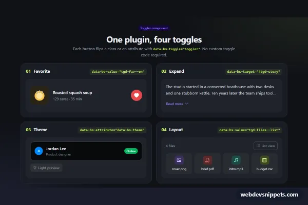
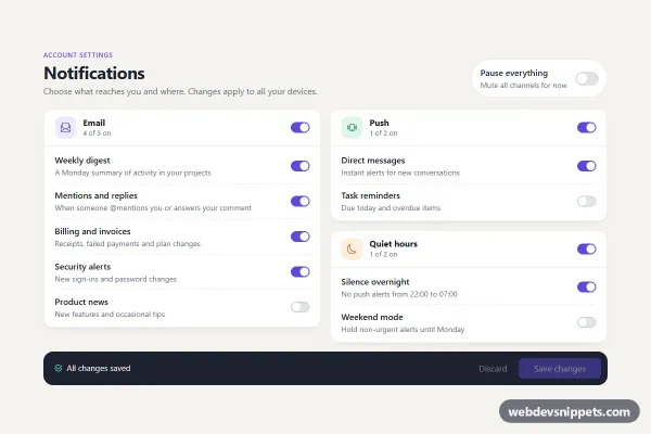
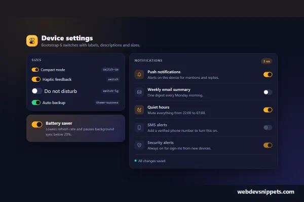
A set of soft UI toggle switches built with pure CSS and no JavaScript. Each switch uses inset shadows for the track and a raised knob with a small glowing indicator, giving the typical neumorphic look. It fits settings panels, smart home dashboards and preference screens.
How it works
The outer .nt-stage provides the light gray surface that neumorphism needs, because the effect relies on a light and a dark shadow on the same background color. Inside it, section.nt-panel holds a heading and a list of rows. Every row is a label.nt-switch containing the text (.nt-label and .nt-hint), a native checkbox .nt-input with role="switch", and the visual .nt-track with its .nt-knob.
The checkbox is visually hidden but stays in the accessibility tree and in the tab order. Clicking anywhere on the label toggles it. The track uses two inset box-shadow layers to look pressed into the surface. When the input is checked, the adjacent sibling selector .nt-input:checked + .nt-track slides the knob to the right with a transform and lights up the .nt-knob::after dot in the accent color with a soft glow. Pressing the switch briefly turns the knob shadow inward for a tactile feel. A disabled input dims the whole row through :has().
Customization
--nt-surface,--nt-lightand--nt-shadowon.nt-stage: the base color and the two shadow tones. Keep them in the same hue family for a convincing soft UI.--nt-onand--nt-on-glow: the color of the active indicator dot and the ring around a checked track..nt-switch--warm: a modifier that switches the accent to amber; copy it to create more color variants.--nt-track-wand--nt-track-h: the size of the track; the knob size and travel distance are calculated from them.--nt-gap: the space between the knob and the track edge.--nt-speed: the duration of the knob slide and the glow transition.- Add the
disabledattribute to any.nt-inputto show a locked setting, as in the Auto sync row.
Use cases
- Settings panels: each row has a label, hint and soft raised switch for turning options on or off
- Smart home dashboards: glowing indicators show which devices or features are active
- Preference screens: native checkboxes with switch roles submit with a form like any other field
- Locked settings: a disabled switch dims its whole row to show an option cannot be changed
Accessibility
Each switch is a real checkbox with role="switch", so screen readers announce it as a switch with its on or off state, and the visible label text becomes its accessible name. The Space key toggles it and Tab moves between switches. A clear outline appears around the track on :focus-visible. Text colors are darker than typical neumorphic designs to keep the contrast readable. With prefers-reduced-motion: reduce the knob moves without animation.
Usage notes
Inside a form, give each .nt-input a name and it submits like any checkbox. Use matching unique id and for values when you add more rows or several panels on one page.