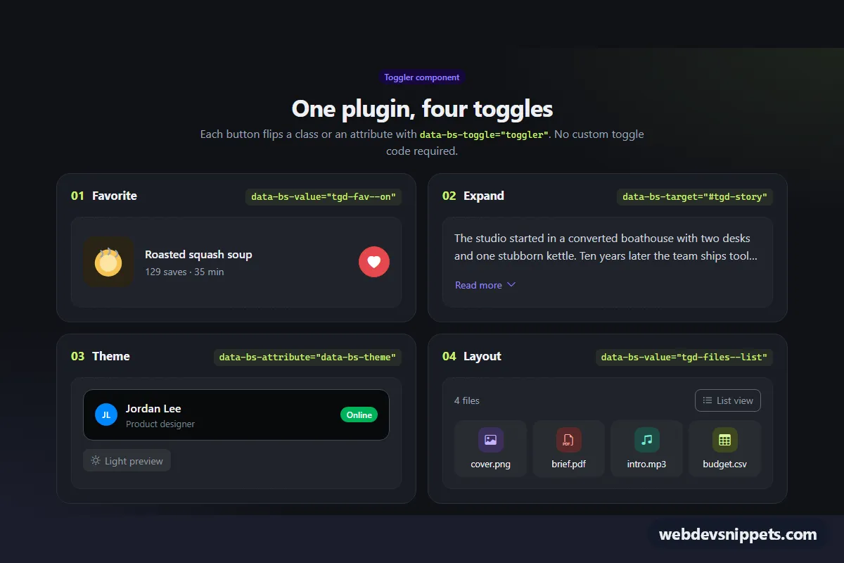
Four small demos of the new Bootstrap 6 Toggler component on a dark panel: a favorite heart button, a "Read more" text expander, a light/dark theme preview and a grid/list layout switch. Each one flips a class or an attribute through data attributes only, so it is a handy reference for the Toggler API and a set of patterns to copy into cards, lists and profile widgets.
How it works
Every trigger has data-bs-toggle="toggler". The Bootstrap 6 bundle handles the click and toggles the value set in data-bs-attribute (default class) and data-bs-value:
- 01 Favorite: the
.tgd-favbutton togglestgd-fav--onon itself. CSS swaps the outline heart.tgd-fav-offfor the filled.tgd-fav-onand plays a small pop animation. - 02 Expand: the button has
data-bs-target="#tgd-story", so Toggler reads its config from the paragraph.tgd-story--openremoves the two-line clamp. - 03 Theme:
#tgd-previewusesdata-bs-attribute="data-bs-theme"anddata-bs-value="light". The first click sets the attribute and the card switches to Bootstrap's light tokens (--bs-bg-body,--bs-fg-body). The second click removes it, so the card inherits dark mode from.tgd-rootagain. - 04 Layout:
tgd-files--liston#tgd-filesturns the four-column file grid into a compact list.
Toggler does not touch ARIA, so script.js listens to the bubbling toggled.bs.toggler event on .tgd-root. It finds the triggers of the toggled element and syncs aria-pressed or aria-expanded. It swaps button text from data-tgd-on and data-tgd-off on .tgd-label, and updates the .tgd-fav-count save counter.
Customization
--tgd-highlighton.tgd-root: changes the lime color of the demo numbers and code chips.--tgd-bg,--tgd-cardand--tgd-lineon.tgd-root: adjust the page, card and border colors of the dark panel.data-bs-valueon any trigger or target: set it to your own class name, for exampleis-active, and style that class.data-bs-attributeon a target: toggle any attribute instead of a class, as the theme demo does withdata-bs-theme.data-tgd-on/data-tgd-offon a.tgd-label: the button text for the on and off states.-webkit-line-clampin.tgd-story: how many lines the collapsed text shows (2 by default).- Remove
tgd-fav--onfrom the heart button and setaria-pressed="false"to start unsaved.
Use cases
- Product and content cards: a heart toggle marks items as favorites
- Articles and descriptions: a read-more expander shows or hides extra text
- Settings and theme pickers: a light and dark preview switch needs only data attributes
- Catalog and gallery pages: a grid and list view switch changes how items are laid out
Accessibility
All triggers are native <button> elements, so they work with Enter and Space. State toggles expose aria-pressed, and the expander uses aria-expanded with aria-controls. The heart button's aria-label switches between "Save to favorites" and "Remove from favorites". Icons are aria-hidden. The pop animation, chevron rotation and theme fade are disabled under prefers-reduced-motion.
Bootstrap 6 notes
Toggler is new in Bootstrap 6. In Bootstrap 5 you needed custom JavaScript, or a Collapse workaround, for class toggles like these. Buttons use the new standalone variants (btn-outline theme-danger, btn-subtle theme-secondary, btn-text theme-accent), and badges use badge theme-success. Built on 6.0.0-alpha.1, so the API may still change. The IDs (#tgd-story, #tgd-preview, #tgd-files) must be unique if you use the demos more than once on a page.