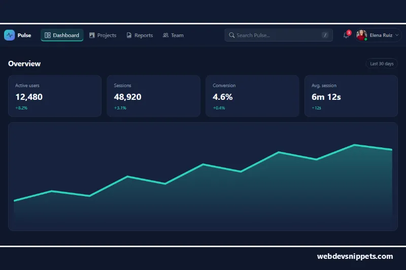
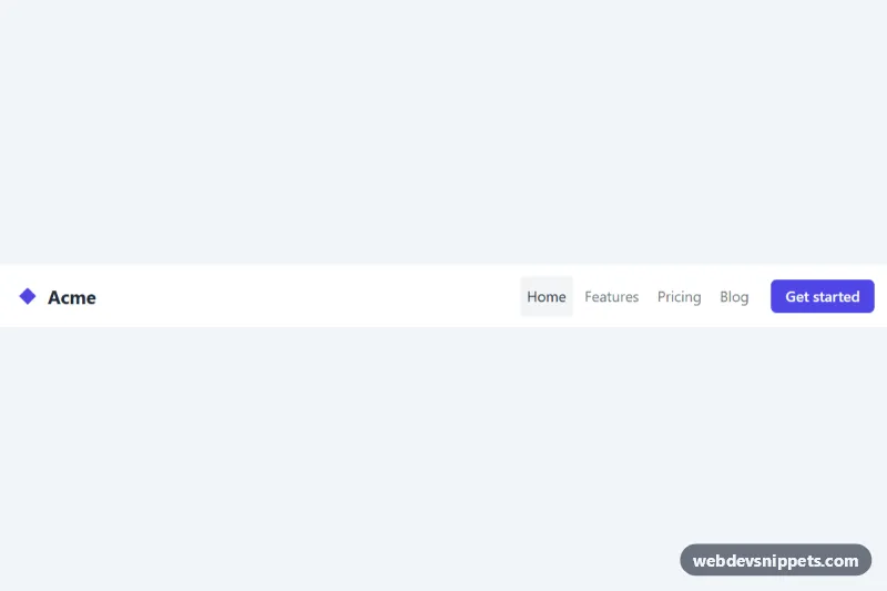
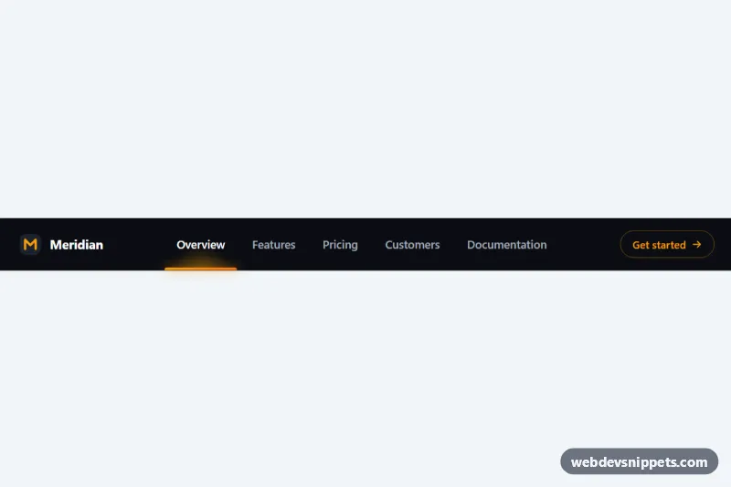
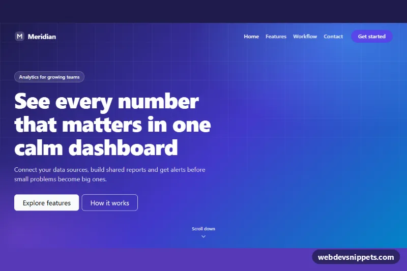
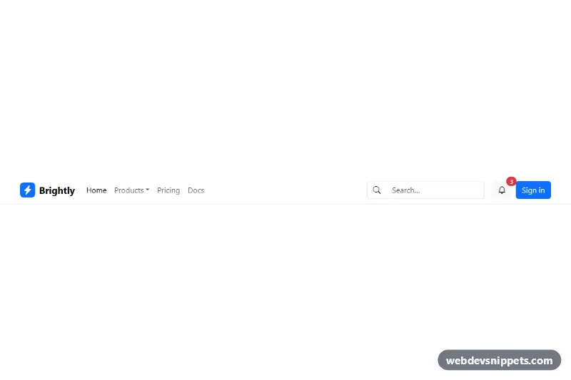
A dark Bootstrap 6 application navbar for dashboards and SaaS back offices. It combines a brand, icon nav links, a search field with a "/" shortcut, a notification bell with an unread badge and an avatar user Menu. Below 1024px the links and search move into a Bootstrap 6 Drawer while the bell and avatar stay visible.
How it works
.nsu-root is pinned to data-bs-theme="dark" and contains nav.navbar.lg:navbar-expand.nsu-navbar. The brand comes first, then a <dialog class="drawer drawer-start"> with the form.nsu-search and the ul.nsu-nav links, then .nsu-end with the bell, the account button and the .navbar-toggler. When the navbar is at least 1024px wide, Bootstrap renders the drawer inline and a container query in style.css moves the search to the right with order: 2.
The search field uses the new form-adorn pattern: a form-adorn-icon, a borderless form-ghost input and a kbd.form-adorn-text hint. The bell button.nsu-bell opens the .menu.nsu-notify panel with data-bs-toggle="menu" and data-bs-auto-close="outside", so clicking "Mark all as read" keeps it open. Each notification uses an initials avatar plus menu-item-content. The button.nsu-user shows an avatar with an avatar-status status-online dot and opens .menu.nsu-account.
script.js handles the rest. Submitting the search calls preventDefault() and announces the query in the .nsu-status live region; replace that handler with a redirect or fetch() to your search endpoint. Pressing "/" outside a text field focuses the search when it is visible. .nsu-read-all removes the .nsu-unread dots, hides .nsu-count and updates the bell label. The script also syncs aria-expanded on the drawer toggler.
Customization
--nsu-accenton.nsu-root: recolors the active link, focus rings, unread dots and the chart.--nsu-navbar-bgand--nsu-surface: change the navbar and page background tones.--nsu-search-width(default20rem): sets the desktop width of the search field.- Change
lg:navbar-expandtomd:navbar-expandand update the matching@container (width >= 1024px)rule to collapse later. - Edit the number in
.nsu-countand the bellaria-labelto match your unread count. - Remove the
.nsu-demoblock; it is only a sample dashboard.
The avatar photo comes from Unsplash; replace it with your own user image.
Use cases
- Admin dashboards: a dark top bar combines page links, search and the signed-in user menu
- SaaS back offices: the notification bell shows an unread badge and a Mark all as read action
- Web apps: press the slash key to jump straight into the search field
- Mobile dashboards: links and search move into a drawer while the bell and avatar stay visible
Accessibility
The form has role="search" and a visually hidden label. The bell and avatar buttons have descriptive aria-label values, and the badge is hidden from screen readers because the count is in the label. Menus are keyboard operable through Bootstrap (arrow keys, Escape). The drawer is a native modal <dialog>. Status messages go to a role="status" region, and all custom focus states use a visible accent outline.
Bootstrap 6 notes
This replaces the Bootstrap 5 combination of navbar-expand-lg, navbar-collapse, dropdown-menu and input-group with lg:navbar-expand, a drawer dialog, menu/menu-item and form-adorn. Badges use badge theme-danger, and avatars are the new CSS-only avatar component. Built on Bootstrap 6.0.0-alpha.1, so class names may still change.