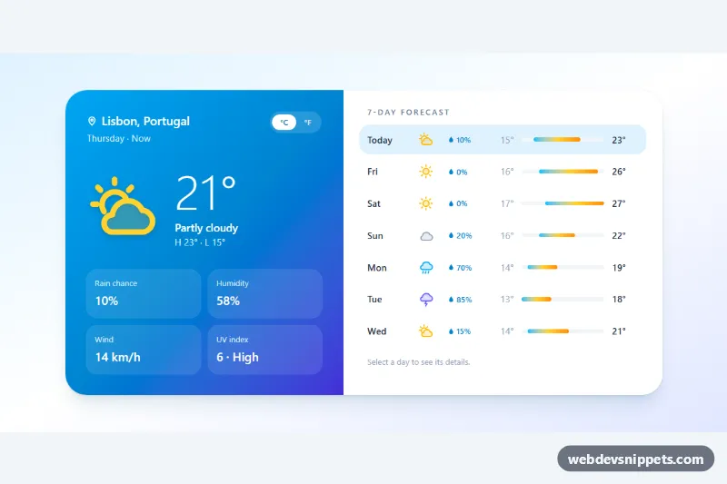
Weather Forecast with Weekly View
Tailwind CSS weather widget with current conditions, a selectable 7-day forecast with temperature range bars, and a °C/°F switch.
Weather cards and forecasts.
2 component(s)
Tailwind CSS weather widget with current conditions, a selectable 7-day forecast with temperature range bars, and a °C/°F switch.
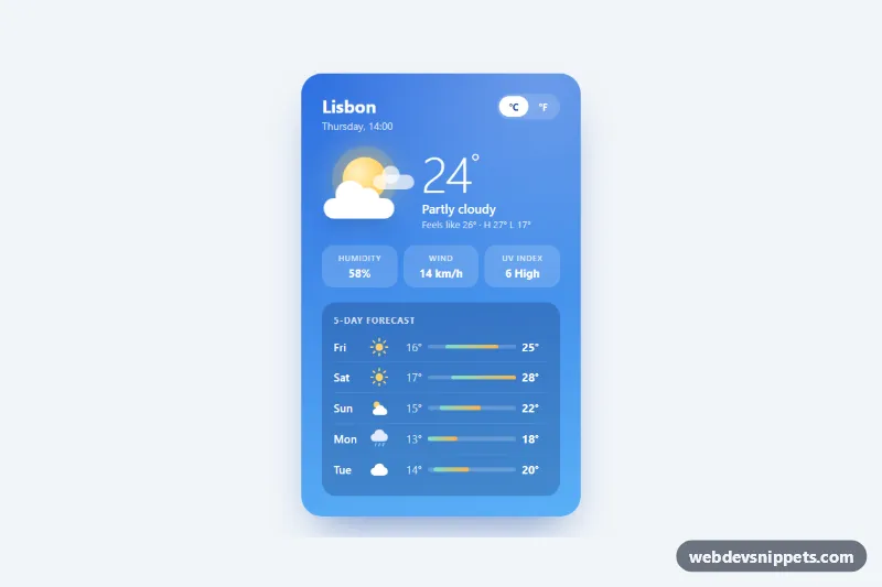
Sky-blue weather card with a CSS-drawn sun and clouds, current conditions, quick stats, a 5-day forecast with range bars and a Celsius/Fahrenheit switch.
A weather widget is a card or panel that shows current conditions and often a short forecast: temperature, an icon for sun, cloud or rain, wind, humidity and a list of upcoming hours or days. Weather cards are used on dashboards, travel and event sites, smart home interfaces and personal start pages, and they make popular UI design exercises.
Use a weather widget when the forecast genuinely helps the user, for example on a booking page for outdoor activities or in an admin dashboard. The templates here are front-end layouts with sample data; you feed them with data from your own weather API.
Best practices for a responsive weather widget:
aria-hidden="true".Intl.DateTimeFormat for the user's locale.prefers-reduced-motion.Each weather widget has a live preview and code tabs for HTML, CSS and JS. Bootstrap 6 versions use the new alpha ES module build and theme-* colour roles so the card adapts to light and dark themes. Bootstrap 5 versions use cards and grid utilities, Tailwind CSS versions use utility classes and gradients, and pure CSS versions rely on plain CSS. Filter by framework, copy or download the code, and replace the sample values with live data.