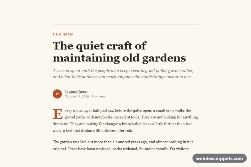
Article Layout
Bootstrap 5 long-form article layout with drop cap, wide figure, pull quote, author box and a sticky reading progress bar.
Text and media layouts for long-form content.
2 component(s)
Bootstrap 5 long-form article layout with drop cap, wide figure, pull quote, author box and a sticky reading progress bar.
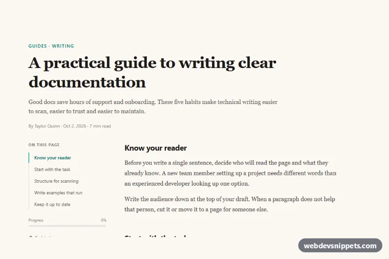
Tailwind CSS long-form article layout with a sticky table of contents that highlights the current section and shows reading progress.
A content section is a layout for longer text combined with media: an article body, a story block, an image beside explanatory paragraphs, a pull quote, a two-column text layout or a section with a sticky table of contents. Content sections carry the explanation on about pages, case studies, documentation pages, product stories and long-form landing pages, where readable typography matters more than visual effects.
Use one whenever you need to explain something in detail. Mixing text-only blocks with image-and-text blocks keeps long pages readable and helps break content into logical chunks.
max-width: 65ch is a simple rule of thumb.<h2>, <h3>) and real lists rather than visual imitations.<figure> and <figcaption> for images with captions and <blockquote> for quotes.width, height or aspect-ratio to prevent layout shift, and lazy-load those further down.Content section examples are available for Bootstrap 6, Bootstrap 5, Tailwind CSS and pure CSS. Bootstrap versions use the grid, typography classes and image utilities, and Bootstrap 6 variants use the theme-* colour roles for highlights and callouts. Tailwind CSS versions apply utility classes to every element, and pure CSS versions style semantic HTML directly with custom properties. Filter by framework, read each layout in the live preview, then copy the code or download it. Replace the placeholder text and images with your own and adjust spacing to fit your design.