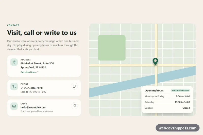
Contact Section with Details
Bootstrap 5 contact section with address, phone and email cards, copy buttons and a CSS map placeholder with opening hours.
Contact details, maps and contact forms.
2 component(s)
Bootstrap 5 contact section with address, phone and email cards, copy buttons and a CSS map placeholder with opening hours.
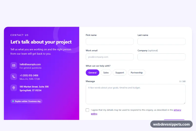
Tailwind CSS contact section with a gradient info panel beside a validated contact form, topic chips, character counter and a simulated send state.
A contact section gives visitors a clear way to reach you. It usually combines contact details (email, phone, address, opening hours) with a short form, a map or links to support channels. Contact sections are placed at the bottom of landing pages, on dedicated contact pages and inside about or services pages. Layouts include split form-and-details sections, card rows for different departments and map-with-overlay designs.
Use one wherever a visitor might want to ask a question or start a conversation, especially on service businesses, agencies and local business sites. Show the channel you actually prefer first, and set expectations such as typical response time.
<label>; placeholders are not a replacement.type="email", type="tel") and autocomplete attributes so mobile keyboards and autofill work.tel: and mailto:.<address> element.aria-describedby.Keep in mind that the snippets contain the front-end markup only; you need your own backend or form service to process submissions.
Every contact section here comes in Bootstrap 6, Bootstrap 5, Tailwind CSS or pure CSS. Bootstrap versions use form controls, the grid and floating labels, and Bootstrap 6 variants adopt the theme-* colour roles. Tailwind CSS versions use utilities, and pure CSS versions style native form elements directly. Filter by framework, test the layout in the live preview, then copy the HTML and CSS or download the snippet and connect the form to your endpoint.